

Flight of Fancy
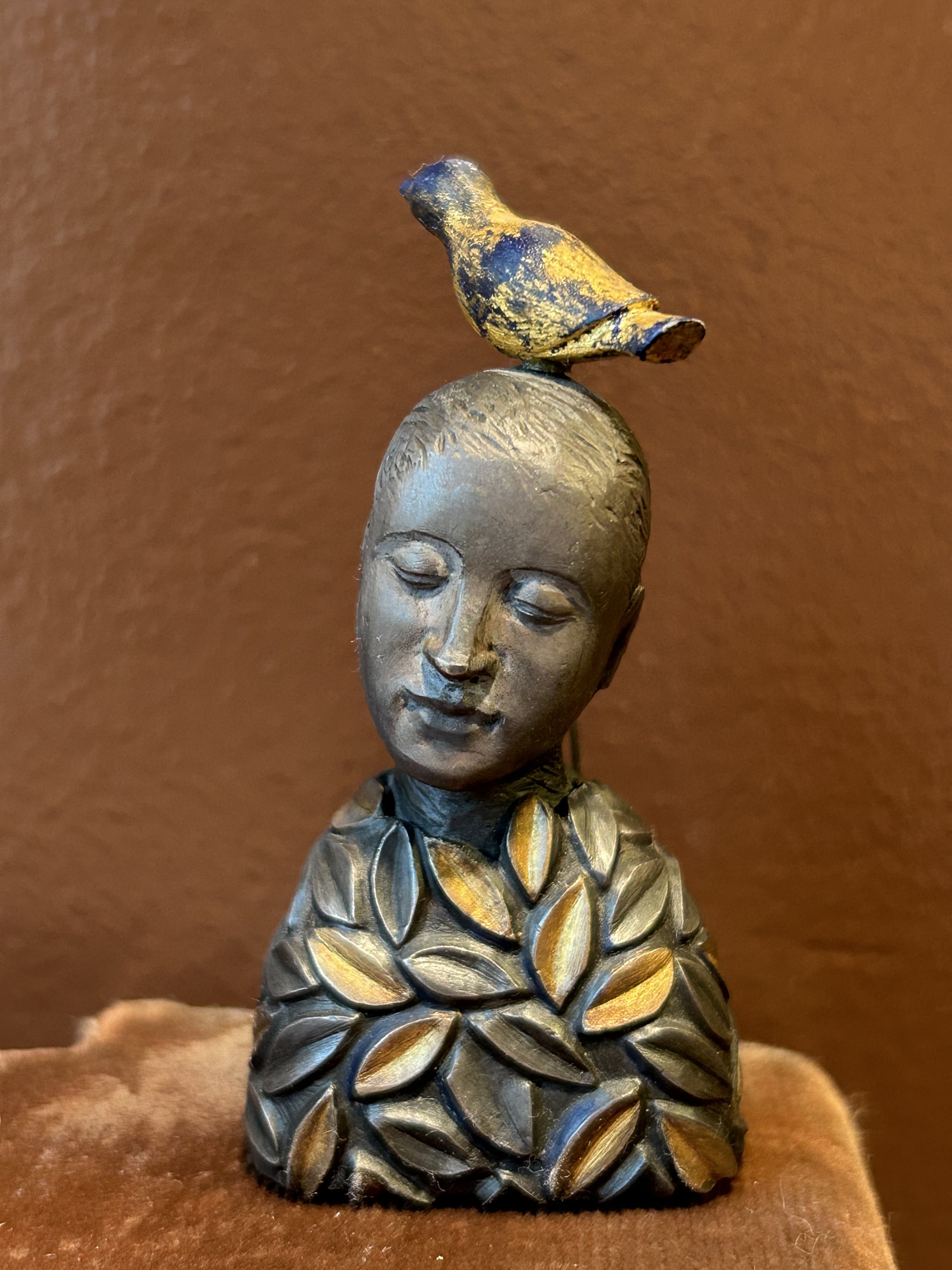
This little woman spoke to me at an estate sale back in 2022. She spoke of thoughtfulness, calm and flights of fancy. She was a bit pricey by thrifting standards, but I suspect I purchased her due to withdrawal symptoms. By 2022 we were starting to emerge from our Covid slumber, all a bit stir crazy. Certainly those of us addicted to thrifting and estate sales were struggling with the lockdown restrictions. Which, of course, were extensive and caused all sorts of other – more significant – issue in our lives. But come April, 2022, it seems the estate sale business started up again, likely with masks, and I purchased this art piece for no other reason but the joy of finally being able to see art again!

The piece was designed to be a pin, but I brought her home and put her on my dressing table. The artist is Karen Halt (b. 1946) though the piece is not signed. When I purchased her, there was a booklet with some other pieces about Halt’s work and thank goodness I took a photo of it, as I most certainly would not have recalled her name otherwise. Ms. Halt’s website (https://www.karenhalt.com/) indicates she often uses birds in her art: “they are gracious visitors who bring joy and dazzle me with their beauty, inspiring work and images that attempt to bridge the gap between what is natural and what is civilized. Their feathers…seek to soften the hard edges of our dwelling places and our fact-filled lives.” The leaves on my sculpture’s body reflect the growth and renewal nature provides. The woman sits contemplatively, with eyes closed, while a small bird sits perches on her head. The bird, connected as it is to trees, reflects a brief moment of touching nature’s beauty; the inspiration that comes from our head and flits off into the clouds.
Better a bird than a dog. While walking a few days ago with hubby, I had twisted my long and thick hair into a clip on top of my head. My hair often causes me to get rather hot, and the day was remarkably warm for a March weekend. As we walked our 70 pound dog, a couple was heading towards us on the path. The woman laughed as they passed, calling out “Oh! I thought you had a dog on your head!” Seriously. A dog on my head? Why of course, doesn’t everyone sit a small dog on the top of their head while walking on a sunny afternoon?! Flights of fancy indeed!

A Paul Tazewell Mystery

I was visiting Minneapolis recently and ventured to a local Bins thrift store with a friend. I didn’t find the facility all that impressive, though I did find a few treasures, a large black artist portfolio among them. My 3-year-old granddaughter loves “doing art” so I thought the portfolio might be fun for her. I flipped through the portfolio while I waited for my friend to finish her Bins shopping, pitching various papers and saving anything that looked interesting, this page among them.
I surmised the original portfolio owner was a costume designer, but I did not spend time researching. I paid for my haul, portfolio included, and moved on. When I returned home, I began cleaning and sorting my treasures. Unclear if I can part with the stunning Louis Vuitton shawl I snagged, and my daughter claimed the pristine 1950s applique quilt, so a successful outing for sure. I began to puzzle over the prior owner of the portfolio.
It was difficult as the only name I could find was “Jean” and “Jeannie”. Sorting through pages, I eventually realized Jean had been a dressmaker, though no address or last name was to be found. There were images from different costume designers thanking “Jeannie” for her work, and I began to read the various notes. Some were high quality prints of characters while others were original sketches. Many were signed, though illegibly. This one, however, had a very clear signature: Paul Tazewell. The sketch, dated 1995, was for a “Claudine” character.
Off to the internet I went, hunting for a “Claudine” in a play or movie. I did not get particularly far. Claudine was a movie, released in 1974, starring Diahann Carroll and James Earl Jones, both of whom won Academy Awards for their roles. The movie’s costume work was done by Bernard Johnson, and most obviously, my 1995 sketch was not related to the 1974 movie. While I have not watched the movie, some of the reviews make it clear it was a landmark film. The lead was a black woman, the producer was a woman, Hannah Weinstein, and the screenplay was created by a married couple, Tina and Lester Pine. The work depicted the pain, limitations and responsibilities of black motherhood, as well as the problems of raising 6 kids within Harlem and the welfare system. These themes are depicted with love and understanding rather than censure. (An interesting 1974 newspaper review: https://aadl.org/node/197115.)
I should point out I am not much of a television or movie watcher. Oddly, and for reasons I cannot explain without therapy, I simply do not turn on television, preferring instead to sew, read or do a myriad of other things. On occasion, if I do want to watch something, I end up calling one of my kids to walk me through how the heck to turn things on with all the remote controls scattered about. I do love theater, and will attend plays and musicals when possible. In fact, my trip to Minnesota was to see a stage production of Life of Pi, as I had read a fascinating review of the puppetry for the production (https://www.nytimes.com/2023/03/21/theater/life-of-pi-tiger-puppet.html). The Bins outing was a fun extra.
Unfortunately, my internet research did not help me discover any play created from the Claudine story line, and so my 1995 sketch remained a mystery. Nor was I any closer to figuring out who “Jean” was. Since I had a name, Paul Tazewell, I decided to research him and see if I could find Jean that way. Well damn.
Paul Tazewell, born in 1964, is a contemporary costume designer, who began his work on Broadway in 1996 for Bring in 'Da Noise, Bring in 'Da Funk. He received a Tony Award for Best Costume Design of a Musical for Lin-Manuel Miranda's Hamilton (2016). I found his website (https://www.paultazewelldesign.com/) and decided to send him an email to see if he could provide any insight into “Jean” and Claudine. After sending the email with an image of the Claudine work, I dug a bit further into Mr. Tazewell.
Whelp, not being much of a television watcher, I had not watched the Academy Awards the night before. I suspect my email will be remarkably low on Mr. Tazewell’s “to do” list: he won an Academy Award for his work designing the costumes for the movie Wicked, the first black man to do so. Claudine may remain a mystery but Mr. Tazewell’s sketch will have pride of place on my art display wall!
p.s. a dear friend figured out Mr. Tazewell worked at The Guthrie Theater in Minneapolis in 1995. So it makes a bit of sense that a dressmaker from the area would have worked on a design he created. Still unclear who our Jean was or what the play might have been, but I”m working on it!

Pins And Needles

This charming cross-stitch work, done by CWK in 1995, came home with me from a thrift store outing. It reminded me of our town, with all the quaint old buildings lining a busy main street. The work is remarkably detailed, but what made me laugh is that every storefront on this lively street is selling needle work: lace making, quilting, smocking, weaving, knitting, embroidery and millinery! Living in a charming turn of the century community is not without its challenges, however, even ones selling pins and needles.
“Libertyville” was an official town in 1837, and incorporated in 1882. The community was a sleepy farming town, and Quaker Oats arrived in 1922 to create a research farm. The 30-acre property on Lake Street QA acquired had a large barn and two houses, with water provided by a well. The village installed water service on Lake Street, though we do not know when nor when the QA farm was connected since no documentation is available
Oh that it was! We have learned that modern building code and charming 100-year-old houses are not particularly compatible. For those of you unaware, Quaker Oats sold the property in 1965, and the buildings were rented to a myriad of tenants - German consulate, Montessori school, laser manufacturer, turkey breeder, and, apparently, lion owning hippies! Families rented the houses, as well as one infamous group of college-aged boys (we have heard about ruckus parties). The large barn, used by QA for its research business, was transformed into 2 apartments which is a bit cringe worthy.
While the water lines to the houses are below ground, the one attached to the barn was run outside the structure; not a particularly wise idea. It burst in the 1980s, and the village disconnected the water, rendering the barn uninhabitable. The farm was subdivided by a local developer in the early 1980s, and we purchased the remains of the farm in 1999. Thus began a labor of love. We rented out the small cottage and started extensive renovations.
When a long legal tangle with the prior owner was finally resolved, we promptly received a “cease and desist” letter from the village regarding the rental. It seems the prior owner learned the village wouldn’t allow rental of the cottage, and she wanted to cause us trouble. At this point I called the village administrator who was apparently moved by weeping new moms (my baby was 8 months old, and the boys aged 6 and 8).
A meeting was called with the powers that be to inform us of the zoning issues. The cottage, they felt, did not qualify for “grandfathering” because the prior owner had stopped renting it to families and used it for her decorating business. Essentially, the zoning rules now applied and we could not have multifamily on our property. Why was it okay, I asked, for a business to be run in a residential area? One rather pompous administrator literally turned to a page in the zoning manual and read the code – you may run one commercial business out of your single-family dwelling place. Well, I said, if you can only run a business in a residential area if it is in a single-family dwelling place, then our cottage had to be a single-family dwelling place for the prior owner’s business to be allowed, and thus it remained a single-family dwelling place. And so it did NOT lose its grandfathering and we can rent it.
Turns out, their attorney grudgingly agreed with me. Now, however, neither the cottage nor our house have water since the water line sprung a leak and the water was turned off . On Friday at 3:00. When my children were arriving home, including an infant and 3-year-old. All plans were ditched, and the weekend was enjoyed sans water. Come Monday morning, however, we began the journey to resolve the water crisis.
There is currently one water line for the property, but code now requires each house to have a separate metered waterline. Since our old system was broken, we were told we had to comply with the code and excavate two new water lines, one for each house. Mind you, I could buy a nice new car for what installing ONE waterline would cost.
Into the village I went. Turns out, senior engineers are moved by weeping grannies. He was sympathetic to our plight, and started researching solutions. After he consulted with the village attorney, we were advised to request a variance to the code – which could take weeks. The village would issue a temporary permit to allow a new watermain to be installed, but if the variance was not approved by the Village Board, we would comply with the code requirements. This did not strike me as an attractive gamble.
While hubby was undergoing surgery, I reviewed the engineer’s emailed request. Due to the Village Board schedule, we only had a day to decide to start the variance process, and then to decide about digging or waiting for the board’s decision. Without water. I was to write an email requesting the variance and explain why.
Instead I read the ordinance: “Single family detached, single family attached and two-family dwellings…shall have a separate water service pipe…for each dwelling…Water service design for all other structures shall be as approved by the director.” After a bit of online definition research, I called the engineer. Well, I said, according to common definitions, a single family detached dwelling has its own property while our cottage does not. The two houses are not “attached” nor are they a single 2-family dwelling. Therefore, the property does not meet the code’s specifications and thus can be “approved by the director”. After a day to consult with the village attorney, the engineer called back. It seems the same attorney who proposed the variance requirement now agreed the wording was vague and thus no variance was needed.
That was the high point of the week. We are on day 10 sans water, and are struggling with unknown pipes. If the underground pipes are copper, we can excavate and have them repaired, roughly for the cost of an engagement ring. However, repairs can’t be done on lead or old galvanized pipes. If the excavation reveals those, we just flushed that “diamond ring” down the drain. At that point we would be facing “brand spanking new car” level excavation expenses. Single Family Dwelling Places are highly overrated. I think I will walk up to town and look for more pins and needles. Can never have enough.

Over The River and Through The Wood
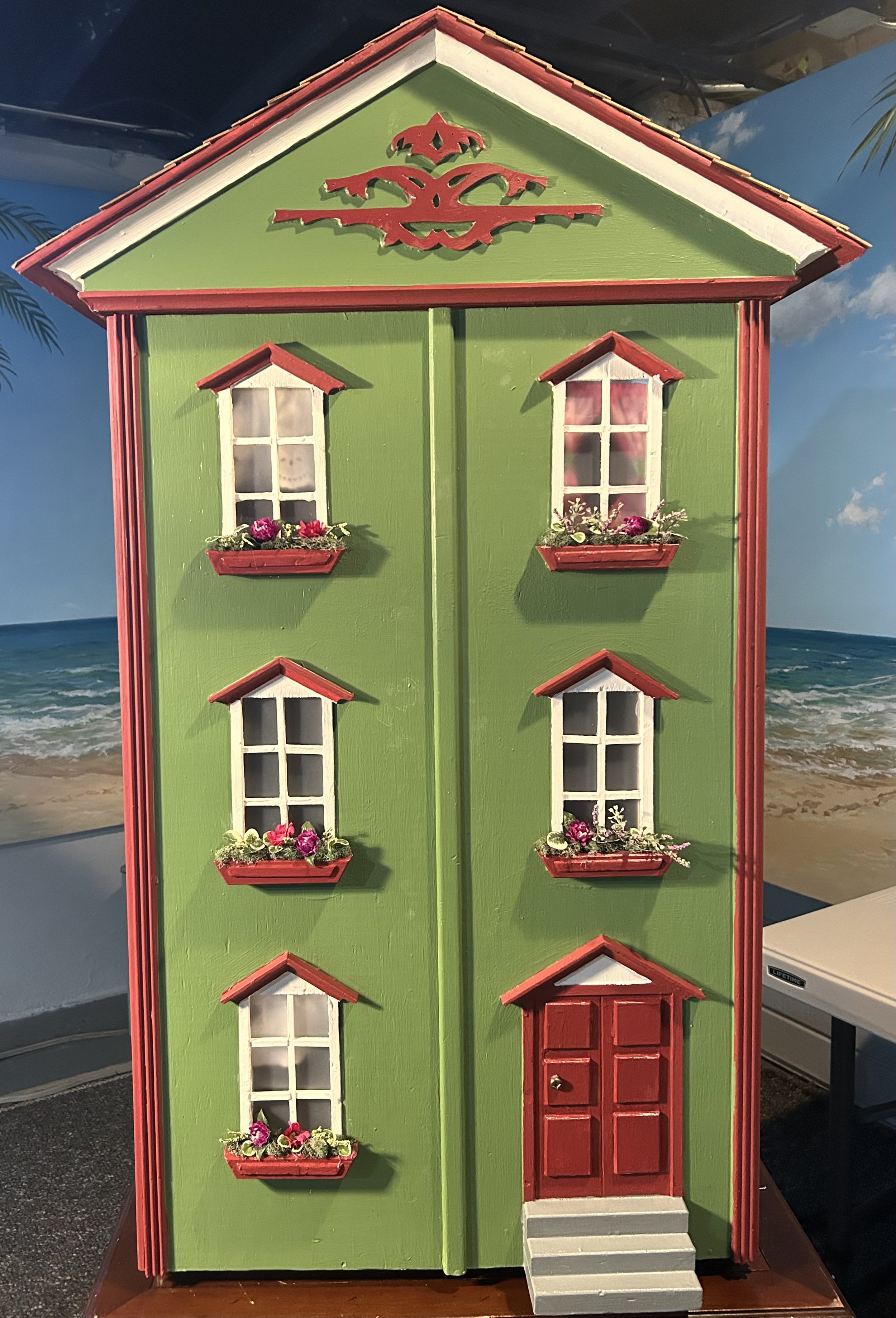
“Over the River and Through the Wood” was originally published in 1844 as a poem written by Lydia Maria Child (originally titled “The New-England Boy’s Song about Thanksgiving Day.”) A few things changed over time: wood became woods, Thanksgiving became Christmas, and the journey now is to Grandmother’s house, rather than the original Grandfather’s house. Child wrote the poem about visiting her grandfather’s house, known as the Paul Curtis House in Massachusetts. This green dollhouse is a gift for my granddaughters, and while their drive to visit me is sans river and woods, it does include awful Chicagoland traffic.
This past weekend was to be the big “reveal” while all my children arrived home for a long overdue reunion. Sadly, the weekend plans went sideways, and while the dollhouse was loved, it remains here for another day. Owning an old house is not without challenges, including 100-year-old water mains. Ours is complicated by the subdividing of the property over the years, so now our water main access is hundreds of feet across a neighbor’s yard in a six-foot-deep meter pit. Oh, and ours services two houses, so when it ruptured, both our house and our rental house became waterless. Of course this occurred on a Friday afternoon…right when all my children were arriving home. The complications of repairing, as well as the Village’s new requirements, have left us a bit numb, and as I write this we still have no water and no resolution from the Village. Hopefully today will bring good news.
Thankfully this miniature “Grandmother’s House” does not include plumbing. The house was one I spotted on Marketplace and was thrilled as it is exactly the same 1940s structure as the dollhouse I made for my daughter 25 years ago (see blog post ericas-heirloom-treasures/thehousethatjackbuilt). The house was sad, needing a major overhaul, and I set to work.


The white paint had to go since I knew the wood underneath was charming vintage pine. I pulled off the contact paper and stripped the paint on two floors. Sadly this mucked up the fireplace a tad and I had to touch it up, as well as create a new “fire” to cover old glue from the prior “fire”. I sanded the heck out of the house, and added pre-painted white baseboards to clean up the not so great edges.
Two of the windows were missing their muntins – a funny word that I thought was “muttins”. Muttin, of course, is the meat of sheep – and being a bit of a Miss Malaprop, I often mix up words based on sounds. The term 'muntin' is also confused with 'mullion' (elements that separate complete window units). Many companies use the term 'grille' when referring to a decorative element of wood placed over a single pane of glass to resemble muntins which actually do separate multiple panes of glass. Some etymology for us word geeks: the word muntin comes from the French word “montant” which is the present participle of “monter” meaning “to rise”. The word was used as far back as the 13th century.
All of which is to say I cut small bits of wood to size, painted and then glued them in place. I added “glass” in the form of a plastic sheet, and hot glued it in place after painting the window framing. The flowers in the flower boxes came from stems picked up thrifting. I used a sweet brass button from my button box as the front door knob, and shingled the roof with mini cedar shakes. The exterior of the house was painted using our house paint so the dollhouse resembles “Grandmother’s House” which should really be “Nana and Pop’s House”.
The vast majority of the house was sourced cheaply. I bought the wallpapers in the pink bedroom and kitchen (chickens duh), though the living room paper was free and the small bedroom “paper” was actually from a thrifted book about clothing artwork that I cut up (as is the mirror in the bathroom). I sourced the vintage wood kitchen set off eBay as I could not stand the cheap stuff available these days. The remainder of the furniture and knick-knacks came from estate sales – including the sweet artist easel for a granddaughter who loves to do “art”.
The house’s artwork was a fun project – the two framed pieces in the living room are actually small photos of both sets of grandparents, with ours showing the date 2025 and the other including the two girls. The pink bedroom art is a reduced sized copy from a feminist calendar I received at Christmas from my daughter, and I had to include the “girl power” imagery for my two granddaughters from their aunt. I made the curtains, bed coverings and pillows and was thrilled to find the little plastic teddy bear in a bin of estate sale dollhouse stuff. The vintage rug in the children’s room was handmade needlepoint work also in that bin. I cleaned and re-backed it so it would survive many years of play. The little metal horse on the mantel, also from the bin, is to remind the girls of their aunt’s “horse” room in our home. And I could not forget to include a small metal sewing machine – also found in my estate sale bin – for my granddaughters to remember me by.
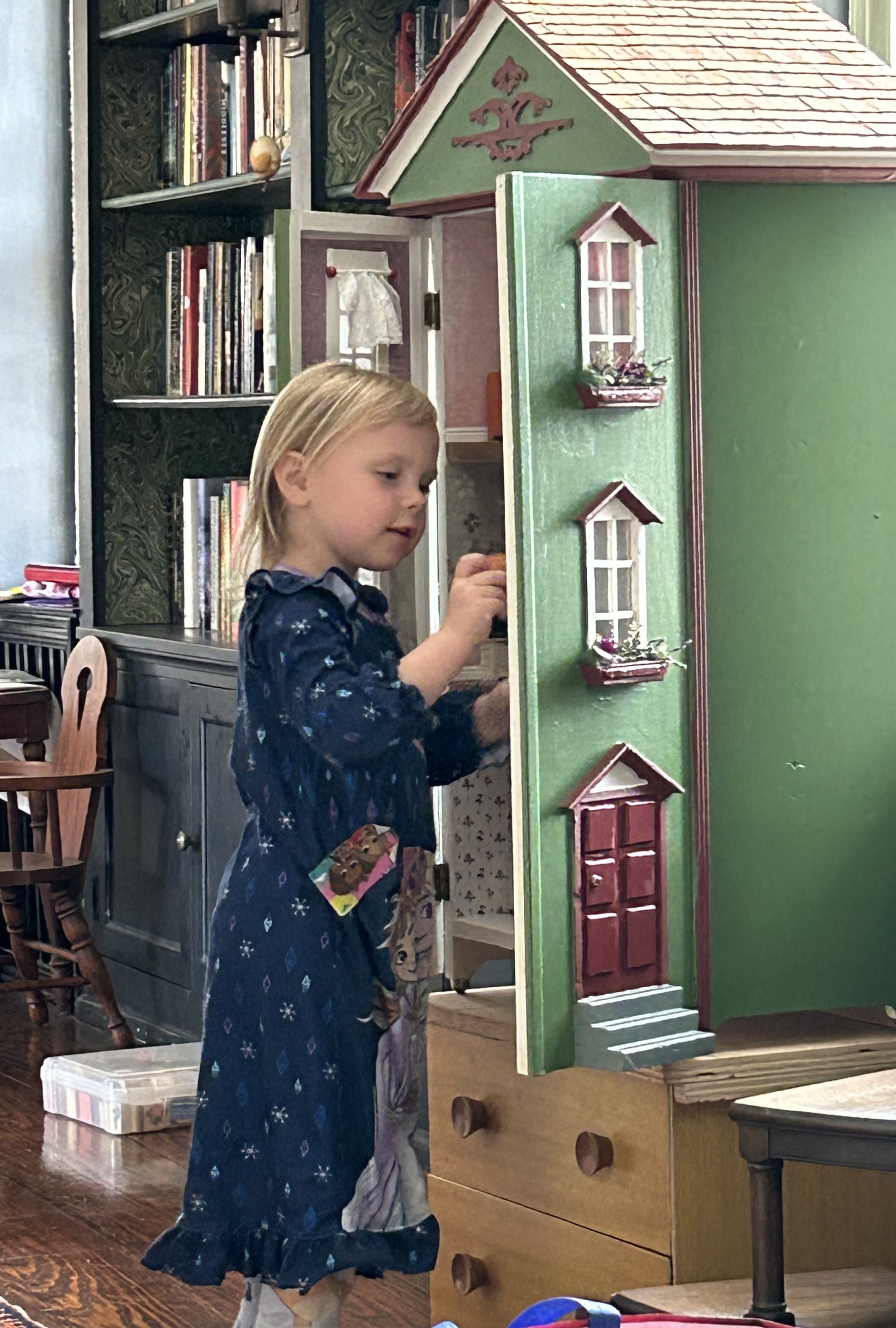
The joy of my granddaughter exploring the treasures will sustain me through the stress of this week. Thankfully I don’t need to excavate a water main line for the dollhouse!


Rainbow Dictionary
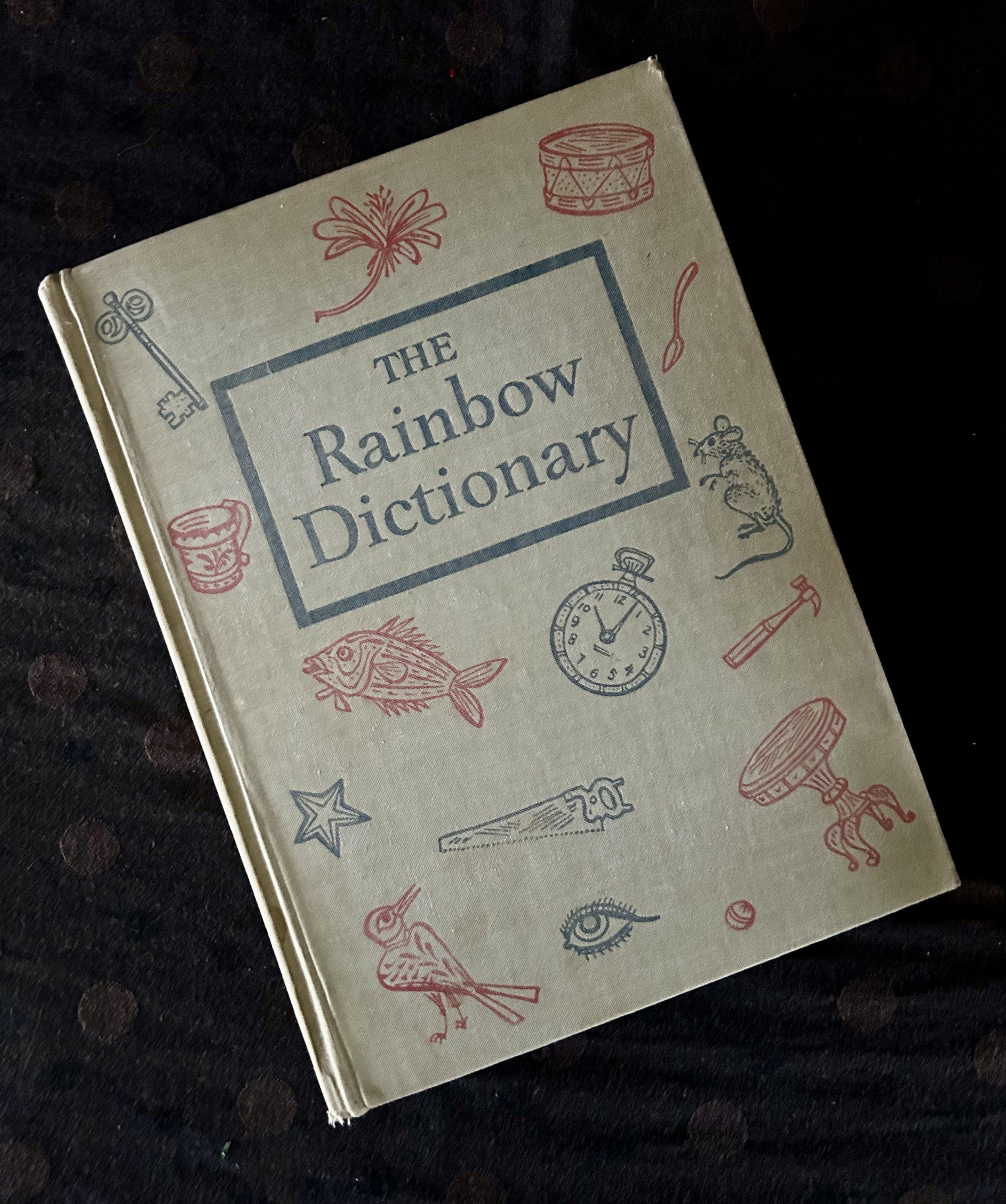
I am a sucker for vintage books, especially children’s, and this one came home with me from a thrift outing recently. The author, Wendell W. Wright, was the Dean of the School of Education at Indiana University, and wrote this book in “MCMXLVII.” As I am not fluent in Roman numeral dates this required an internet search: 1948. A New York friend was visiting when I found the book and was appalled I did not place old books in the freezer. Seriously? It had never crossed my mind, but, after a quick wipe down, this book chilled overnight to appease her. Apparently, according to an article I found
book lice are tiny and generally a dark white or brownish color. They are rather fond of book glue, moisture and mold, which is why you often find them living their best life within the pages of an old book. Silverfish are bigger and easier to spot, and, worse still, bedbugs sometimes find their way into the spines of hardcover books. The problem isn't just that these bugs can chew and damage your books; it's that once they are in your home, they can make their way into other areas such as your furnishings and cause further damage. Freezing books can kill off any living insects and their eggs. (https://www.newsweek.com/woman-explains-immediately-puts-thrifted-books-freezer)
The same article quotes a scientist who is not so sure freezing will kill off unwanted bugs: "In the lab, we tend to preserve microbes at freezing temperatures and, if they are dry, they tend to survive for months, if not years." I hate to point out that “scientists have resurrected viruses dormant for tens of millions of years in Siberian permafrost” so I am not highly optimistic that 1948 critters would be done in by a brief freezer sojourn. (https://pmc.ncbi.nlm.nih.gov)
The book itself is a treasury of vintage images and thoughts. The illustrations, done by Joseph Low, combine “imagination, freshness, vivacity, joyousness…and an effort has been made to draw upon the gay and happy experiences of children.” When I came across the large illustration for “Playground” I laughed out loud. My parental brain started yelling warnings, and I wondered how the heck those of us old enough to recall all these playground games survived childhood.
Even in the 1970s these worrisome playground toys were still in use. Teeter-totter anyone?! I absolutely loved playing on teeter-totters, and getting stuck up high was the best part – 6 feet off the ground, clinging to the handle and jumping about to get your weight to shift the leverage. And that metal jungle gym: yup, we had those too – creating challenges to playmates to scale past to stand on the top…oh maybe 8 feet in the air. Not a worry about the metal causing harm when falling, much less being rather hard on body parts. While my childhood playgrounds did not include a “may pole” (this one allowing the children to cling to a handle and swing in the air - dear lord), ours had a teether ball pole. I was ruthless at tether ball, smashing the ball to smack my opponent in the face was hands down the best part. I wasn’t much for the open sandbox, though my husband built one for our young boys back in the early 1990s in our yard. We did have a cover on it to keep the sand clean, and also keep neighboring cats – and the toxoplasmosis they carry – away.
Oddly, the artwork is lacking parents. There is one woman pushing a baby stroller and a woman riding by on a horse (even in 1948 that seems odd), glancing over her shoulder at all the activity. There are 37 children cavorting about – including 3 in the wading pool. Nary a lifeguard or parent in sight. The other thing I realized is how homogeneous the children are. Do you have Native American ancestry? Asian? Black? Possibly you are handicapped and need accommodations to enjoy playgrounds? No luck here – these children are all Caucasian. While I cannot speak for the diversity of the U.S. population in 1948, I am fairly confident there were Native American children, Black children, Asian children, not one of which are depicted in this scene. According to the 2022 census, 60% of the current population of our country is Caucasian. As such, 14 of these children should reflect a different heritage. And what about the physically disabled children? Children represent 6% of the 42.5 million Americans with disabilities, over 250,000 children. That would be the same as half the population of the city of Atlanta being disabled.
Our country is quite literally a melting pot of cultures and ethnicities – yet there seems to be a political desire to “return” to the glory days depicted in this playground. I for one do not believe that is either possible or beneficial. The joy of growing older is opening your eyes to knowledge, to learning viewpoints beyond your own. If everyone in your life is identical to you, the experiences of your life narrow, not expand. As I stress about our current political dynamic, with this idea of “returning” our country to a mythic past, I find comfort in the deep freeze my book went through. Yes, the idea is to “kill off” all those bugs and restore the book to its former clean glory. But the reality is those darn bugs – and most everything else – will survive a deep freeze, and grow back. My childhood memories are my own, reflecting the lily-white world I lived in. But I recognize the beauty of diversity and appreciate all the contributions other cultures, ideas and ethnicities offer us. When the deep freeze is over, our little bugs will repopulate and offer us some solace.

Ten Dollar Table

I do feel dreadful for BAF. Some time back in the 1970s she completed a charming needlepoint canvas with pink flowers and butterfly design. She knew what she was doing, and the work is done as “petit point” – a canvas with a very tight weave requiring tiny stitching. The entire work is filled in with stitching, the cream as well as the floral design. I do not know if she started with the wood table designed to display the canvas under glass or if she decided to make her piece fit inside it. There is a bit of canvas on the back that is not stitched, so I suspect the latter. The octagon wood trim is narrow and is not glued to the wood backing. When the piece was assembled in 1975, someone used small nails to secure the pieces together, and over time the wood framing popped loose, with one of the octagon joints detaching.
I came across the work at a local estate sale. Due to the “damage” they priced it at $10. Ten Dollars. Needlepoint projects are expensive – mainly because the canvas is typically hand-painted with a design and can be very pricey. For reference, a local store, The Forest Needle in Lake Forest, has a small pillow canvas for sale for $185, and that does not include the yarn or the labor to complete the piece. Here I came across a completed work, well executed and framed on a very practical small table and it set me back $10. Still can’t get over it as you can tell.
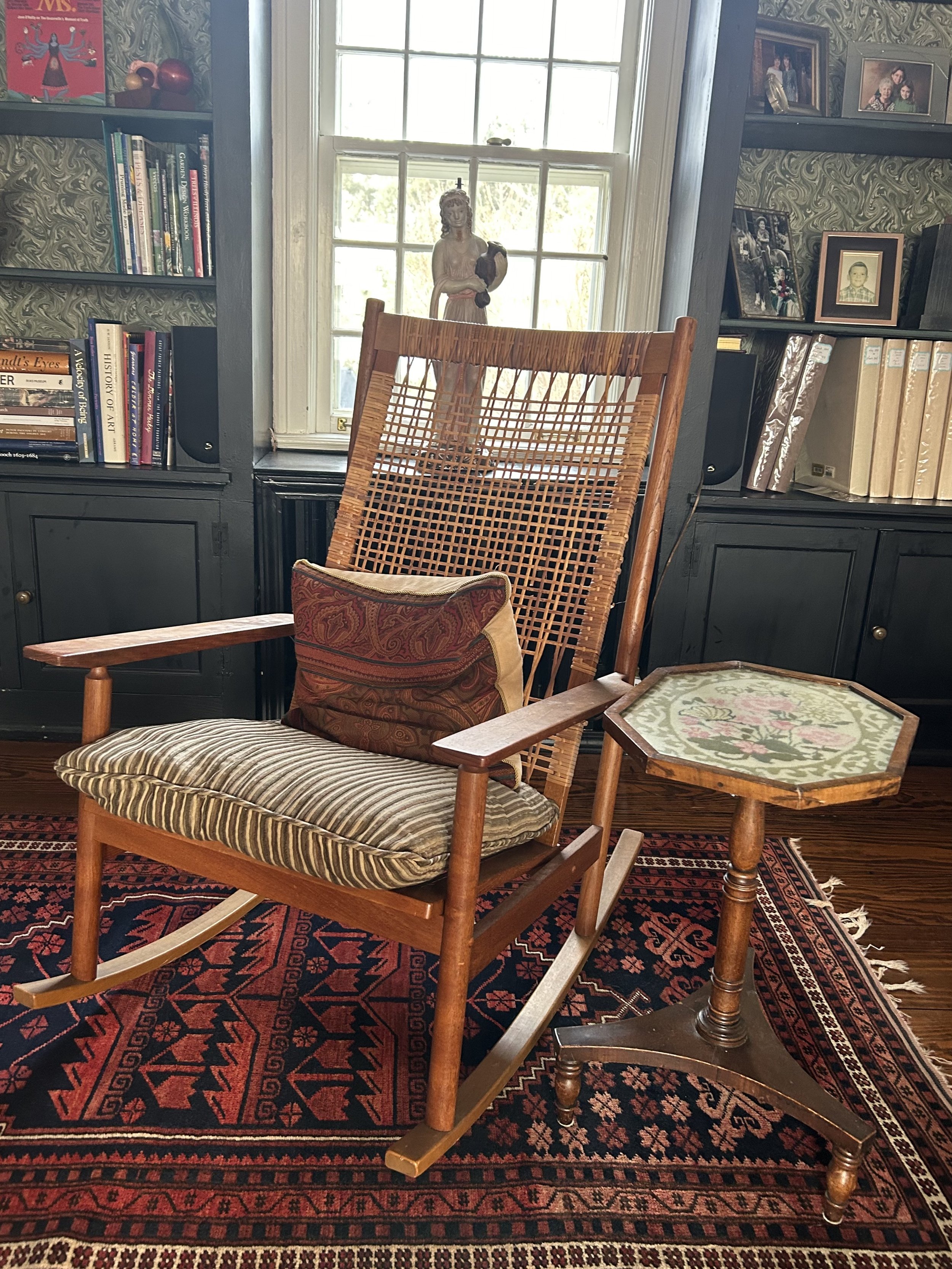
However, I did need to recruit hubby for yet another project. He grumbles when I show up with a piece that requires repair, but he too appreciates the hard work someone put into these charming hand-made works. My initial “repair” of the table was remarkably ineffective – I think it promptly broke apart again - so he took it apart. Ended up using small metal brackets on the underside to adhere the backing to the narrow mahogany edging. Once nice and sturdy, the side table ended up in our sitting room, sitting next to a Midcentury Scandinavian rocking chair I like to use when working on needle projects (knitting, crochet, hand sewing). My mother, Barbara F. Humphrey, had a small rocker all my life where she sat knitting away, and it is remarkably calming to sit in one while reading or working. If you have never sat in a rocker, I suggest you try one. They are not just for grannies, even though I am one. BAF as well as my mother BFH would approve.

Dandelion Dreams

Yes, I know dandelions are “weeds”, but they are also lovely and remarkably resilient. And have a fascinating history. Not the least of which is how often people capture them in art. This photograph is one I took this past summer in the field by our home. The seed head was huge, about the size of a softball. And I loved the details of the unopened flowerhead and splashes of pink clover. Thankfully I captured the plant when I did as the utility company mowed the field down the next day. There are few plants that are as tenacious – or resilient – as the dandelion; they thrive in most any climate, will seed in rough terrain or disturbed areas, and offer a charming symbol in the process.
Dandelions originated in Eurasia, popping up on disturbed habitats after the last Ice Age. The name came from their French name: ‘don de leon’ (tooth of the lion) referring to the plant’s jagged leaves. They traveled to Europe from Asia, being used for medicinal reasons, treating liver and digestive issues predominately. The plant is also entirely edible. Interestingly, dandelions then traveled on the Mayflower, landing in North America along with the pilgrims. So the dandelion is an immigrant to our country, and its comfortable adaption to its new region is the predominate reason American gardeners use herbicides on lawns.
Children are endlessly attracted to dandelions, and the plant is a symbol of hope, healing and resilience. I suspect I am not the only one who spent childhood – and my children’s childhood – blowing on dandelion seeds to make a wish. Of course, that does a lovely job of spreading those pernicious seeds, resulting in yet more plants. But symbolism-wise, the idea is to spread hope and positivity. There was also the childhood game of holding a sunny yellow dandelion flower under your chin, similar to the buttercup. In my childhood, this would divine if you liked butter – and not a clue how or why this mattered, but the process was fun, especially as we didn’t have buttercups handy. In the 18th century, the stronger the yellow glow on the chin, the kinder and sweeter the child. The yellow flower as the sun, reflecting joy and happiness on a child is a sweet image, slightly more logical than concerns about butter consumption. Though in my case, I suspect I had a rather strong buttery yellow glow as a child.
My children happily collected bouquets of the flowers – not hard to do on our property with the open utility company fields east of us. I did discover an old superstition about those bouquets, however. It said that bringing dandelions into the house can cause you to wet your bed! The leaves are known to be a diuretic, thus their use for medicinal purposes for centuries. But, given that dandelions have more vitamin A than spinach, more vitamin C than tomatoes and have a great deal of iron, calcium and potassium, maybe harvesting those plants would be better than herbicides? As my gardening leaves a lot to be desired, I am thinking Spring salads of dandelion greens may be in the offing.

Quirky Girl

I have friends who often say they hate shopping – they couldn’t imagine spending time hunting through a thrift store. I get it – it can take time and can be fruitless. That said, there are many reasons I appreciate the process. Take, for example, my outing yesterday. I have been constructing a doll house for my granddaughters over the last few months, and needed, as one does, finials for 3 curtain rod. I stopped at a craft store to look at beads and there were a number of strikes against those I found: they were dang ugly; they were sold in bags of 100; and the cheapest bag was $6. In addition, they all were made in China and I have an allergy to disposable, cheaply made things from China. It dawned on me I should just go to the thrift store so off I went.
Not all thrift stores carry jewelry, though my local one has a ridiculous amount of it. Over the years I have found remarkable pieces, some used as gifts, some to be resold and a few I’ve kept. One I could not part with: a stunning Georg Jensen “Fusion” necklace designed by Nina Koppel and handmade in Denmark in 18k white gold with 0.5 carats black diamonds. In fact, my granddaughter has commented on liking the necklace…and she is three!
Shopping at the thrift store meant I was able to pick from numerous options for my finials, I only spent $1.50, an item was repurposed instead of just thrown away, and a charity benefited from my purchase. Those all seem like wins to me – and the beaded bracelet let me decorate 3 dollhouse curtains with charming finials . (I can hear you grumbling, wanting a photo of said dollhouse, but you will have to wait with bated breath for another blog post.) Not one to waste a thrift store outing, I did a quick walk through as I never know what I might find.
This quirky woman called out to me from the crowded shelves, making me smile. I sensed she was unique, but did a quick image search with my phone to make sure she wasn’t massed produced junk - the things filling the shelves at HomeGoods etc. Sure, I could buy her even if she was, but personally I don’t see the point as noted above: allergy to China junk. Turns out my instinct was correct – she is by Judie Bomberger, a California artist active back in the 1990s. Interestingly, when I did the search I realized I have a number of Christmas ornaments by the same artist, some gifted to hubby and me years ago and some picked up thrifting. The ornaments are all circus themed and thus fit our Calder family room vibe. This piece, however, required a bit more research.
It was remarkably difficult to discover much about Judie Bomberger on the internet. All the art sites and Wikipedia pages said the same terse, useless sentences: “Judie Bomberger is an American Postwar & Contemporary artist who was born in the 20th Century. Judie Bomberger’s work has been offered at auction multiple times, with realized prices ranging from 15 USD to 140 USD, depending on the size and medium of the artwork” (AI at its finest no doubt). It took some digging to track down more information (https://thegiggleguide.com/brand/judie-bomberger-inc), though even that is limited.
Judie Bomberger started making sculptures in the 1990s, collecting metal from scrap yards in California, using a blow torch to form designs, and painting them. Her works all have names, and the “resonating theme is strong, joyful, whimsical and just for the fun of it.” She was licensed to create a “collectible” series reflecting the Beatles’ Yellow Submarine movie, and also “worked for nine years in collaboration with Cirque Du Soleil creating steel sculptures and ornaments depicting their performers”. I suspect she is still alive, living in California, but could not find out much more about her.
My found treasure depicts “Babette” and was created in 1996. While the base steel shape was laser cut, creating multiples of each shape, Judie hand painted each piece. There are other Babettes – some facing the other way, and some painted in different colors. I would love to know if Babette was an actual performer with the Circus back in the 1990s, but I could not figure that out. Typically Judie signs her work on the back, though this my Babette is unsigned. Her art has such whimsy and joy, and Babette speaks to me of Springtime, was well as the joy of found treasures. When my husband saw her, he said she definitely “was me” with her fly away hair and wild pink outfit, adding I couldn’t sell her as she is quirky – just like me.
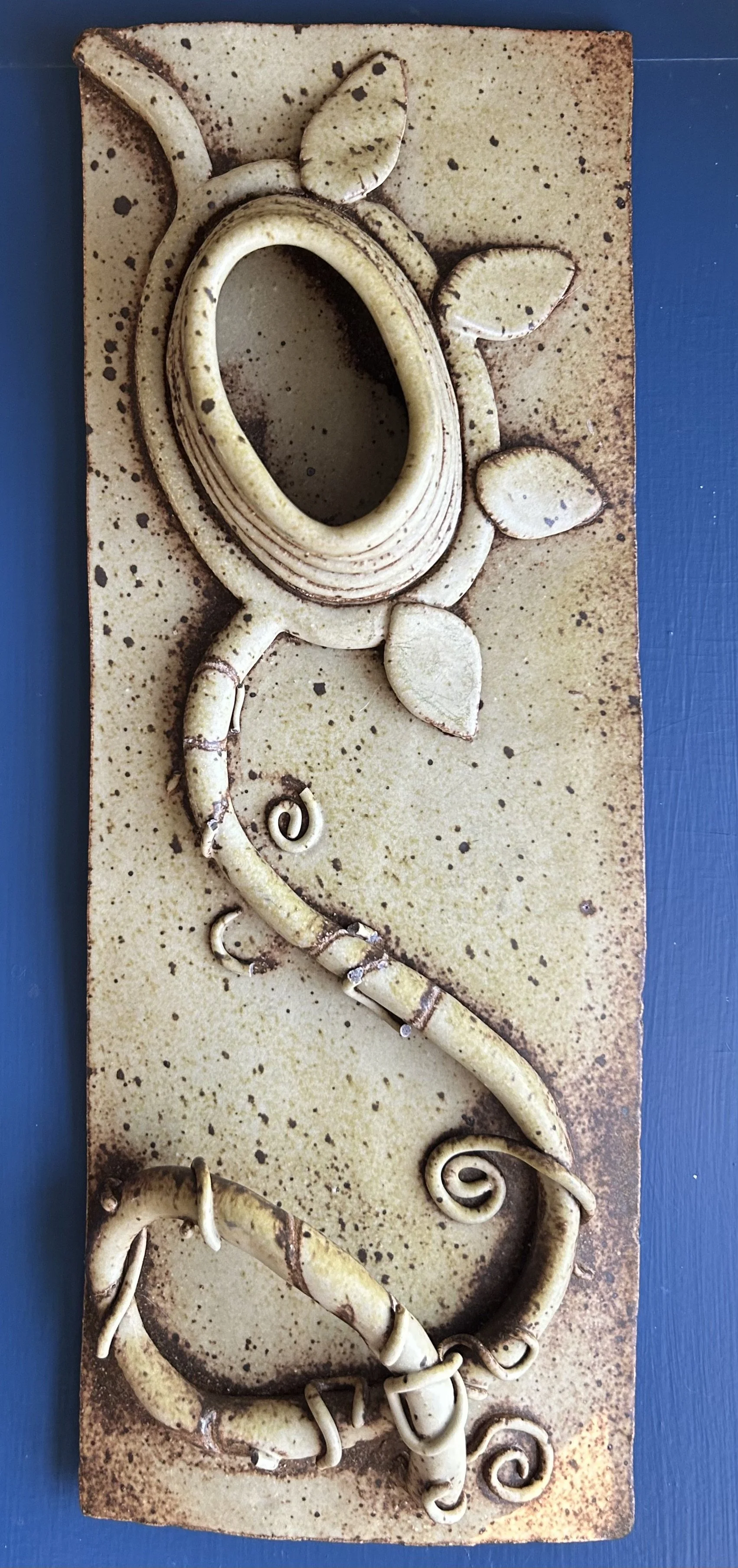
Tangled Roots

Some pieces of art bring with them complicated feelings. Why they inspire such is beyond me, but I sense a bit of kismet from art at times. This pottery work is a good example: it arrived in my life at a time of introspection. The piece is remarkably heavy, over 3 pounds, and measures 17” x 6”. I pulled it out of a bin of clothing during a thrifting outing the other week. My friend thought it dang ugly and could not imagine buying it. I was intrigued all the same, and purchased it by weight for $4.86.
I was not sure what the work depicted when I picked it up. After scrubbing it clean, I realized it was a flower, built up with pottery on a plaque-style base. I suspect it is made with stoneware clay due to its weight. Potters use 3 main types of clay: earthenware, porcelain, and stoneware. Earthenware is often terra cotta in style. Porcelain is used for dishware and fine pieces. “Stoneware is a dense, strong, and impermeable clay that is normally only partially vitrified (fired to the point that it is not porous)…Stoneware is fired at temperatures ranging from 2,000° to 2,400° F. These high temperatures partially or completely vitrify the clay. Unlike porcelain, which is almost always white, stoneware is usually colored gray or brownish because of impurities in the clay.” (https://seattlepotterysupply.com/pages/the-types-of-pottery-clay)
My mystery potter did not sign or date the work, and I am guessing by its vibe it’s late 1970s. The sunflower design is made from a “rope” of clay, with added leaves. Overlaying the stem is a swirling vine which has broken in a number of places. Not surprising given it ended up in a bin of thrift store merchandise. The fact it survived without further damage is a testament to the density of the clay. The missing vines don’t bother me terribly, and when I showed it to Hubby he thought it remarkable (clearly I have trained him well!).
This work makes me think of the resilience of human beings and the tangled lives we build for ourselves. The internal monologues we listen to, often a product of childhood dynamics, which impact us long after those early days. Those monologues are like train tracks, laid down with shoddy materials, and yet we expect the train of our life to run smoothly on that bumpy foundation. It is no wonder people – not just me – struggle, as it is so easy to jump aboard that train. While we can see the flowers growing along the railway, we can’t stop the train to explore them, so entrenched are we in our commitment to that darn track. How that track manifests in our lives becomes the challenge – not just because addictions can take over, but because those monologues send us on painful journeys, impacting ourselves and those we love. For me, it is time to realize the clay underneath those tracks is strong, and I can skip the darn trip down the shoddy rails. Things may have chipped off, vines may have swirled around unnecessarily, but the basic foundation is made of stoneware. And dang it, I want to explore the flowers.
The analogy to this artwork is apt – it survived unknown travails along its journey. And yet none of those matter - what matters is the flower is still there, intact in its 3-dimensional glory. The vine, chipped and disconnected, still shows growth and movement. The why, where, when don’t make a damn bit of difference. Either you accept today and turn to the sun. Or you wallow in the deep history and forget that blooming takes work.

Tree of Life
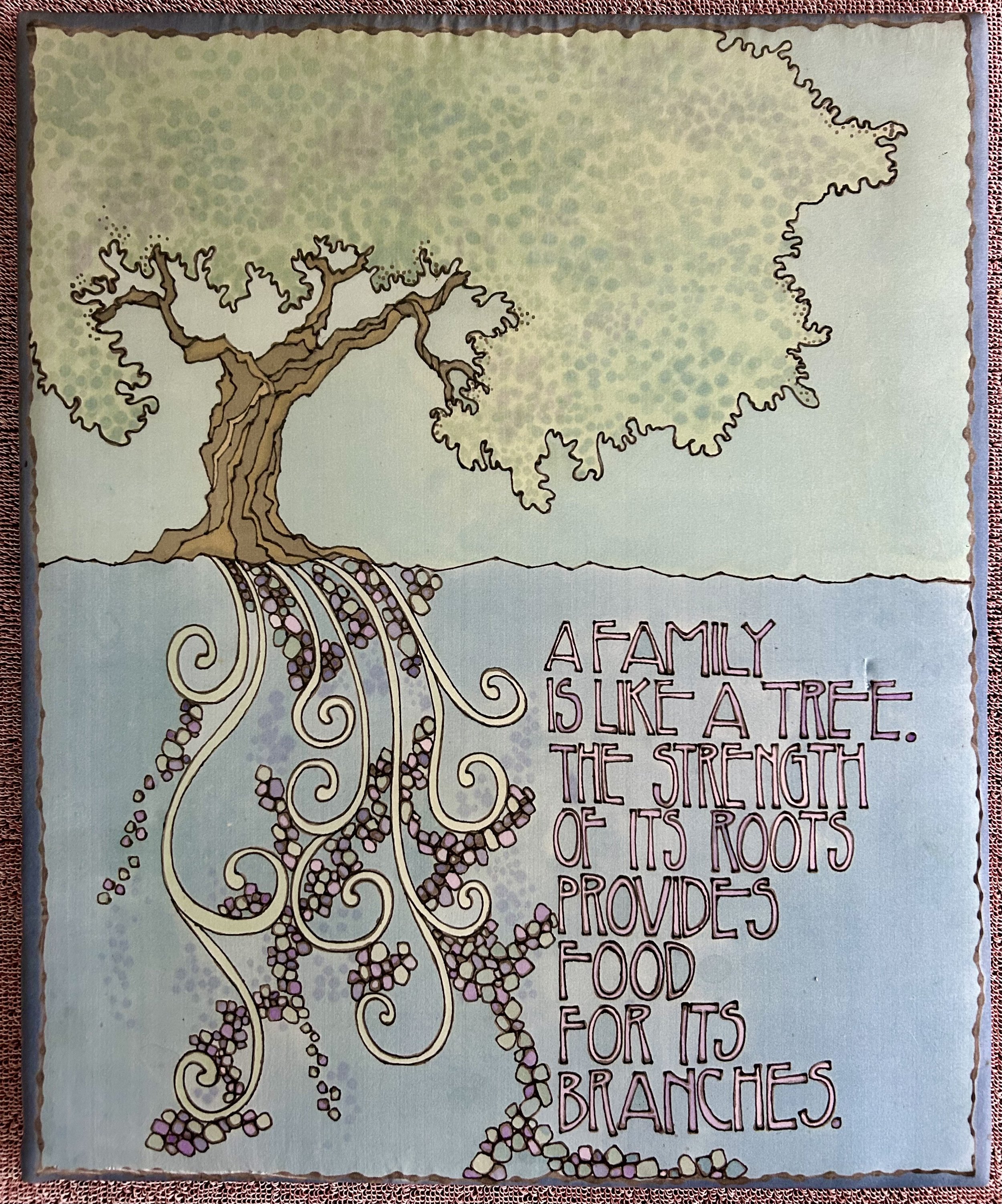
Ferreting through the Bins recently, I came across this piece. It is large, 19” x 23”, made of padded silk and mounted to a wood frame. The piece is not signed nor dated, and, given its weight, cost less than $3. Miraculously the silk was not torn, stained, or damaged. If you have been to a Bins thrift store, you understand how remarkable that is. If you have no clue what I’m talking about, here’s a photo I took recently of my two friends getting into the spirit of the place:

Thankfully, I found a card tucked into the wood framing which informed me the artist was Mary Jo Scandin, and her art medium was batik fabrics. Batik is an unusual art form, using wax and dye instead of paints to create works. She describes her process on the card:
“Each batik begins with a pencil drawing directly on a piece of white natural fabric. The area to remain white is then painted with a melted beeswax and paraffin mixture. The wax acts as a resist to the dyes which are to follow. The first dye bath is a light color and after it has dried, new areas will be painted with wax. The fabric is then dyed again, and the process repeated several times until the number of colors desired is obtained. Each piece is individually designed so no two pieces are ever alike.”
While I could not find much information about Mary Jo online, I learned she and her husband Jim ran an art studio and gallery in Sister Bay, WI, from 1983 until 2002. Blue Dolphin Gallery, also in Door County, now carries some of her work, and confirmed she is still alive. While the individual at the gallery was rather terse, their website has a quote from Mary Jo:
“Through my work I attempt to integrate my various identities of woman, mother, friend and artist with my associations to those women in our history who also spent time sewing, quilting, knitting and handling fibers…I am inspired in my work by the spirits of those who came before me, those whom I know presently and all others still to come. It is my desire to express my concern for truth, justice and peace and to challenge some of the stereotypes concerning the human condition and its relationship to the universe. My final hope is to express hope.” (https://www.bluedolphinhouse.com)
I have a sense of kinship with Mary Jo Scandin, as I too love the imagery of trees, and respect women’s needlework as an art form. I learned my sewing skills the old-fashioned way, from my mother, as well as quilting teachers and friends, and one of my early quilt projects paid homage to this. I “remembered” this quilt having a tree of life block in the center, but after looking at it, realized the tree imagery is in an outer border. The center block is actually a “feathered star”, composed of 164 pieces. The quilt was created through a workshop I took 30 years ago from Muriel Douglas, a remarkable quilt artist. The year-long class focused on the medallion-style quilts Muriel favored, and was held once a month at a quilt shop in Woodstock, IL. There were no patterns, we simply started with a block of our choosing, and built on it outward, border by border. The darn thing got huge, measuring 94” square. The 24 trees, in the second to last border, were pieced using a lovely Liberty fabric. As I only had so much of the green fabric, and couldn’t make more trees, I offset them with basket blocks using another red Liberty print. When I began the final swag border using that same red Liberty print, I realized I did not have enough fabric to complete the design. I contacted the archive at Liberty of London (didn’t actually know there WAS an archivist at Liberty until I started that process), and they sent me all they had of the fabric so I could complete my work. Heaven forbid some future Liberty of London archivist goes looking for that red fabric – it is now all embedded in my quilt!
I love the huge old trees on our property, and feel I am a caretaker to these living beings. I often transplant saplings - oaks, basswood, maples, redbuds, junipers - that pop up on our property, sometimes sharing them with friends. I plant them where they can thrive, with sun and protection from critters (who I have learned enjoy munching on many types of little trees). I schlep hoses to water the trees in hot weather, and spend much time pruning and shaping them to foster healthy growth. Sometimes I have to take down trees, especially those that grow too close to the house or get damaged in a storm. Sadly, many trees get attacked by bugs or fungi and that is yet another care taking project – providing chemicals to help them withstand the infestation. Watching an old tree succumb, no longer sprouting growth each Spring, is actually remarkably sad when you’ve lived with their beauty for so many years. It is not hard to recognize caring for trees is much like raising a child, with the hope you can provide enough care while they are young and growing strong roots, so they can stand on their own and thrive.
For me, the tree image represents our human connection, the ancestry that came before us, the branching of our “family tree”. I too have concern for truth, justice and peace in our lives. I see trees dying from a damaged environment, and worry the roots of our trees may not be strong enough to offer hope to future generations. But pessimism doesn’t do me any good, and I look to art, family and nature for comfort. Mary Jo Scandin was a serendipitous discovery, offering beauty and inspiration and reminding me that trees – like humans – have strong roots.

Nicks and Dings
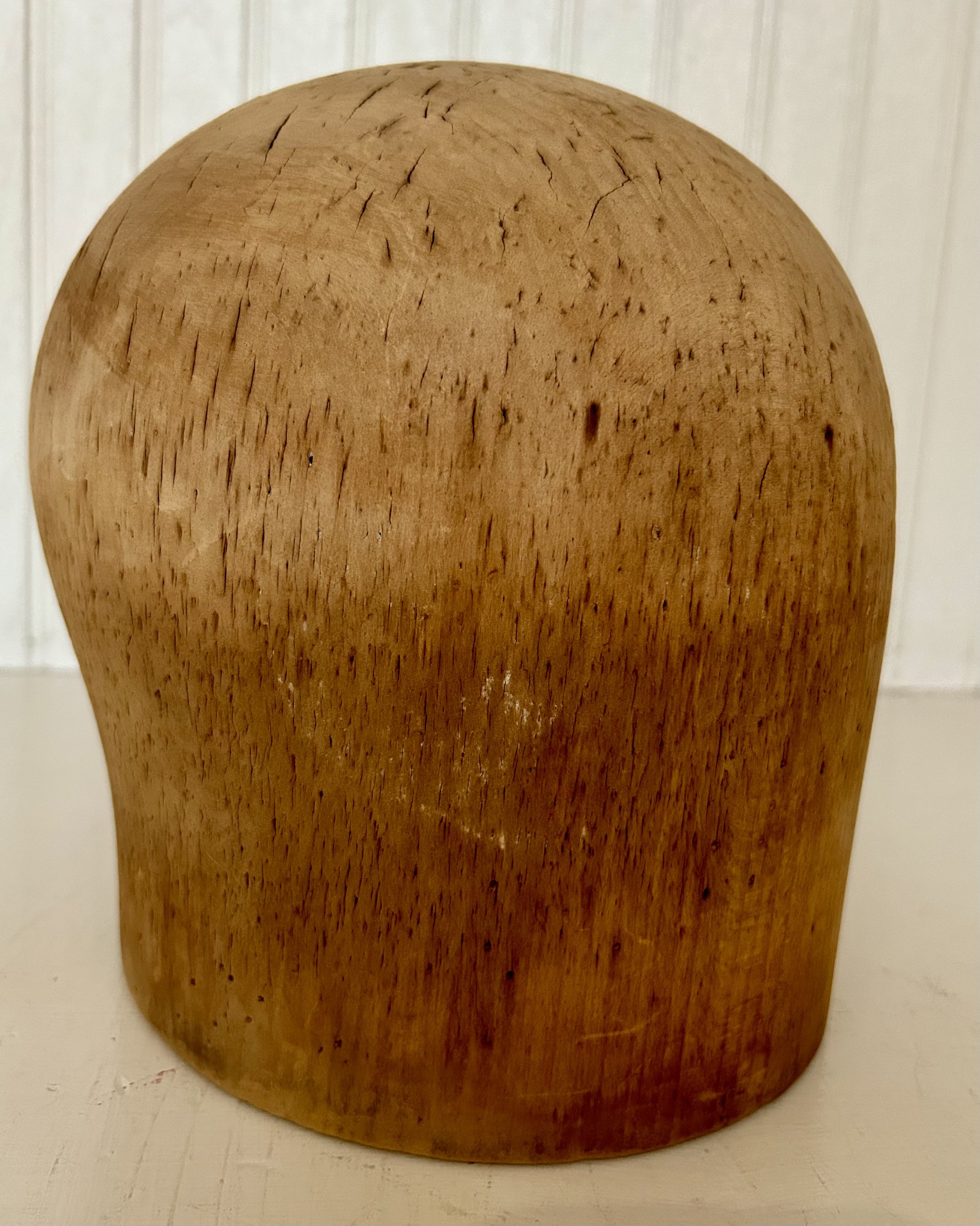
My mother, Barbara Fallon Humphrey (1928-2021) treasured this hat form and it was in her sewing room throughout my childhood. Now it sits in my sewing room, often displaying a charming hat. It originally belonged to my grandmother, Friederica Hermes Fallon (1898-1961),“Nanny” to my 5 older siblings, but called Frieda by everyone else. I was named for her as she died of ovarian cancer at the age of 63 before I was born. Frieda did not have an easy life. She had little formal education, married at the “old maid” age of 29 and was left a single mother of two daughters by age 37. Mom always spoke of her mother’s ridiculously fancy taste, often using the adage “champagne taste with a beer pocketbook”. Our joke was that this was clearly an inherited trait as Mom, too, enjoyed beautiful things, and “the apple doesn’t fall far from the tree” applies here to me as well. I have very few things from Nanny, and the hat form reminds me that while Nanny’s life was difficult, she used her talents to add beauty in the world, and supported her girls while doing so.
Hat forms were used to mold material into a specific style hat, and workshops would have many different sizes and shapes of hat forms, some quite elaborate. My grandmother’s form is a fairly plain one, carved from a single piece of wood. The traditional material used for hats was felted animal fur, a process developed in the 17th century. Hatters used mercuric nitrate to separate animal fur from skin, creating a felted fabric. This process was called “carroting” because mercury, often derived from cinnabar, turned orange when liquid. By the 1800s it was known this resulted in “mad hatter disease” - essentially mercury poisoning, medically called “erethism”. Mercury use for hat production was banned in Europe by 1900, but hat production in United States involved mercury up until 1941. It was stopped “mainly due to the wartime need for the heavy metal in the manufacture of detonators”. (https://en.wikipedia.org/wiki/Erethism). The main risk for hatters was the absorption of the vapor, as mercury’s relative chemical inertness makes it unlikely to be absorbed through contact. Which is certainly a good thing for owners of old hats, and possibly old hat forms pre-dating 1941. As my grandmother only had the one hat form, I suspect she was a “milliner” not a “hatter”. Hatters made the actual hats but a milliner did more decorating of hats – adding lace, feathers and other embellishments to an existing hat. The nicks and dings in my grandmother’s hat form would have come from her using pins to hold things in place as glue dried or needles from sewing bits and pieces together. I do wonder, however, if her early death from cancer may have been attributed to working with hats during the 1930s, with the corresponding mercury exposure.
I also have a set of 8 needlepoint chair seat covers done by my mother and grandmother in the 1950s – thankfully mercury free. A brother, who inherited the dining room set, removed the covers recently, “modernizing” the chairs with new upholstery. He planned to throw out the set and I paid $14.55 to have him ship them to me. Having been in use for over 60 years, they desperately need to be washed. This requires a blocking form – another project for hubby! (see prior blog post: catawampus-framing). While I could ask my husband to create something for me to use, the basic issue is I don’t have a use for 8 seat covers at present. Hopefully they will be put to use someday as they are a testament to my mother’s and grandmother’s needlework skill, done on a very fine canvas with tiny stitching. Accomplishing one of these would likely cause me to lose my eyesight – finishing eight boggles the mind.

I also have a rose applique quilt made by Nanny, which was from a 1950s era “kit”. Nanny started 3 of them – one for each of my 3 elder sisters, but only finished one before her death. My mother stored the tops in her bedroom closet during my childhood. I recall this specifically because our Siamese cat could often be found curled up on the pile on the closet shelf! Eventually Mom cleaned off the accumulated dirt and cat hair and finished the applique work, sending them out to be “professionally” quilted in the 1970s.
When hubby and I were newly married in the late 1980s, we would go antiquing in Chicago - shops filled with treasures snagged in the rural areas of Illinois, Wisconsin and Indiana. At one store we found a lovely iron bedframe designed with circles of roses. The frame became our guest bed, displaying my grandmother’s quilt for years. Sadly, guests outgrew double beds in the prior century, so the iron bed was set up in our daughter’s room for a spell, though getting that old wood box spring up our staircase involved some serious engineering. Adult daughters with significant others do not like double beds any more than prior-century guests. So out to the barn it went, with the darn box spring being chopped up and thrown out. In case anyone is worried, Mom gave the remaining two quilts to a different brother for his two daughters. Unclear what happened to them, but I hope they were saved.

While there is no paperwork from Frieda, and very few photographs, I do have my Mom’s birth certificate from Chicago. The document says her father, Martin Fallon, was from England, and was 34 when Mom was born. He had been in Chicago since 1921 and he and Frieda married in 1927, though I do not know how or where the couple met. In truth, Martin was from Boston, and was wanted for some insurance fraud he skip town to avoid. He left behind a wife and 3 children (including another daughter named Barbara), who all moved in with his mother, my great grandmother Julia Fallon, when he disappeared. Julia Fallon hired an investigator to find her missing son. As he had served in WWI, driving ambulances in France, his name was entered in a federal data base for veterans registering for benefits. My mother suspected her father’s actual name may have been George Fallon, though upon arriving in Chicago in 1921, he went by Martin Fallon, which was his father’s name (my great grandfather).
Eventually the 1930’s depression hit, and money became an issue. When Frieda insisted her husband sign up for benefits from the veteran organization, she had no way of knowing those benefits would not benefit her in the slightest. Once he did, the investigator in Boston was notified. Soon some communication was sent, though I do not know how this transpired. At this point Frieda learned her husband had another family in Boston. She begged him to divorce the wife, allowing him to stay if he did so. He said he could not as she was Catholic, which is a bit ironic as my grandmother – his “second” wife – was as well. He left soon thereafter, and my grandmother moved with her two young daughters to live with her eldest sister Frances (1888-1952) and her family. Besides the financial impact, and social stigma, Frieda was distressed her daughters were “illegitimate”. While the label is not as devastating, nor really used much in our day, in her era it was significant. Frieda’s brother, Joseph Hermes, a Chicago judge, arranged for his two nieces to be legally “legitimate”. No clue what that would have entailed, but it was important to my grandmother and my mother.
To support herself and her daughters, Frieda got a job teaching sewing at a high school, and had a side business decorating hats for clients. I suspect Frieda learned to sew from her mother, Katherine Becker Hermes (1834-1931), a woman who arrived in this country from Germany with a sewing machine (see prior blog post: hemming-my-history). It seems a creative sewing talent runs through this line of women. Frieda was very talented, making all the family’s clothing and using her skills to earn money. Mom was also a remarkable seamstress, but her creative art form was knitting. I turned my focus to quilting, and it suits my brain which loves to “organize” and fit things together. My grandmother’s hat form, sitting by my side while I work in my sewing room, reminds me that life can be a struggle, full of nicks and dings, but creating beauty helps brighten any difficulty. And a little financial input never hurts.

Spirit of Ecstasy
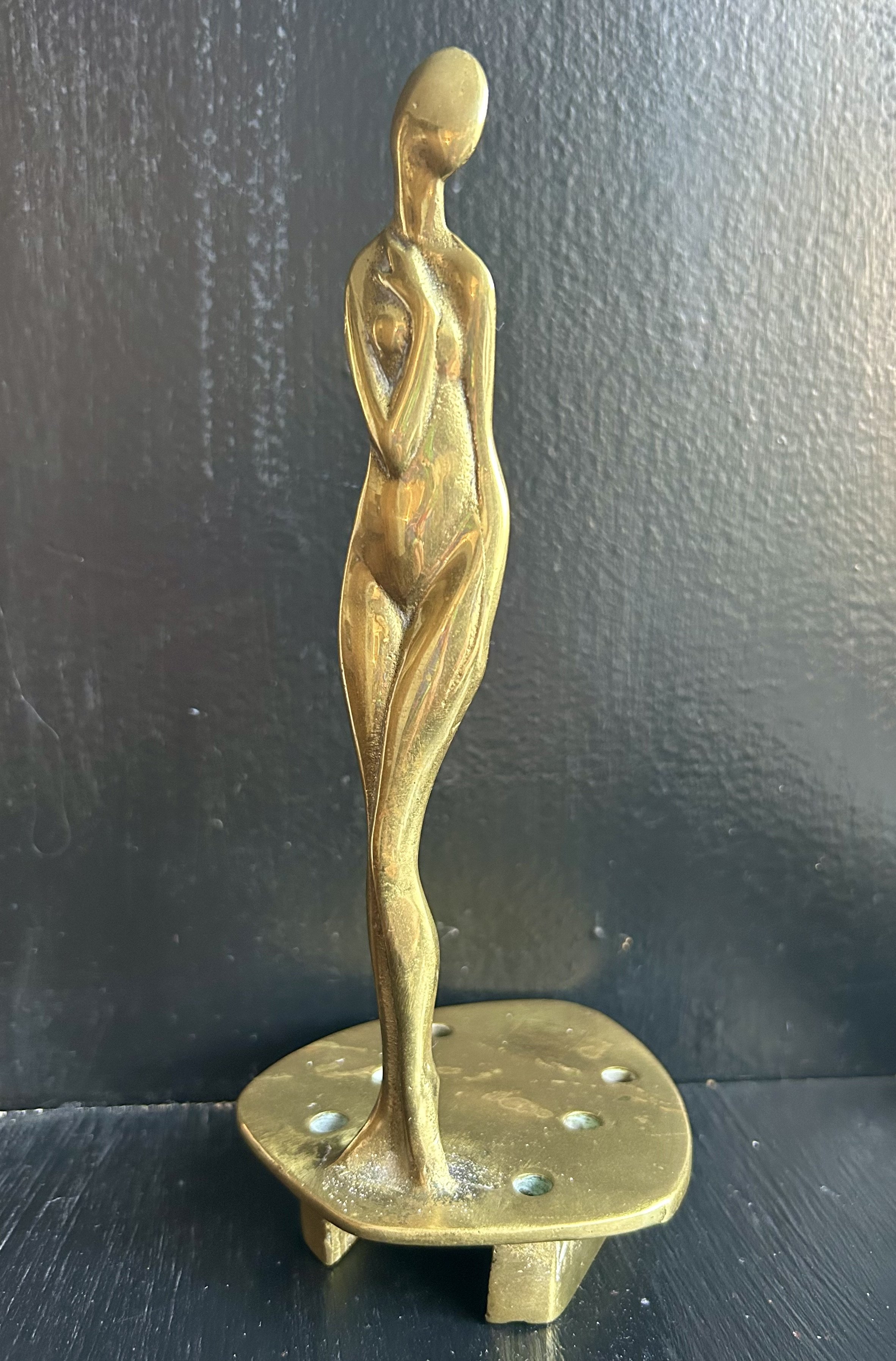
I picked up this willowy woman at an estate sale and was told she was an automobile hood ornament. She is cast brass, with no date or signature. I have done a whole lot of research – heading down some cool rabbit holes - but her purpose remains unclear. The unknown artist referenced Botticelli’s Birth of Venus -same elongated shape, similar arm placement, similar canted body stance - but her Art Deco vibe dates her to the 1920s. I am skeptical that she was for an automobile mainly due to the base. It is unclear how the odd shaped platform would have been attached to anything; the holes do not have threading and the bottom is puzzling. At some point I decided she was a radiator mascot leading me to the Spirit of Ecstasy. But now I am not so sure.
In our family papers are two photo albums created by my grandmother Kat as a teen (Katharine Strong Humphrey Osborne 1905-1987). She took snaps documenting trips and visits with friends and family, and thankfully penciled in identifying information. This one, from 1922, shows an automobile owned by “Dot and Katie”. It is unclear who Dot and Katie were, but they arrived in their car, and a group outing ensued complete with picnic and flat tire (a scene caught by Kat’s camera). Their auto was a Model T Ford Coupe, and I suspect an expert could identify the specific year, falling between 1919 and 1922 (https://modeltfordfix.com/the-1919-1922-model-t-ford/). Automobiles in the early days were vastly different vehicles from what we call “cars”. Cranks had to be turned. Various gages had to be monitored, and spare tires were frequently put to use. They had external radiators, covered with a radiator cap at the front of the hood, allowing water to be added as needed. Notice the door on the side – it’s in the middle! Dot or Katie had to climb to get into the driver’s seat. It wasn’t until 1926 that Ford had a functional driver door.


There is some speculation that my Art Deco brass woman was a car’s radiator mascot, and I loved the idea. Her tall curvy form would certainly make an impression as she is enveloped in steam escaping through the holes. Sadly, I could find nothing like her, and none of the antique radiator “mascots” had a similar base. Almost all had round bases, such that they would be twisted onto the radiator filler cap. As much as I would love her to be one, I don’t think she is. That said, “radiator mascots” are fascinating.
According to the Studebaker Museum: “radiator mascots turned the basic radiator filler cap into a renowned work of art. Mascot designs varied widely, including mythological figures, brand iconography, animals, human figures…As radiator filler caps retreated under the hood during the 1930s, the radiator mascot evolved into the hood ornament.” In 1911 Rolls-Royce vehicles started using the “Spirit of Ecstasy” on the radiator and then eventually as a hood decoration. (https://studebakermuseum.org/exhibition/radiator-mascots-art-style-story-2/)
According to Rolls-Royce, the Spirit of Ecstasy was modeled on Eleanor Thornton (1880-1915), a vibrant woman who was part of an early automobile club in England, working at an automobile magazine. By age 22, she was secretary to Baron John Montagu, a wealthy supporter of the automobile industry in England. The original statue was commissioned by Baron Montagu to be placed over the radiator of his 1909 Rolls-Royce Silver Ghost. That statue had a finger on her lips, a reference to the secret love affair between Eleanor Thornton and Baron Montagu. Beginning in 1911 the company commissioned the same artist, Charles Robinson Sykes, for a variation of the original Spirit of Ecstasy to use on all its automobiles. Spirit of Ecstasy, also called Eleanor, reflects her dreams, energy, grace and beauty. (https://www.rolls-roycemotorcars.com/spirit-of-ecstasy).

Eleanor was accompanying Lord Montagu to India in 1915 on the S.S. Persia when a German U-boat torpedoed it in the Mediterranean, killing her and 342 others. Baron Montagu and 175 others survived. The boat sank in 10 minutes, and only four lifeboats had time to launch. (https://www.pandosnco.co.uk/persia.htm)
I remain puzzled by my brass lady, but appreciate that sometimes there are not answers to questions. Hard to believe in this internet-handy day that something can remain a mystery, but I will have to leave this one unsolved. The circuitous journey I took in researching her led me to Eleanor Thornton and the Spirit of Ecstasy. Eleanor was a woman who defied the conventions of her day, who made her way in the world and has been immortalized for over a century. The artist described the statue as "a graceful little goddess…who has selected road travel as her supreme delight… she is expressing her keen enjoyment…her sight fixed upon the distance." (https://en.wikipedia.org/wiki/Spirit_of_Ecstasy). Eleanor did not live long, and her only (illegitimate) child was given up for adoption. And yet, here she is inspiring me and offering up her story all because of a radiator cap. Or not, as the case may be.

Present On The Counter

This dainty Art Deco statue came home with me from a sale at an antique dealer’s house. The house was chock full of “collectibles”; some lovely and some not so much (vintage brass bullet shells anyone?) I had stopped a prior week and saw this little lady, but she was priced out of my budget at $295. As the house remained stuffed, the company held a “fire sale” the next week, and I swung by again. Needless to say, I did not spend anywhere near that much, and happily carted her home, along with a few other treasures. (A $5 handmade Native American basket because I can never leave one of those behind.)
As I drove home from the sale, my audio book had a character say “I am present and accounted for” – a phrase that recalls a very specific memory for me. When hubby and I were newly engaged we purchased a charming gingerbread brick house in Rocky River, OH. I lived in New York City at the time, and thus ensued a significant change in my life. I left a corporate banking job, packed up my east side apartment and moved via U-Haul to our new home in suburban Cleveland. Hubby was working at a trading firm and I anticipated getting a banking job. The future did not turn out that way, and our lives abruptly changed again after Black Friday in October, 1987. The banking industry in Ohio crashed and hubby lost his job. With no incomes and one puppy, we needed to renovate the house, sell it and move yet again to find jobs. Oh, and there was our wedding during all of that. Thankfully we made a good sum on the house even though we owned it less than 6 months.

During one of those early months, Hubby had come home and headed upstairs. I called up to him and heard him say “There’s a present on the counter for you”. Oh my, what a charming husband! Like a little girl, I dashed into the kitchen and looked about. This was not too time consuming as there was literally one counter in said charming (tiny) kitchen. No present. Huh. No downstairs bath so no other counter. Went back to the stairs and called up to ask where exactly?
“Where’s what?” he yells back down.
“You said there’s a present on the counter for me.”
“No,” he says, “I said: I am present and accounted for”.
37 years later it still makes me chuckle. The term “present and accounted for” is from the military. Interestingly, the US version is redundant – if you are present, you’re also accounted for. The British version is “all present and correct” which doesn’t roll off the tongue, but makes more sense. Honestly to that point in my 24 years I don’t think I had ever heard the term. Clearly, being a newlywed had me thinking romantically – and not hearing what was actually being said. Having now been married for 37 years, I can honestly say we would respond almost exactly the same. He is present. And I am off in the clouds, hopelessly romantic or lost in thoughts. And, as my children would point out, not listening so well. So now every time I see this little statue, I perk up thinking of a possible present on the counter. But honestly, the real present is that for 37 years hubby has been present and accounted for, even if he’s not much of a gift giver.

Santa’s Star(fish)
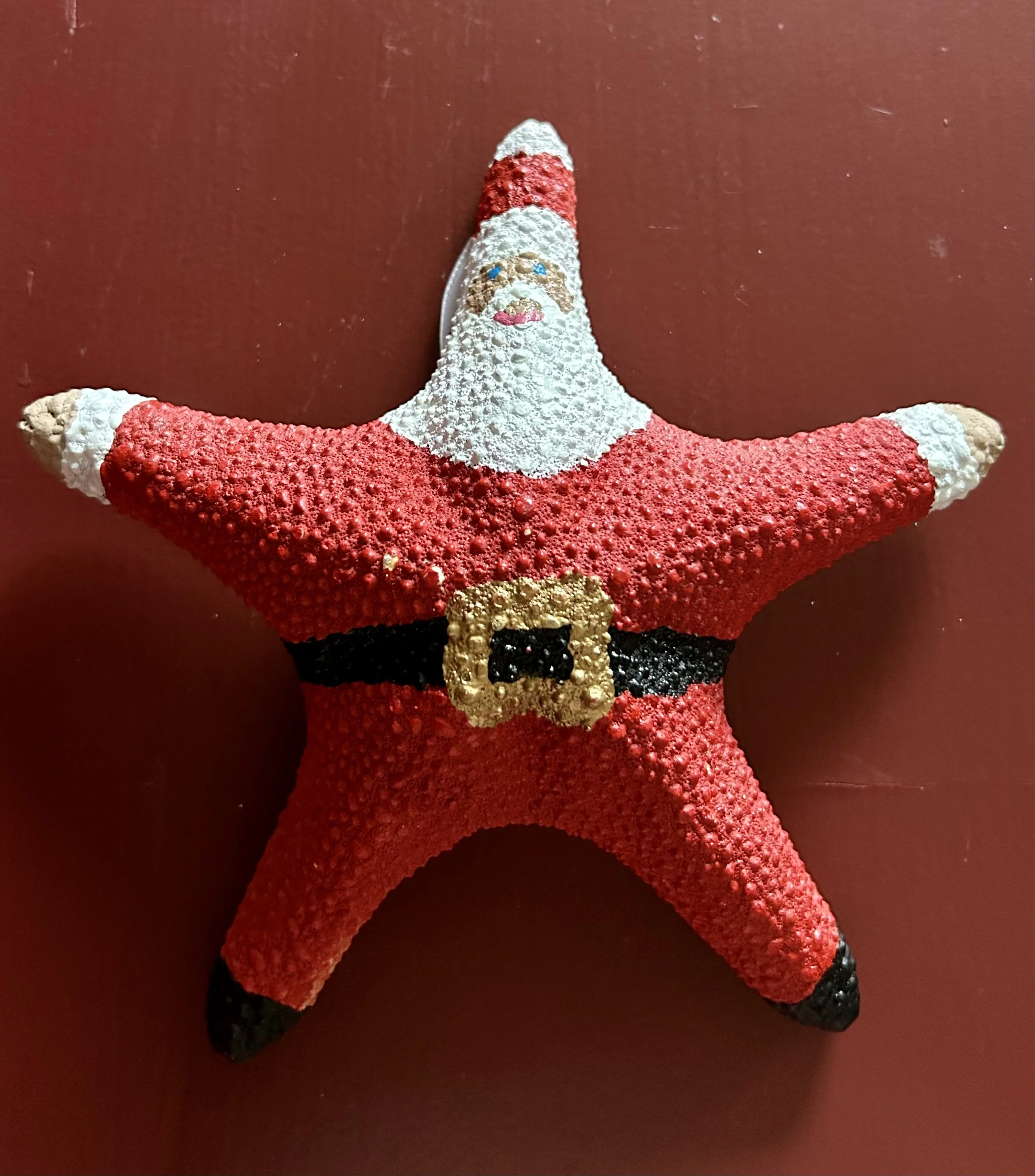
People are endlessly creative. I struggle to pass by handmade Santa Claus pieces when I am thrifting or garage sale hunting. The problem is there are entirely too many out there, made in remarkable mediums, including ceramic, wood, gourds, cornhusk, lightbulbs, cloth, wax, and, apparently, starfish. There are also an obscene amount of cheaply made ones, mostly from China, at which I turn up my nose. When I bring home a handmade Santa, I tuck it into one of the storage bins in our basement, rarely recalling what I’ve gathered until it’s time to bring up the holiday bins. When unpacking, it becomes a bit ridiculous as all the “new” Santa’s emerge.
I have been purging the holiday decorations – getting rid of things hubby and I have no attachment to, selling vintage pieces and donating others to a thrift store. Some things I’ve passed on to the kids, especially those things that have meaning for them. But sadly none of this seems to apply to Santa. If he was handmade, I become sentimentally attached. I often wonder why people get rid of these art projects, as someone somewhere put a good deal of effort into making them. And the handiwork is often amazing.
This year the collection grew significantly. I had stopped at a garage sale this past summer at a small home in our town. The owner had moved into a care facility and the sale was run by neighbors which was very sweet. On a table in the driveway was a fraternity of handmade Santa’s. Dear lord I was overwhelmed. They were not priced, so I tried to pick a favorite one or two, figuring they may be expensive. I then learned they were a $1.00 apiece. Ok, game over. I picked up 12, though I did sell one on eBay for $32 (apparently Johanna Parker papier-mâché Santa’s from the 1980s are collectible).

Johanna Parker
I was recently poking about the local thrift shop and found a beautiful ceramic one, passing on two sewn ones from the 1980s –they were a tad too “country living” for my taste. Another one - made out of a starfish – was also at the thrift shop, but I struggled a bit deciding whether to buy it. It feels slightly peculiar, and I still have not decided if it is a creative use of the poor starfish, or sacrilegious to the animal. It reminds me of the antique ivory dresser set I have.
The set was from my grandmother, Katharine Strong Humphrey Osborne (1905-1987), though it is unclear how she got them. I am guessing they were her mother’s, Margaret LeBoutille Strong (1874-1906), who died after Katharine’s birth. I get a queasy stomach when I hold them, but realize the poor elephant died over 100 years ago for these things to be made, and to not treasure them is also disrespectful of the elephant’s death. In my great grandmother’s day, there was no concern for the animal involved, and, as the set was saved by my grandmother and my parents, it clearly was considered a valuable item. My mother displayed the set on a dresser in my eldest sisters’ bedroom, and eventually she gave them to me. I have them stored in a cloth bag and remain unsure what to do with them. (Suggestions are welcome).
But, the starfish! Good grief. It is hard to fathom how that was considered a “canvas” to make a Santa. But who am I to judge? I love all the carved wood, cloth-stuffed, ceramic made Santa’s, and adding a starfish Santa seemed a good idea at the time. It does still make me cringe, but art is not always about loving something. Sometimes it is about making you think.

R. Carson 1993

P. L. Walk 2008


H. Taasch 1993


U.S. Pat. D290-381


Eldreth 2002


R. Carson 1992

Gilligan, Northern Lights Candles


House of Hatton 1994
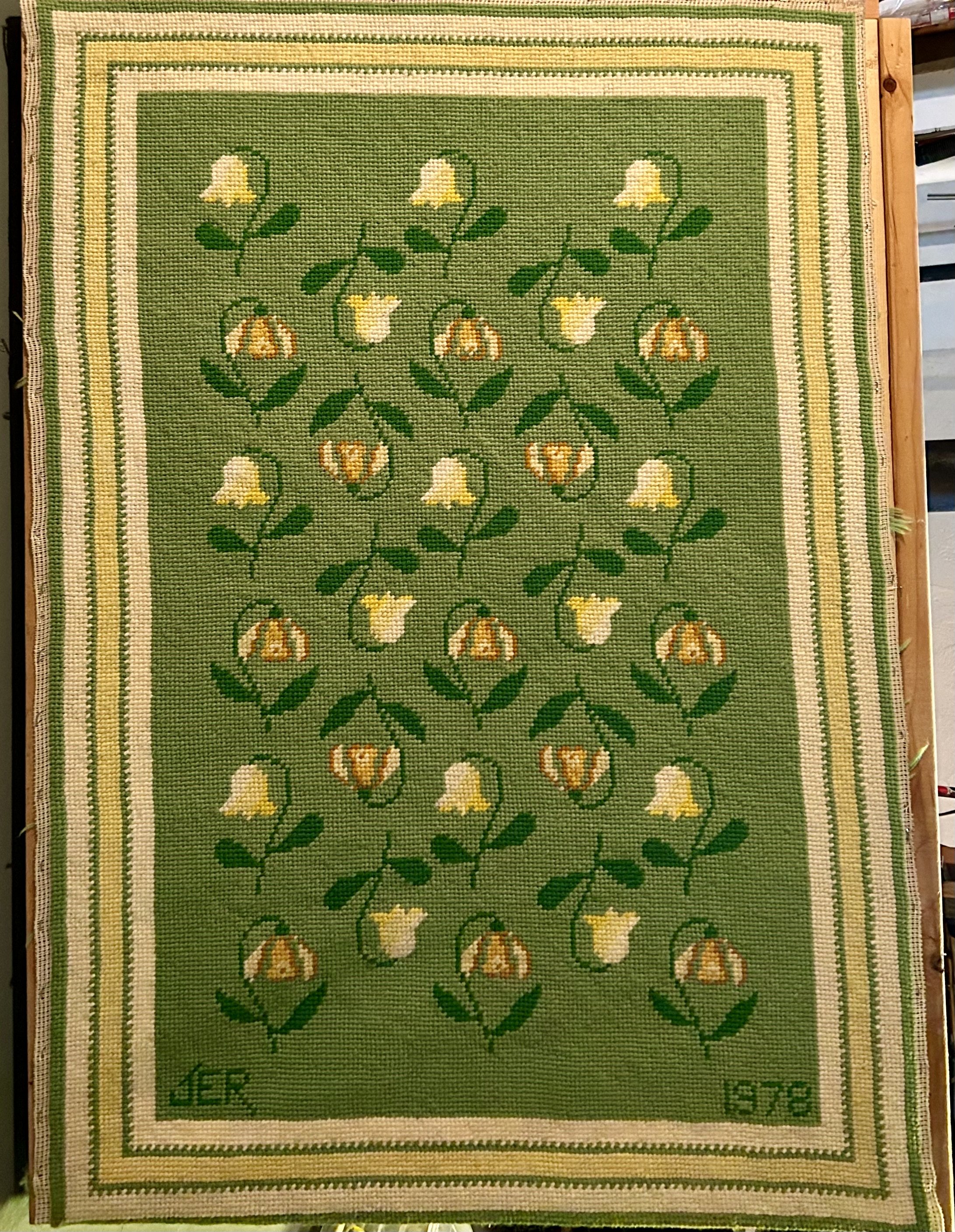
Catawampus Framing

There are projects that make their way into my life through no fault of my own. This vintage needlepoint rug is a case in point. A friend picked it up at our usual thrifting haunt. She decided it wasn’t something she could sell and, charmingly, gave it to me. I say “charmingly” because she is charming, but also because it’s a “free horse-$100 saddle” scenario (a term that makes me laugh, having purchased a teenage girl a saddle with a tax charge higher than $100). More “chaaaarming” than “charming” because unfinished projects quite literally bother me. My appreciation for vintage handiwork meant I couldn’t see it thrown away, but had no idea how to finish it. Nor what I would do with it when done. Very few people would tackle this beast and live to tell the tale. Time to do some research.
JER happily needlepointed the top in 1978, but then was at a standstill. If you saw the canvas, you would understand. Suffice it to say the back looked like a shag rug, and the whole thing was a parallelogram not a rectangle. It needed to be blocked. When a person stitches a piece, they will work in one direction. Over an entire piece, the tension of their stitches adds up to cause the weft of the underlying canvas to twist a certain way, skewing the overall piece. Ok, crafter-inspired physics lesson over, but this rug needed to be mounted to a stretcher, soaked, and let to dry, which would square it back up. (I could explain why this works, but will refrain. See this link if curious: https://thornalexanderstyle.com/needlepoint101). I’ve often regretted not having my mother’s handmade blocking form, which she used during my childhood to block her projects, though in this case it wouldn’t do me much good. This particular “canvas” happens to be 3 feet x 5 feet, making the “wood stretcher” thing a challenge.
Having a barn (or two) full of random things, I asked hubby if he could make up a frame out of old wood. He grumbled, but eventual scrounged up and cut some boards, hauling them to the basement to assemble (too cold out in the barn in December). I used my sewing machine to secure the edges of the rug with a zigzag stitch, then stapled it to the new frame. Doused it with water, and left it dry.
The rug, it should be mentioned, needed a serious haircut. The back strands were not finished off properly, and it was rather shaggy. Once mounted on the frame, I trimmed the strings as best I could. To clarify, the back of a needlework project shouldn’t have knots and long loose yarn waving about. To begin stitching, the tail thread is caught under the first few stitches. When ending, the thread is buried into a few inches of prior stitches. Thus no knots. JER hadn’t read that page of the directions and simple knotted the ends, leaving random inches of left-over yarn.
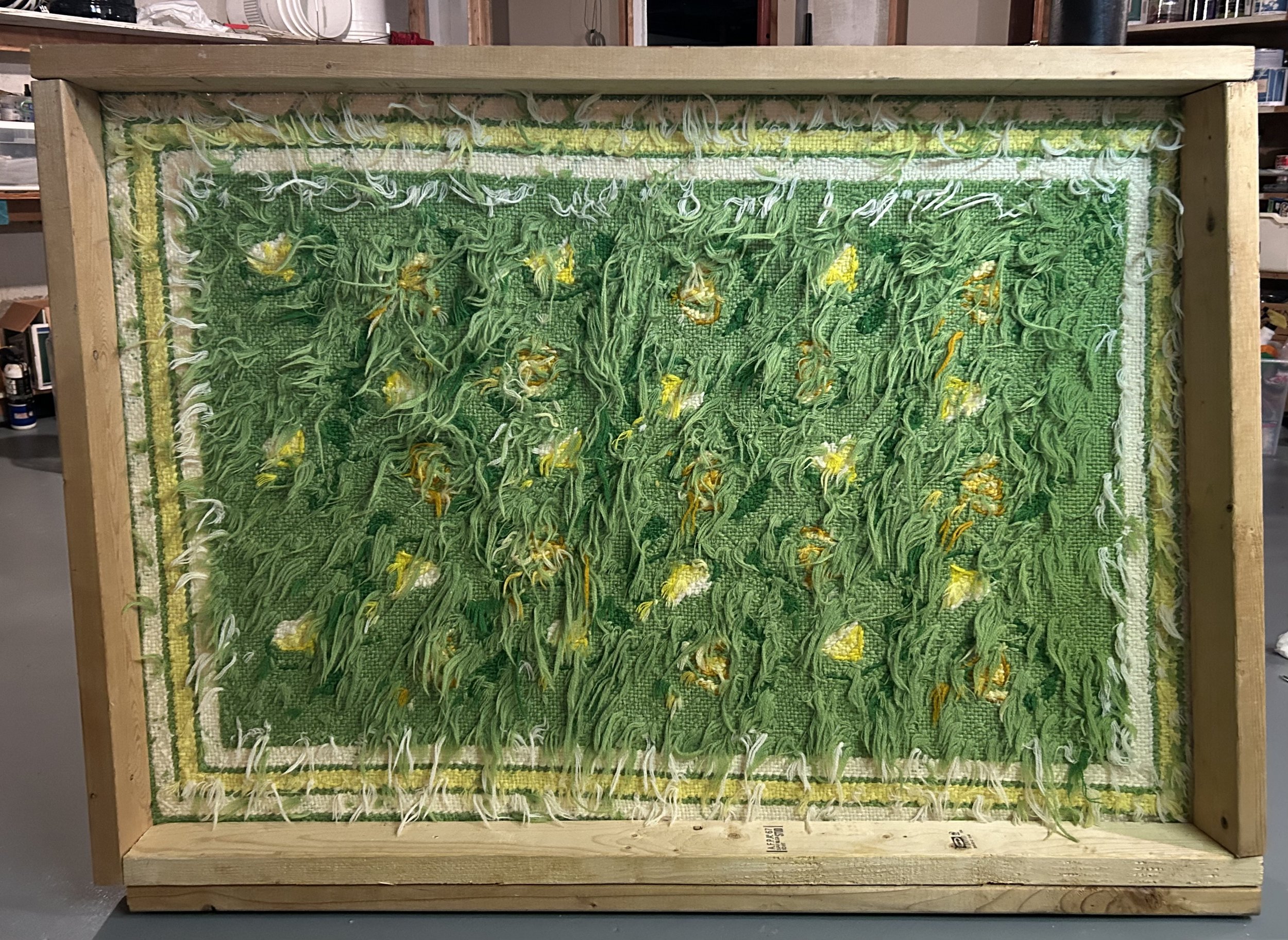
After a few days I puzzled over why the rug’s selvage was not running square along the wood frame. Frustrated, I pulled out all the damn staples and tried again. Mind you these were electric staple gun staples, pried out with an old screwdriver and pliers. Starting over, the piece kept going askew. In total frustration, I rummaged around for a T-square (yup, we had my dad’s old one) and checked the frame. One DAMN corner was not square. Hubby and I scratched our heads, tried various things, disassembled the wood, and puzzled some more. Until one of us thought to measure the length of the boards (no names used to protect the innocent). And yes, hubby had cut one side 2” shorter. Dear god in heaven. I was trying to square up a parallelogram canvas on a catawampus trapezoid frame.
Once the third round of mounting, watering and drying was done I applied a glue to the back. In researching I learned a fancy (read: expensive) industrial glue was recommended to finish off the back. I wasn’t keen on dropping $50, so ended up using mod podge craft glue which worked as a (cheap) substitute. Once dry, the rug was taken off the stretcher, and the glued chunks were trimmed (I likely should have watered down the glue but oops). I now needed a backing on the rug. Another “free horse-$100 saddle” scenario: the recommended fancy rug backing was also in the $50 range, but I’m too cheap. Off to the sewing store, where I found a nylon fabric in literally the same shade of 1970s green for a total of $10. Trimmed the rug, zigzagged the raw edges (again), sewed and flipped, much like inverting a pillowcase. I needed to press the now-sewn edges to finish the rug off, but ironing the darn thing was a challenge. I was unsure of the fiber of the 1970s yarn, and was leery of ironing the green backing fabric (nylon + hot iron = nothing pretty). Eventually, using a pressing cloth and large binder clips as “pins”, I was able to sew a finished edge. This keeps the back in the correct place, adds durability to the edge and helps keep the canvas from fraying.
Not 100% sure all those “shag rug” ends might not cause trouble, but that is a future me problem. For now my only modestly catawampus rug graces the floor of our dressing room. I appreciate my friend’s found treasures, and give hubby accolades for helping me with all these ridiculous “projects”. Even if sometimes I end up with a bit of a charming snafu.

Comfort Zone Trunk
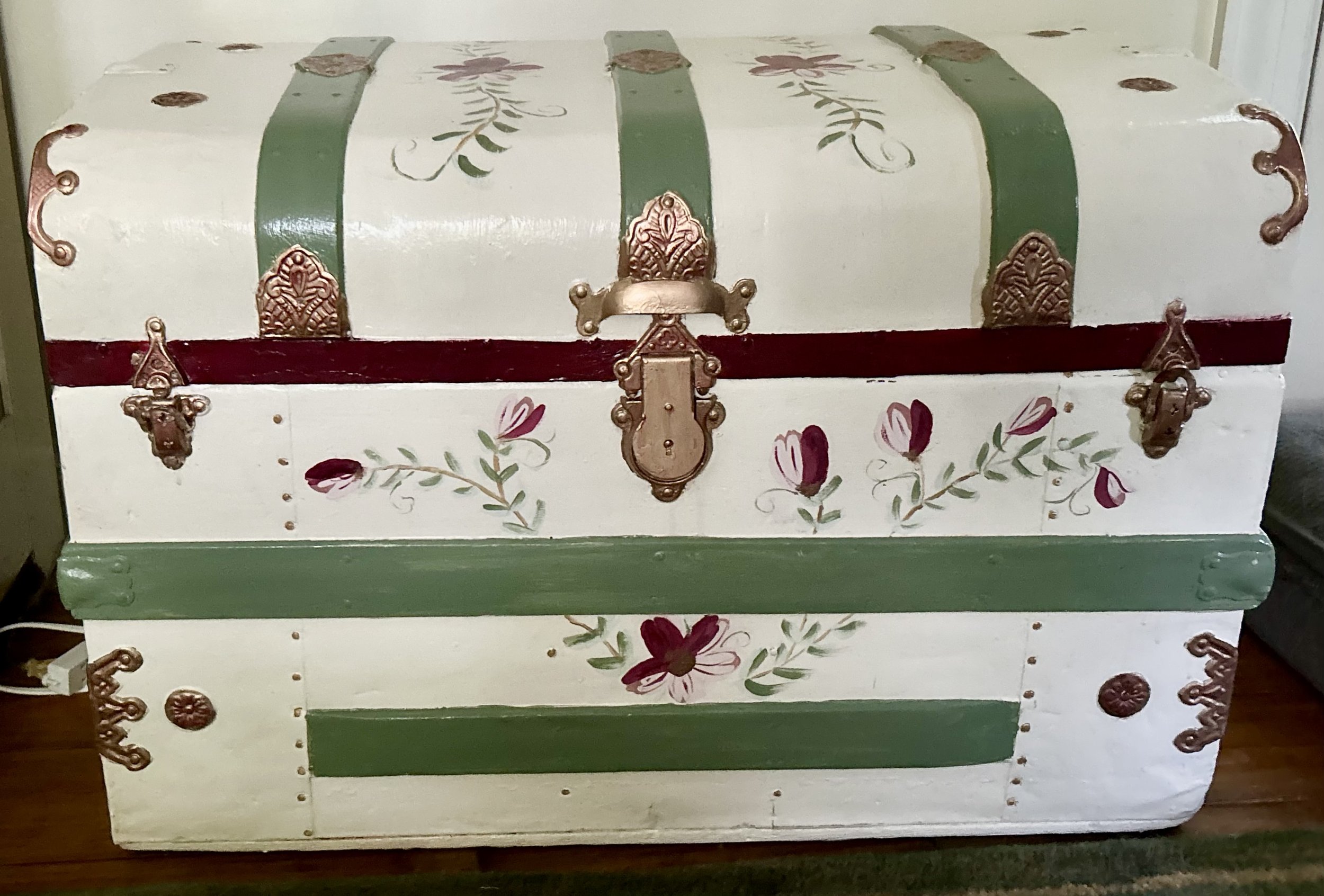
This trunk was a project I completed recently. My sister has the charming yellow painted trunk my mother Barbara F. Humphrey (1928-2021) did back in the 1950s, and I decided since I could not “have” my mother’s, I would create my own in her memory. The one done by my mother was a “domed” trunk, a classic 19th century steamer trunk. I wanted one that had a flat top as that is more useful in a guest room. My trunk was a Marketplace find, but was painted a vivid orange.
This trunk is one of countless old “steamer trunks” left over from the turn of the 19th century – and the history of these trunks is intriguing. Ok, maybe to me and no one else but I’m writing so you’re stuck with my intrigues. Believe it or not, travel in the late 1800s and early 1900s by train or ship also had restrictions on luggage sizes. Small sized trunks were stashed under seats on trains, while larger ones were sent to the ship’s hull or carted away by porter to the storage train cars. The domed top trunks, known as camelback or barrel top, were inspired by the fancy trunks used by the curvaceous Opera performer Jenny Lind (1820-1887). Prior to her, trunks were a utilitarian item, usually rectangular, and referred to as a stagecoach trunk. There is a myth that the domed top trunks were used by wealthier travelers, because…”upper-class passengers did not like…their baggage being stacked with the lower-class passenger luggage. The manufactures started making dome topped trunks so that the baggage handlers would not stack other bags on top of theirs. Which makes sense, until you look at old photos of porter and luggage handlers loading these on ships. In the photos…most of these were stacked up on their end” meaning the trunks were sideways in the storage areas. (https://mainesteamertrunkcompany.com)
Since I loved the interior, with its curved tray and robin’s egg blue paint, I purchased the orange beast and began work. I sanded the darn thing outside in the summer, with orange dust covering my clothes and hair, though I wore a face mask. I then began painting, using a lovely antique dresser as inspiration. The dresser, with matching mirror, is in our guest room (also my sewing room), and was an estate sale find from 25 years ago. The sale was in Racine, WI, in an empty mall storefront. The contents were from the Johnson family (of Johnson Wax fame) as they emptied numerous “storage” units. I arrived to snag the lovely hand painted dresser and mirror, and ended up going back two more times, gathering other treasures, as well as yardage of amazing fabrics I shipped to my mother for her sewing projects. (The lamp on the dresser is the only piece I have from my mother-in-law Lotte Jarrett (1927-1988)).
I am not much of an artist so painting the trunk took me a few weeks to finish to my satisfaction. This involved wiping off and redoing various attempts. Adding different colors and accents slowly. The gold used for the metal hardware was too darn shiny, so highlighted it in burgundy color. I think I managed to create a nice compliment to the dresser, and the trunk is now used to store bags – all those darn store bags you don’t want to throw away; Ziplocks from myriad sewing projects (quilters LOVE Ziplock bags); large tote bags for schlepping quilts, gifts, etc. My intention was to have a spot in the guest room for people to sit as well as plop down their luggage, and as an added bonus I now have corralled all those bags in one spot.
I love finding uses for vintage things, even when there are modern, cheaper options available. The charm of the older pieces shows through in the workmanship, and the uniqueness. Why surround yourself with boring when you can try something fun? My mother quite literally never decorated with yellow that I recall, and yet she enjoyed painting an old trunk in yellow with folk art charm back in the 1950s. Sometimes a small project lets you try things outside your comfort zone. And that is always a good idea.
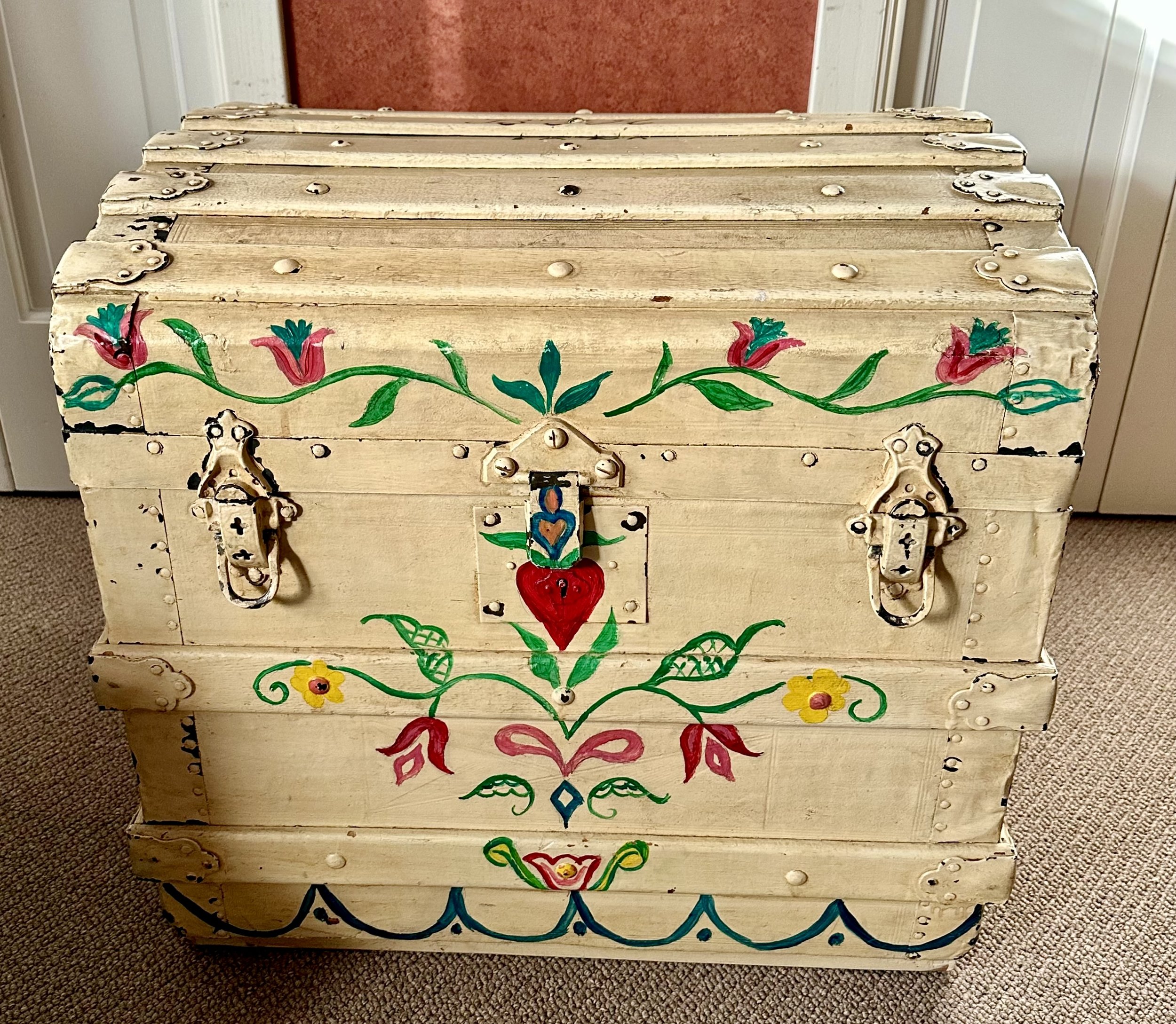
Barbara F. Humphrey’s trunk dated 1958

A Moment Of Truth
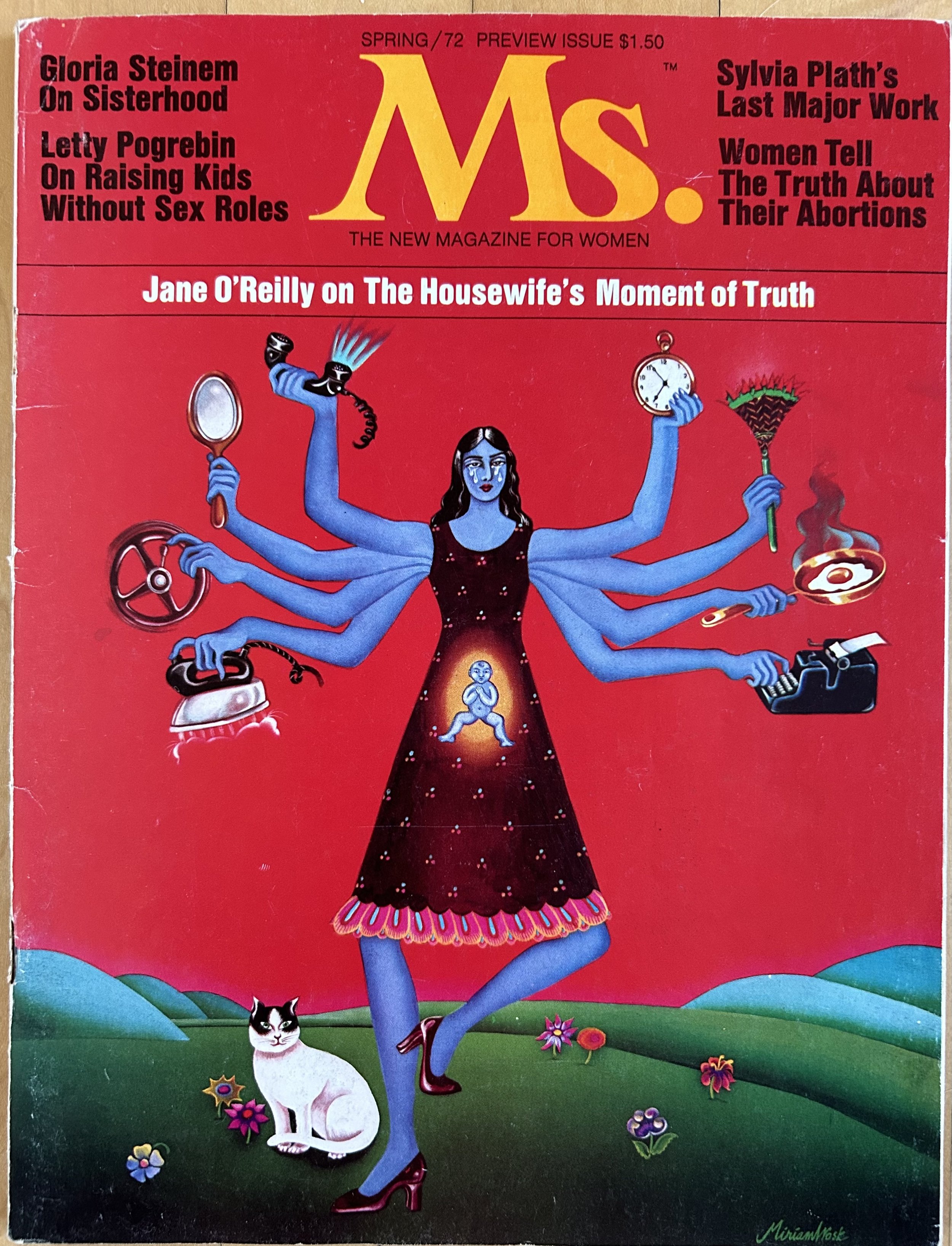
When I volunteer at the thrift store, I often come across things that intrigue me. Not always officially “art”, and in this case I would say more an “artifact”. There was no way I was passing up this magazine when I spotted it. I did not know, however, just how much an artifact the piece is - as far as I was concerned, any Ms. Magazine from the 1970s would be interesting. The magazine was poorly mounted in a frame, with the insides slipping off the binding, and thus a bit catawampus. I asked the manager to put a price on it for me, and was a tad worried she would recognize what it was, pricing it high, or holding onto it for more research. She did neither, and I purchased it for $15.
According to Merriam-Webster online dictionary, an artifact is:
a. a usually simple object (such as a tool or ornament) showing human workmanship or modification as distinguished from a natural object.
b. something characteristic of or resulting from a particular human institution, period, trend, or individual
c. something...associated with an earlier time especially when regarded as no longer appropriate, relevant, or important
This magazine actually hits all three definitions. It is a simple object: a published magazine, filled with writings and ads. It definitely qualifies as resulting from a particular human period – the 1970s United States, with the feminist push for equality and rights. But that last definition made me pause. Is the “housewife’s moment of truth” no longer relevant or important in our society? Has much changed over the past 50 years for women and their rights? In researching this piece I came across a quote which also made me pause: “While on a personal level feminism is everywhere, like fluoride, on a political level the movement is more like nitrogen: ubiquitous and inert.” (Manifesta: Young Women, Feminism, and the Future, Jennifer Baumgardner and Amy Richards). American women today seem to accept they have rights and yet do not realize just how fragile those rights are historically. And don’t get me started on fluoride – but an apt analogy as it too may soon go the way of the dodo. Gloria Steinem and her magazine paved the way for women to ask questions and make demands, but the backlash was severe, and continues to be so.
Steinem was working at the New York Times Magazine office in the early 1970s and was asked by her editor to either “go to a hotel room with him in the afternoon, or…mail his letters on the way out.” She adds, in an interview with the Smithsonian “I mailed his letters, but thanks to changed consciousness, I realized it wasn’t right. I didn’t have to put up with it. I could speak up about it.” Basically, she quit (https://www.smithsonianmag.com/explore-the-founding-of-ms-magazine). I worked at Chemical Bank in NYC 15 years later and, sadly, experienced similar comments. I actually filed a complaint at the time, and the bank executives had a conniption fit, making the trainee class I was part of learn about sexual harassment. That, however, did not mean sexism in the corporate world simply went away if my experience in the banking world through the 1990s is any example.
Back in the 1970s, the news industry would not print any “real” stories about women. “The male editors of the major women’s magazines—called the “seven sisters,” like the colleges—would not accept pitches that did anything other than advise readers to be better, happier, more productive housewives and mothers” (https://yalereview.org/article/closer-look-ms-magazine). After quitting, Steinem began work in her apartment with female journalists and politically active feminists to create a women’s magazine. It was an uncomfortable gathering, and eventually the more “militant” feminists parted ways as they did not like to cater to the advertising world (run by men). “There was no budget to advertise the preview issue, and much of the press attention that it elicited was negative…The magazine’s own editors planned for slow sales: when a stand-alone edition of the preview issue appeared in January, it was labeled “Spring 1972” so that it could stay on newsstands for months. As it turned out, there was no need for such hedging. The issue sold out in eight days.” (https://yalereview.org/article/closer-look-ms-magazine).
My thrift store find is one of those issues, preserved most likely by a woman for 52 years. Hubby joked that the woman must have only had sons, who, while clearing out their mother’s stuff, couldn’t imagine why she kept a Ms. Magazine from the 1970s in a frame. It amuses me that the magazine I found is actually valuable, so nah nah na nah nah boys. Your mother was a wise woman.

This particular one is in remarkably good condition, complete with all those “blow in” inserts. Honestly, that impresses me the most as I promptly tore all those things out when I read a magazine. Particularly back in the 1990s when perfume companies used the blow ins to promote fragrances, making the magazines rather pungent. I only just found out those things have a name, and a rather odd one at that. The term derives from the fact that the machines, used for stapling the magazines, blew in the cards…thus they were referred to as “blow ins”.
The magazine’s cover art is by Canadian artist, Miriam Wosk (1947-2010), patterned on the image on Krishna, the Indian god with many arms. Krishna, the Hindu god of love, compassion and protection, is often depicted as blue. Wosk’s version has a blue woman juggling the demands of work, marriage, and motherhood. The idea being “having it all” was a serious juggling act, and not at all easy. It was only in the next year that the U.S. government allowed the designation “Ms.” to be legally used by a woman. Prior to then women had to use “Miss” or “Mrs.”, as though a woman’s marriage status was all that could define her, compared to a man who is always “Mr.”. Okay etymology fans, did you know “Mrs.” was originally short hand for “mistress”? Grant you, back in the 1500s, it was an honorific title, specifically for upper class women, not the slightly risqué idea of a woman having an affair with a married man we tend to interpret it as. Over time, “Mrs.” was associated with women who had husbands, and thus were married women. The idea of a woman’s marital status being irrelevant to the way she is addressed only came about after Ms. Magazine created the honorific “Ms.”
When I was first married, my mother mailed me a letter, addressed to Mrs. “Hubby” Jarrett – as though Erica now didn’t exist. I made it very clear to her I was NOT Mrs. Hubby Jarrett, I was Erica H. Jarrett, or Ms. Jarrett if need be. That was in 1987 mind you. Society – and my mother – still expected a woman to become her husband’s property – if not in actuality, at least in spirit. My mother’s traditional salutation did puzzle me a bit. She demanded – and was paid - a salary from my father back in the 1960s for her work raising 7 children. She proudly had her own financial accounts all my life, and she was given the house they purchased in 1970 as she pointed out to my dad she did all the work to create our homes. From that point on, she owned the real estate my parents lived in, held in trust in her name only. And she made these demands from my father for equality before the 1974 creation of The Equal Credit Opportunity Act. That Act allowed a woman the right to open a bank or credit account, without a man signing for her. Yet here she was calling me “Mrs.” in 1987.
Interestingly, the 1980s saw a “backlash” against this feminism, and particularly against women’s ambitions. The “New Right” was growing, and targeted feminist issues – reproductive freedom, affordable childcare – in an effort to bring back “family values”; read: women stay home and have babies. Ms. Magazine had its own backlash. When Congresswoman Shirley Chisholm, the first Black candidate for president, was on the May 1973 cover, almost all newsstands across the country declined to stock the magazine. When Alice Walker appeared on the cover in June 1982, newsstands in the South refused to display the magazine. “Steinem had imagined that a feminist readership with diverse interests and purchasing power would change advertising for the better. Instead, the pressure to please advertisers—publishing’s most concrete proxies for the powers that be—changed the magazine’s content for the worse.” (https://yalereview.org/article)
50 years later it seems we are still struggling to define what it means to be “feminist”. I have ideas that revolve around our patriarchal social structure, and all the ramifications of the Right’s political agenda. But it does me no good to harp on it; I only get more depressed and worried. So the best approach for me is to find joy in artifacts, recognizing the strength of the women who worked tirelessly before us to try to achieve something in the face of obstacles. No one said it was going to be easy to demand equality. History has a sad way of proving that point. And Krishna pointedly reminds us that compassion, protection and love take work.

Daffodil The Dragon

This pottery piece actually chokes me up a bit. Silly, I know, but I see myself in the lumpy sweet dragon peering into a reflecting mirror, and realize that even at age 60, life is full of introspection. And trying to change for the better. Some introspection is healthy, some toxic, and avoiding the toxic takes work. The pottery piece also stores memories, new but treasured all the same.
This past Thanksgiving did not include my sons and their families. It was hard to not have them here, though in both cases, it was clearly the right choice. So my local daughter made sure to spend time with us, and I was grateful for her kindness. She arrived Wednesday morning to learn to bake pie, a ludicrous situation as both her brothers have whipped up pies for years. Including one son using a farm-share pumpkin to make a fresh pumpkin pie during college! Her, not so much. I had no idea making pie dough was a textural issue, but I have learned it is, and realize it is a texture I actually enjoy. Her, not so much. When baking was done, daughter wanted to stop at an estate sale in a town nearby.
The day before Thanksgiving was an odd day for an estate sale, and we were amused by the event, chatting about things and people we spotted. I found this handmade pottery piece and immediately thought of a daughter in law. I have virtually no idea why I associate dragons with her, but suspect it is the close jump from dragon to phoenix. The phoenix image I do understand as their dog’s name is Fawkes, the phoenix from Harry Potter. I made my son and his bride an engagement quilt depicting a phoenix, done in her favorite colors. The original paper piecing pattern was 12” and I wanted it much larger. Thankfully Juli Weber at Little Fort Media in Waukegan (https://www.facebook.com/LittleFortMedia/) is a whiz at figuring these things out, and the resulting quilt is close to 3 feet tall. Phoenix are mythical birds, known for their loyalty, intelligence, and bravery. They regenerate themselves by bursting into flames and rising from the ashes. A powerful metaphor for life and marriage, certainly, and quite appropriate for their wonderful Malinois rescue pup.
My estate sale dragon is signed “Tyler”, though unclear if that is a first or last name. Guessing it is from the 1970s due to the coloring, but that is only a hunch. It is a handmade pottery plate with a hole cut out of the middle to insert the mirror. The charming dragon sits by the side, much like Narcissus looking at his reflection in the water. The dragon is made of a different textured clay from the plate, formed in lumps and built much like those drippled sand castles I made as a child in the 1970s. The dragon’s face is remarkably sweet, and I sense a female dragon. The glazing on the plate makes it seem she sits on a grassy bank by some water.

The Greek myth of Narcissus is not a charming tale, and lent its name to the psychologically unhealthy Narcissist Personality Disorder. Sadly I have a great deal of family experience with that disorder. A handsome youth, Narcissus never found love, leaving many broken-hearted women and men in his wake. Eventually, he spotted his reflection in a pool of water, and fell in love with himself. “Naturally, this one-way relationship went nowhere, and Narcissus, unable to draw himself away from the pool, pined away in despair until he finally died of thirst and starvation. Immortality…was assured, though, when his corpse…turned into the flowers which, thereafter, bore his name.” (https://www.worldhistory.org/Narcissus/). The Romans adopted the myth, and it was very popular in their art, including 50 wall paintings at Pompeii alone. Interestingly the narcissi plants are poisonous, and the name is roughly translated from ancient Greek to mean “numbness”. A daffodil plant is part of the Narcissi genus and its charming appearance in spring offers us all a route out of the numbness of winter. So my feeling about my introspective Daffodil Dragon is that she is looking inward in search of a path forward, focusing on the beauty of life to help.
Unfortunately for daughter in law, when the dragon came home, she wandered into our dressing room, jumping up to land on the brown walls and settled into place. She is charming, and makes me pause when I see her. These last few weeks have been tough for me, and I feel both sadness and disconnection. While I do connect with many people, that does not seem to stop my brain from diving deep into the pond of woe. I am working, with hubby’s input, to recognize my thoughts are not always my friend. Being mindful takes a ridiculous amount of energy, and it is always easier to slip back into woe is me. I see the little Daffodil Dragon in the morning and evening. And I remember my children, the loves and lives they have and the luck I have to live such a complex and rewarding life. I promise Daffodil will eventually find her way to Colorado to take up residence with the phoenix. For now she is helping me smile.

Paris Is Always A Good Idea
Another anniversary rolled around recently, and, as is somewhat typical for me, I thrifted a fun item to gift hubby for number 37. I picked up this oil painting at my local thrift shop, unframed and with some “dings” in the canvas, making it a bit warped. The scene, with its cobblestone roads and French storefronts, definitely screamed “Paris” to me. Paid $8 and presented it to hubby as we have enjoyed trips to France, both for our 30th and our 35th.
He loved the vibe and colors of the piece, and wanted to display it. Easier said than done as my addiction to thrifted art means our walls are a tad cramped. He pointed out the colors worked well in our family room, with the 1970s Calder vibe. I love how he is getting into the swing of design, commenting on the juxtaposition of art and now the understanding of color and related images. Question became what to remove. We decided a poster, picked up from eBay years ago, could move on in the world. The 1950s circus poster worked well with the “circus theme” family room, but we did not have much attachment to it, other than the money spent on the framing. I have listed the thing on eBay, but, sadly, shipping it will be very expensive given the glass and long size, making it hard to sell. Anyone interested?!

My Paris painting, now hung in place of the circus poster, had two areas where something had pushed on the canvas, creating unsightly dimples on the surface. I researched how to deal with “dings” on an oil painting and found a remarkably simple solution. When an artist prepares a canvas for painting, a ‘gesso’ layer is painted on the raw surface first to seal the canvas. “Gesso” is Italian for “chalk”, and was traditionally made of animal glue, chalk and white pigment. Its use, according to Wikipedia, “provides a strong foundation for the paint to adhere to, prevents the paint from soaking into the surface, and can also be used to achieve a desired texture or surface finish.” However, artists do not apply gesso to the back of the canvas, and thus the repair is quite simple: using a squirt bottle, I sprayed and dabbed water on the back of the painting, and miraculously the dings shrunk and disappeared!
The artwork I found is dated 1984, though the signature was a mystery. In my attempt to read the darn thing, I realized the signature is flanked by a dapper man with a bicycle on the left and a woman dressed in white on the right. Hubby has a passion for bike riding so it seems appropriate as an anniversary gift, though I promise I did not wear a ridiculous hat for my wedding! Not unheard of in the “big hair” days of 1987, but my head was unadorned, other than a headband wrapped in small roses.

In researching the art, I eventually found remarkably similar pieces, all prints of street scenes in Paris. The artist is identified as “Claudine” in those works, and the signature is similar enough I suspect mine is a “Claudine” work as well, though done in oils on canvas. Sadly, the echo chamber of the internet happily identifies “Claudine (Romanian, born 1938)” but other than that, I can find no information about the actual artist. My painting includes an artist working in the lower left corner. He is wearing a red coat and black bowler hat, with an umbrella shielding his easel as he works. I suspect that is an autobiographical reference for the artist, thus a man.

I began puzzling over the signs on the buildings, so looked online for images of the Montmartre area of Paris. Voila! Believe it or not, the painting is a work depicting an actual place. Our next visit to Paris will now include an outing to Montmartre to find this intersection, Rue Saint Rustique. My internet rabbit hole has now introduced us to the oldest street in Paris. I will leave you with a link explaining the history of the street (https://www.solosophie.com/rue-saint-rustique/) and start planning my next trip to Paris, maybe for our 40th anniversary.

Serendipity

The wonderful thing about art is how it impacts you, both inspiring memories and creating them. This art pottery is a perfect example: the serendipity of friendships and the memories that flit off from there. The piece immediately made me think of my mother, Barbara F. Humphrey (1928-2021), as she loved Scandinavian design, and taught me a great deal about appreciating artistry in many forms.
Mom loved beautifully-made items, and would joke she inherited this from her mother. She said my grandmother, Frieda H. Fallon (1898-1961) had “champagne taste with a beer pocketbook”. Mom also had expensive taste, but she was a Depression child, and while she loved - and could afford – beautiful things, she couldn’t get away from her thrifty ways. Mom did all the decorating of our homes, painting and hanging wallpaper with my father. She scoured thrift stores and resale spots for treasures (sound familiar?!), and learned how to refinish old furniture, some of which I still have. One little dresser she picked up in Pittsburgh, telling my hubby she would refinish it for him. After she was done, she decided to keep it, and hubby was salty about that for years, often joking it was “his”. When we moved Mom in 2011, hubby finally got “his” dresser and he uses it as his nightstand.
My parents traveled a great deal, and Mom would bring empty suitcases with her on trips to countries famous for their yarns (England, New Zealand, Scandinavia). Mom also adored fabrics, and I took many trips with her to wonderful fabric sources during my childhood. Even though she had the means to purchase fancy outfits, she would sew or knit them herself, and I honestly do not think I wore a store purchased dress until my sister’s wedding in 1980. She even knit my first communion dress and sewed my high school graduation outfit, using a Ralph Lauren prairie outfit pattern from the early 1980s (I still have that one though god knows it wouldn’t fit a flea). The fabrics from Marimekko, a Finnish textile company, were a favorite of hers, and she picked them up for years for sewing projects. I will have to look for photos of Mom in her 1970s Marimekko dresses as I can picture them in my mind.
Mom also loved the streamlined look of Scandinavian design. We had Dansk kitchenware and various teak furniture, including our kitchen chairs. A Nanna Ditzel teak highchair. An original Eames chair with its black leather and rosewood frame. My father used that chair for most of my childhood, giving it to a sister when my parents moved to Florida in the 1990s.
When Mom moved into an assisted living property back in 2011, she still had the Ditzel high chair she purchased for my brother, her youngest child. She insisted I take it. Sadly, I had no use for it as my children were grown, and I knew better than to think my children would allow grandchildren to sit in it – not particularly “safe” by modern standards. I sold the thing, though I cannot say I wasn’t tempted to keep it. Mom loved these designs, and as I have thrifted, I have been drawn to similar pieces. I found a set of 6 teak chairs not long ago, and sold them for a significant profit. Danish by Poul Volther for Rojle Frem from the 1960s. The woman buying them was likely an antique dealer, selling them in turn for even more money. I would have kept them, but the chairs were a good 2” shorter than modern table chairs, making them a tad impractical.

I also have found a number of lovely pieces of pottery (see blogs ericas-heirloom-treasures/letting-go and ericas-heirloom-treasures/the-warmth-of-clay) and, through those treasures, reconnected with a dear climbing friend who I will call Elsa. Elsa is originally from Sweden, and we met climbing at a local facility around 25 years ago. While we have drifted apart as time and lives have changed, it has been a remarkably lovely process to reconnect. Elsa reads my blogs, and was gob smacked I found a highly collectible Lisa Larson sculpture for $16. She had a small piece made by Lisa Larson and was excited to see the one I found. Soon thereafter I found a piece by another Swedish artist Johan Krukmakare, a name that actually means “potter” in Swedish. I had written that I thought it was simply a designation, but she said it is an actual surname in Sweden, and Johan was a potter named Potter!
I shared an estate sale listing with Elsa back in October, as the sale had a remarkable piece I coveted. The weekend of the sale I was with my brand-new granddaughter, and wondered if Elsa would attend the sale. Elsa wasn’t able to attend either, as she had family in town, and her reply was an emoji “ 💸 “ as these pieces are highly collectible, selling for well over $1000. We both sighed over the charm and moved on, enjoying our connections with family young and old.

The piece we coveted was made by a Danish artist, Bjorn Wiinblad (1918-2006), in the 1970s or 1980s. These works are known as his Eva Series, and there a numerous versions in different colorways. Wiinblad was born into a political family, and from a young age was interested in art. His father, not keen on art as a career, had him study typesetting, though he never actually became a typesetter. He rose in the art world during the post-WWII era in Denmark, when there was “a minimalist approach, prioritizing simplicity and functionality. This led to the birth of a new design aesthetic characterized by clean lines and minimalist forms, marking a distinct departure from the heavy, ornate furniture that preceded it” (https://www.relaxhouse.com.au/blog/history-of-danish-furniture-how-it-all-began/). He was exceedingly successful, becoming both famous and wealthy in his lifetime. His pieces are in many museums and are highly collectible.
Needless to say, Wiinblad’s works are far from minimalist in style. In fact, he intended his works to counterbalance all that streamlined esthetic, and loved to incorporate natural elements, bright colors and whimsy. He was a prolific creator, working in ceramics, theater sets and costumes, puzzles, tiles, textiles as well as drawn works. As the Nordica Museum stated for their retrospective show of his work in 2018: “with a career beginning in 1945 amidst the enduringly popular “Danish modern” design movement, Wiinblad injected fantasy and an almost cartoonish flair that created a perfect accent to all the clean-lined furniture and modernist spaces of the time” (https://nordicmuseum.org/exhibitions/the-whimsical-world-of-bjrn-wiinblad).
Imagine my surprise this week when I received a text from another good friend, who I will call Ariel. Ariel was in southern Illinois visiting family and sent me a photo with a comment saying “if I was going to buy you a Christmas present from Denmark”.

I was a tad confused, but after some back and forth, it turns out the piece she sent a photo of was at a local antique store. It had been donated to a charity, and they in turn asked the antique store to sell it. Ariel knew how much I love art, but the pink color and charming female figure immediately made her think of me. While the list price wasn’t awful, given their value, I threw out a lower bid and they accepted! She now sits watching me in my dining room as I type, filled with a silk flower crown I created from thrifted flowers. Elsa, who happens to be in Sweden visiting family, sent a photo of the one her family owns, and we both smiled at the creative genius of these pieces which brighten our days. I will treasure Eva both for her charm and for the serendipity of her connection with friends.