

Wonky Perspective

I can’t help but love this ridiculous oil painting. It was a recent thrift shop find, setting me back $2.50. It is a small piece, and not framed, though someone strung a hanging wire at its top. While signed, the signature is a mystery. Undated, though the style and colors peg it as 1970s. I picked it up because it made me laugh.
The use of perspective in art has always been a struggle for artists. While the ancient Greeks and Romans understood perspective, the concept was lost for centuries, being “discovered” again in the 15th century. In 1436, Leon Battista Alberti “codified… much of the practical work on [perspective] that had been carried out by earlier artists; he formulated, for example, the idea that “vision makes a triangle” as well as the importance of a vanishing point. (1)
Translating the visual world onto a flat canvas requires an understanding that our eyes perceive items on a flat plane as having different sizes based on their distance from us, with our eyes drawn to a specific location on the canvas. This is known as the “perspective” of the work – where our eyes are drawn to – with an awareness that some things are “in the distance”, and small, while others are nearby, or larger.
Artists have used mechanical aids to help create this perspective, relying on a horizon line and the vanishing point. At some points artists actually drew lines in pencil or chalk directly onto the canvas to help with this, and even poked pins into the artwork to attach strings to a “vanishing point” (Vermeer’s work is famous for having these pinholes). “So as to appear farther from the viewer, objects in the compositions are rendered increasingly smaller as they near the vanishing point.” (2) Think of a road leading off to the horizon –

the visual of the horizon line, the vanishing point of the road as it reaches that horizon, and the triangular shape of the road as it moves into the distance are all clear visuals of these ideas. In this sketch, the poles along the road and the trees along the way all get smaller as they are “further away” from us. (3) Children tend to disregard the use of perspective, and untrained artists -and even some trained ones – can botch the execution of perspective, much like my ridiculous artwork.
This painting is more than slightly wonky – slides into downright hysterical. Where to start?! Clearly the artist intended the horizon to be the actual horizon where water meets sky, painted in a light gray off in the distance to the right. However, instead of allowing that to draw the eye to a vanishing point, the fishing pole is the “vanishing point” – but illogically as the top of the pole appears even with the far distant horizon. Just how big is that fishing pole?! The birds are not helping. The one closest to the bottom of the fishing line is the smallest – as though it is the farthest away, and yet it is next to the fishing line which logic tells our mind is actually nearer to us.
The fishing child’s legs are hysterically out of proportion as well, specifically in relation to the charming wood fence that meanders into the distance – right into his chubby feet. To make matters worse, the little girl sitting behind him is actually significantly bigger than he – which logically makes sense as she is depicted as older, but illogical in the perspective of the piece. As the fence meandered into the distance, the children got LARGER! And somehow their chubby little bums sit charmingly on a slight hill in the foreground, filled with sunny flowers. But the perspective of the children’s rear-ends make it seem they are precariously seated with a pit of flowers directly behind them!
The flowers are also confused – those in the precarious pit and distant field are done in a fairly good rendition of perspective. But note the two little ones to the far right – which should be significantly bigger than those on the hill due to their proximity to the front of the picture plane. But no, they are tiny, so tiny in fact, the boy’s shoes – much farther down the fence – dwarf them!
There are so many different perspectives at work here that the painting does cause a sense of vertigo. Not clear if our mystery 1970s artist was possibly aiming for this effect, or simply completely oblivious to the effect. The two children also remain oblivious to their precarious position, and await the result of the fishing expedition, complete with a wicker basket by the girl’s side. Though, given the confusion of distance, size and proportion, I am slightly worried about the pending size of that fish.

Monitoring The Barn
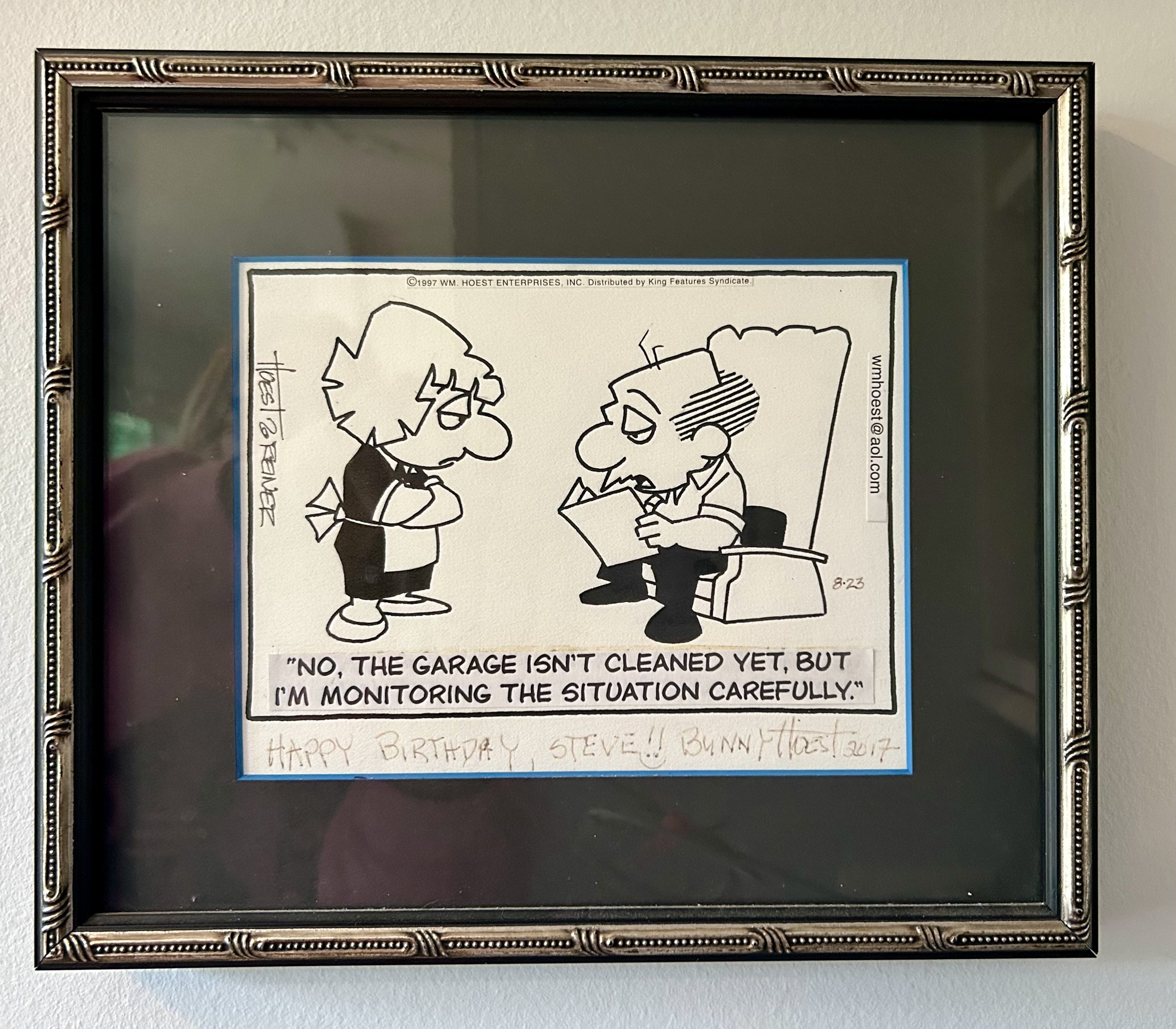
While I have never been a comics reader, early in our marriage, we received The Chicago Tribune newspaper on Sundays as Hubby enjoyed the comics. He often would read some out loud, and Lockhorns was a perennial favorite. This particular comic was run on 8/23/1997, and its humor spoke so clearly to our approach to “projects” around the house. The piece amused me so much, I reached out to the artist to purchase the original panel as a birthday gift for Hubby for 1998.
Those of you paying attention will notice it is signed by Bunny Hoest in 2017. When Bunny Hoest personalized the original strip, she used a non-permanent pen, and a number of years ago I realized her signature and inscription were faded away. I disassembled the framing and mailed the original art back to her to re-sign the piece. It seems with another non-permanent pen as that writing is ALSO beginning to fade. As the woman is now 93, I will leave her be.
The Lockhorns cartoon was started by Bill Hoest (1926-1988) in 1968, before their marriage (her second). It ran in over 500 newspapers, and was syndicated by King Features. The comic is done as a “panel” not a “strip”, with a scene presenting the “the ups and downs of committed relationships through the lens of the married couple Loretta and Leroy Lockhorn. The two exchange witty barbs and sarcastic quips all while demonstrating their deep love and affection for each other. Through thick and thin, couples counseling and Leroy's occasional trips to the bar, Loretta and Leroy exemplify the enduring nature of their relationship” (1).
Upon Bill Hoest’s death in 1988, Bunny took over the cartoon design, working with artist John Reiner, who came to work with the couple while Bill struggled with cancer. After researching, I learned Bunny used “gag writers”, a process the couple started in the 1970s. She says: “ I look at everything that comes in and I literally hand pick the one or two I will use from the ideas people send in. If I use the idea, even if I have to do a lot of editing, we used to say it comes in as gem or a germ. If it’s a germ of an idea it means I can rework it so that it’s perfect for the LOCKHORNS. If it’s a gem of an idea means it comes in perfect and I burst out laughing -this is it. So, we pay 10 dollars for every idea used. It’s not a living, I have 100 gag writers and I use 11 ideas a week, 6 daily and 5 on Sunday. So if a gag writer gets a couple in a month, he makes twenty dollars.” (2)
I also discovered, in this same 2012 interview, why the piece I own has taped lettering attached. The process of creating the comic involves Bunny developing the design, John drawing the artwork, and a typesetter using the “Hoest font”, typing up the needed words and pasting them onto the original piece. This piece would then be mailed in to King Features to complete the color placements, and distribute to the syndicates. In 2017, Bunny donated all the archives of the Lockhorns work (among other cartoon work she created) to Adelphi University. This piece hangs on my kitchen wall instead of residing in the Adelphi archives.
I am a bit of a “let’s tackle something new today…and finish it NOW” type person, while Hubby is sure a bike ride or some other relaxing option is a better choice. 37 years into a marriage, we remain the same. Now, though, it is not a garage he needs to clean, but a huge barn -literally, as our property has a few barns. Still waiting for him to tackle the piles in the area daughter and I aim to hold a “barn sale” in a few weeks. Sigh. To be fair to Hubby, my daughter -in-law refers to me as “Hurricane Erica” so it is possible I am a tad over-busy. It’s safe to say I am monitoring the barn very carefully.
(1) https://en.wikipedia.org/wiki/The_Lockhorns
(2) https://www.raymondpalma.com/bunny-hoest-interview-current-writer-of-the-lockhorns-comic-strip/

A Smack Of Jellyfish
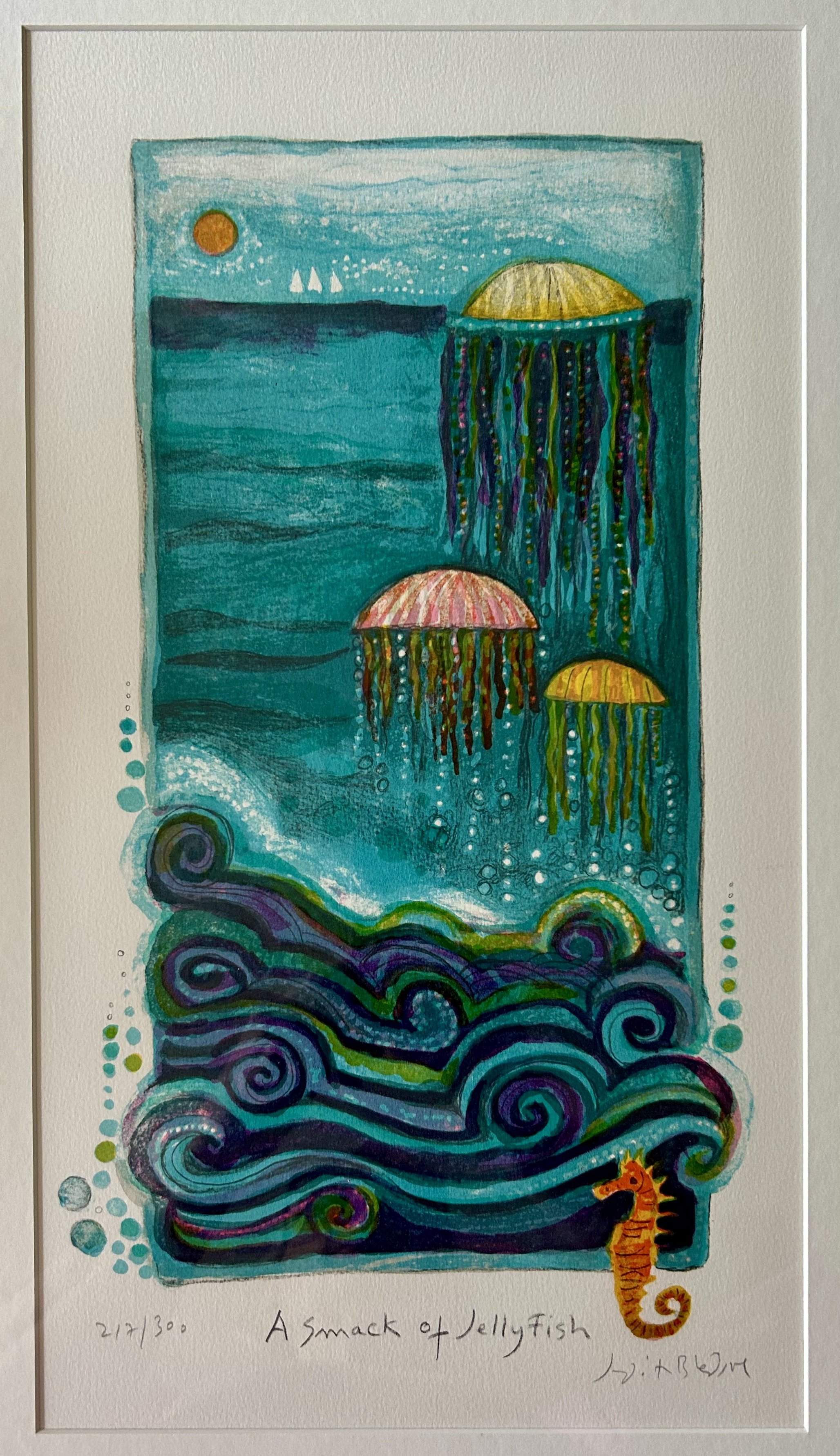
I love everything about this lithograph. First off, who knew a group of jellyfish was called a “smack”?! That sent me right to The Oracle (see prior blog: https://www.ericasheirloomquilts.com/ericas-heirloom-treasures/the-oracle-not-at-delphi). The term is derived from the sharp blow (or smack) you feel when you get caught in a group of jellyfish. I, for one, have never been “caught” in a group of jellyfish – I spent many vacations visiting Siesta Key, FL, both as a child and with my children. Whenever jellyfish were about, we high tailed it out of the water. There are numerous types, some completely harmless, but a number of jellyfish can cause severe pain to humans. Much like mushrooms, they’re not something to mess with, and I suspect the common response among beach visitors is to avoid jellyfish like the plague.
I discovered the fabulous lithograph while volunteering at my favorite thrift shop, framed in a simple, well executed frame. When I am volunteering, I cannot price something I covet, for obvious reasons. After doing some research, I asked the manager for a price and she determined a fair one. Not cheap, but under $50. I happily paid it as I have decorated a son’s childhood bedroom with nautical imagery for many years. Interestingly, I don’t recall my son ever expressing any specific desire for his room to be “nautical” in nature. However, I hung a wallpaper border of nautical flags which set the tone for the room for well over 20 years, and either he humored me or he enjoyed the spoils of my thrifting/flea market hunting.
This piece was destined for that room, and while the other works are all watercolors of boats, this piece fit right in. I will have to write about some of the other pieces as they are impressive watercolors, but the main reason I added this piece was the collection of very large shells I have. My eldest sister acquired these when we would visit our grandparents on Siesta Key. As a child I coveted those large shells, and spent many a morning scouring the beach for large shells washed in overnight. Beach glass, sand dollars, shark teeth, even sea horses were found. But alas no impressively large shells. I suspect these shells may have been purchased as the local gift shops were filled with such finds. Back in the 1960s, the stores were small shacks on the beach, surrounded by towering pines, and the gaggle of us kids would wander through them admiring all the found shells. Those charming beach huts are long gone, replaced with high rise condos. My memories of the rented sea side bungalows and towering pines have remained. As have the shells – though to be honest I’m not clear how I ended up with them. They were displayed in my sisters’ bedroom, and I recall my eldest sister drew the shells in pen and ink while studying fine art in college. Not sure where those drawings ended up, but they hung for many years in my parents’ home.

(the 1970s sea urchin light was a flea market find)
I keep meandering, so back to our lithograph. Smack of Jellyfish was made in 1982 by Judith Bledsoe, and the back has a detailed documentation of the work. What a fabulous thing for us art hunters! Much like vintage quilts, so much art has no information and the work, while signed, remains a mystery. In this case, we are informed the work was derived from an original oil painting done by Bledsoe, and redesigned into a lithography run of 372, of which this is 212 of 300. Thankfully, the back explains why the series is 300, but 372 were produced. 60 were run as “artist proofs”- a process by which the artist develops the artwork, printing samples, so to speak, until she feels the piece is how she wants it. The final 12 were “personalized dedications to collaborators in the handwriting of the artist” – meaning additional printings given to other artists or printers who helped in the creation.
What I especially love about this documentation is that it explains HOW the work was made. “The artist created the image by drawing directly onto ten zinc plates and one plastic sheet.” In addition, the artist “supervised the mixing of colors, pulled several proofs and made corrections. The edition was pulled, one color at a time, at Arts Litho in Paris, France. “ The plates “have been destroyed” thus no additional unauthorized pieces could later be made. The work was published by Circle Fine Art Corporation, and bless them, they note they want “you to be fully informed about the art and how it was created. This Documentation provides you not only with the information required by the various fine art disclosure laws of NY, IL and CA, but also with additional important facts and data”! I was unaware Illinois had such a law. Seems it was enacted in 1972, and there are some very specific guidelines regarding the sale of print work. "Fine print includes, but is not limited to, an engraving, etching, woodcut, lithograph or serigraph”. https://www.ilga.gov/legislation/. It does indicate any framed work under $60 does not need to follow the law. Phew!
Who was Judith Bledsoe? The Oracle says she was an American painter and print maker (1928- 2013) who ran away from home at age 16 and moved to Europe. After living in London, she settled in rural France. (https://judithbledsoe.com/About the Artist.htm) She did work for UNICEF as well as the 1996 Olympics in Atlanta, GA. In her own words: “My involvement in art has come as naturally as breathing – I could not have done anything else. It is all a matter of seduction, as most things in life are. Inspiration grows out of doing the actual work itself, from working steadily and keeping your sensitivity alive to everything…Art for me is magic, although it’s also magic when someone falls in love with a work of art, sees it and has to have it live with them in their home. That’s what art is – a torrid love story. You have to create it with your heart full of flowers.” It’s safe to say Bledsoe got my torrid love affair of art! Now to keep my eye out for art under $60.

Pretty In Pink Hermes

While I certainly covet art, I also covet a few items of clothing: vintage Louis Vuitton purse, Missoni sweaters, and a Hermes silk scarf. Not as if my life style warrants such treasures, but a little luxury never hurt a girl. The likelihood of coming across any of those at a thrift shop I would have said was close to nil. I will have to revise those odds, however as I scored this amazing work a few days back. For $1.00. I kid you not.
I’m realizing I have yet to discuss clothing as art – but i have always felt “clothing” is an artform. The designing of. The fabric and details of. The selecting and wearing of. There is art involved in each step, though our modern “disposable” society often forgets all that when grabbing cheap clothes at a box store. To make an article of top quality, there are designers, dyers, weaver, engravers, printers, sewers. I’m sure there are others, but you get the idea. This particular scarf was designed by a Vladimir Rybaltchenko (1939-2002), and made by Hermes of Paris in 1981.
It is known as the “Ich Dien” scarf, part of a series of The British Heraldry designed by Vladimir Rybaltchenko in 1969 and re-issued as a Limited Edition in 1981. It was in honor of the marriage of the Prince of Wales to Diana Spencer, and bears his coat of arms against the backdrop of Gothic architecture. The scarf depicts the coat of arms of “England (three lions)…of Ireland (a gold harp with silver strings), Scotland’s coat of arms, a lion in the upper right and at the center the Royal Badge of Wales.” The term “Ich Dien” is the motto of the Prince of Wales: I serve. (1)
I can’t bring myself to sell it – a common thing I do with treasures I find. But I have decided I will claim it as art and justify keeping it. (I should note hubby has literally never asked me to sell or get rid of art – sometimes when I replace things he will comment that the piece didn’t really work for him. But when “treasures” come home, he’ll often say “hit the bid”).
How did I come by this remarkable, limited edition, perfectly pink scarf?! I had stopped at my local thrift store and an employee was hanging recently received scarves for sale. We fell to talking as I browsed the scarves. Glancing down at the plastic bin she was pulling the scarfs from, the bright pink, and clearly silk, scarf winked at me. I reached in, pulled the darn thing out, and could hardly believe it was an ACTUAL HERMES SILK SCARF for $3.00 (I ended up paying $1.00 due to discounts). I didn’t look at it very closely, tucked it under my arm, visited with a few other employees, paid for my scarf and a few other little things (children’s book of course) and dashed to the car. I am still amazed.
The details of the piece are stunning. Turning to The Oracle, I learned more about the process. “Hermès relies on a global team of approximately 50 independent, freelance designers…to dream up its prints. Once a design has been chosen…it gets scanned into a computer where an artist outlines the design on a screen”. (2) After colors are chosen, there is a six-month engraving process where “Hermes engravers break the artist’s design down into unique films, one for each color contained within the design. As many as 47 different films may be created for a single scarf design.” (3) While the engravers are at work, “Brazilian silk is transported to France where the raw silk is woven into the silk used for the scarves. This weaving process can take up to three months. Craftsmen then mix pigments together and boil them to create the perfect colors for the design. Once the colors are prepared, the silk is stretched over a printing table and the screens are applied to the silk. One by one, each screen adds new color and pattern to the silk to build the final pattern. The colors are allowed to dry, then they are “fixed” into place with steam.” (3) This entire process, from start to finish, takes almost two years from design to scarf.
I did laugh, though, when researching the scarf, as the site detailing the heraldry had a reader comment from adguru1010: “Clearly the scarf held up better than the marriage!” I will wear the Hermes as I love the color pink, and take joy from the artistry of the work.
(1) (Details of the scarf spelled out here: a-closer-look-at-the-british-heraldry-limited-edition-ich-dien-hermes-scarf/ )
(2) https://www.harpersbazaar.com.sg/fashion/how-the-hermes-silk-scarf-is-made
(3) https://fashion.luxury/style/made-hermes-scarves/

Lion Low

I picked this watercolor up at an estate sale the other day. While the piece has no date, I immediately felt it was from the 1970s, and made me remember Born Free from my childhood. I managed to dash to the sale late in the day, and found the artwork in the garage. Painted by “Mary Lee”, titled “Lions”, and set me back $25. Internet sleuthing is near impossible for a watercolor with no date and “Mary Lee” as the artist. (see note)
The earworm “Born Free” started buzzing in my brain, and so off to the Oracle to see why. Born Free was a memoir published in 1960 by Joy Adamson. A movie followed in 1966. (The movie won two Oscars for the song Born Free which explains my earworm). Given that I was only 3 when the movie came out, I suspect my memories were from the 14-episode television show run in 1974. The story of an “orphaned” lion Elsa, raised and then released into the wild by Joy and George Adamson is more complex than my memory recalled, and while tragic on many levels, it also did a great deal of good for conservation awareness. George killed Elsa’s mother, and then reared the 4 days old cubs he discovered (which is why he believed the lioness was attacking him – she was protecting her cubs). Two cubs were sent off to zoos and Elsa was eventually released into the wild after much retraining. Sadly, she only lived a few more years, dying of a tick-born malaria-type illness. Tragically, Joy Adamson was murdered in 1980 at age 70, and George was murdered by poachers in 1989. The Elsa Conservation Trust they created for the profits from their numerous books and movies has continued to this day, and it donates funds for wildlife education and conservation. https://elsaconservationtrust.org/

Back in 1990, pregnant with our first child, husband and I attended “Art In The Barn” in Barrington, IL. While browsing, we came across “Animal Crackers” by Ann Otis. I loved the colors, and the memories it recalled of eating Animal Crackers as a child while grocery shopping with my mother. I could still happily eat a box, and I purchased them for my children while schlepping them through grocery stores as well. Who didn’t “play” with the animals as you munched them?! If you managed to save a few unbroken ones, you turned the box into a circus toy. Only lasted as long as the crackers, however, which in my case was not terribly long! The charming artwork hung in our nursery for years, and eventually was put away as the kids grew and décor changed.
As an aside, it seems I was smart enough to tuck a business card into the back of the frame when I purchased the piece. Ann Otis was a local artist, who made “etchings and monoprints”, and she charged $75 for the framed piece in 1990. Given her chosen mediums, I suspect the work is an etching, with multiple plates imprinting different color to the work. A complicated process, and criminally underpriced. You can see the etched line work clearly in the standing lion, particularly in his mane and face. (Note to self: always save the paperwork)

Many years later, when I began collecting “circus” artwork, I picked up yet another lion. This from the local flea market. The piece is a woodblock print – the image was created by carving a piece of wood with the lion, and pressing it onto the paper. The added grass and blue sun may have been a second piece of carved wood, inked in different colors and layered over the lion. “Sollid” made 200 of these, likely in the mid 1970s based on the coloring. The dealer, Dale’s Upstairs Gallery in Racine, WI (no website -he’s old school) uses vintage frames he collects to reframe old pieces, and suggested the white washed framing. We settled on the dark blue matting and I love the unusual look!
This woodblock lion hung in our “circus theme” family room near my Calder until another fun estate sale find replaced it (https://www.ericasheirloomquilts.com/ericas-heirloom-treasures/dante-at-the-circus). Now, having two charming “lion” pieces tucked into a closet, I decide two makes a collection, and moved them into an upstairs bathroom. Word of advice, however: don’t give an O.C.D. art obsessed woman a “theme”! Finding “lion” artwork has become a fun hobby.

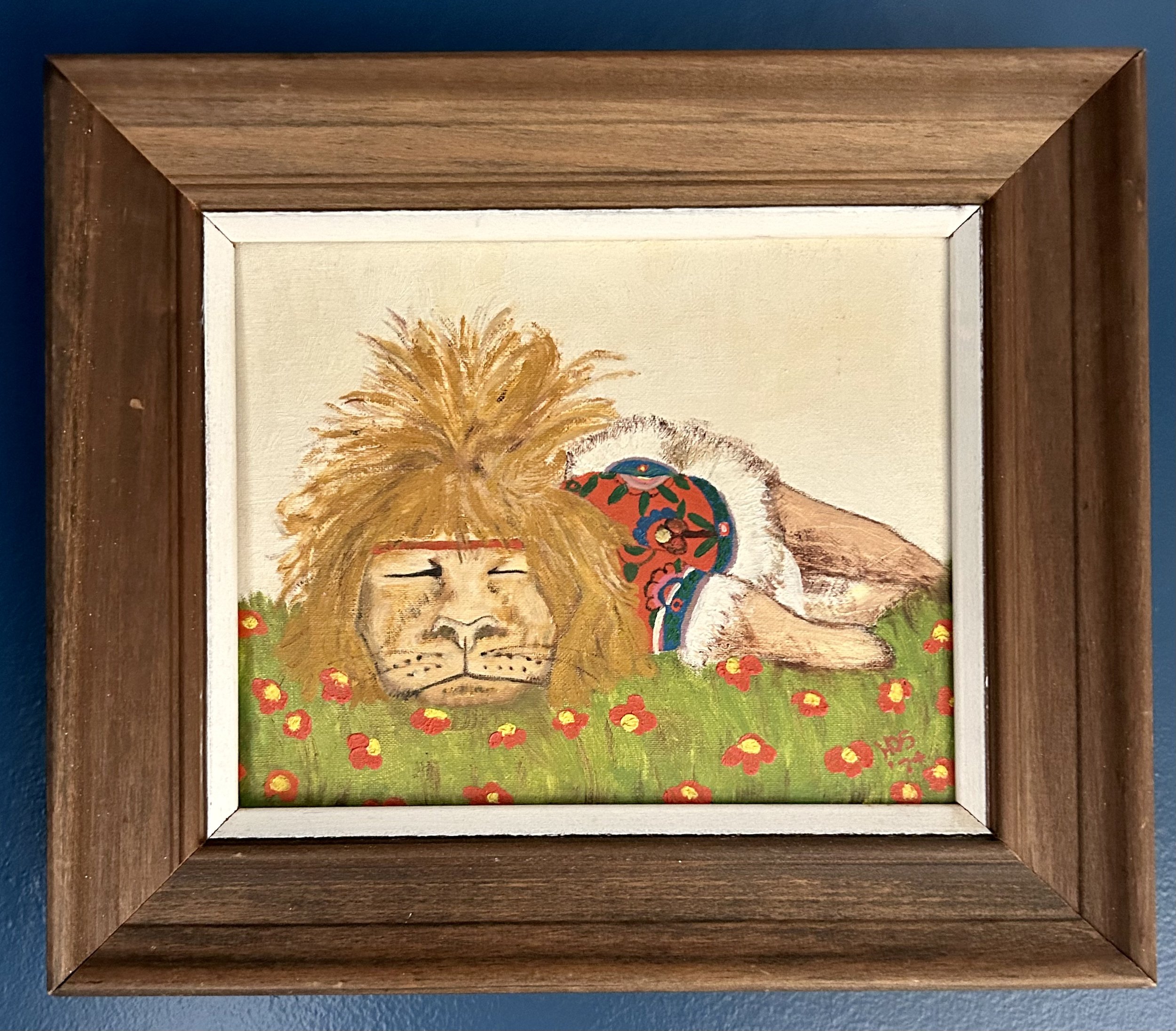
This piece, a charming acrylic painting, was found at the local thrift shop, destined immediately for the bathroom. It is unsigned and undated, and cost $2.50. It is painted on wood, and the bright colors make me guess it’s c.2000. It is small, but I do enjoy the feeling the artist created, with the fabulous flowers draped through the lion’s mane, and the majestic face, well done in paint.
My last piece (thus far anyway) was purchased off eBay as it was one I could not pass by. An oil painting on canvas, dated April, 1974 and signed by Helen Owen Snodgrass. No information online about artist, but she clearly had a sense of humor. She titled the piece “Lion Low”. The back also states “Mother” gifted it to “Jill” on July 29, 1974. No way of knowing, but I suspect Helene may have been Jill’s mother, gifting her a humorous visual for the 1970s, including the ridiculous headband and hippie hairdo. After the 1966 movie, and 1974 television show, lions became quite popular. Born Free inspired many of the nature shows we all watched on our old television sets – no remotes, no recordings, tied to the actual channel’s schedule. If it was Sunday at 7:00 you sat on the sofa to watch Mutual of Omaha’s Wild Kingdom. There were other animal shows as well, Animal World, Flipper, Mr. Ed – the idea of animals deserving respect and conservation was a new idea, at least one that finally got traction, in the 1960s and 1970s. I’d be lying if I said the damage humans are doing to the animal world – as well as environment in general – does not distress me. But when I am feeling low, I can appreciate the artwork of many people celebrating these majestic animals.
Note: internet sleuths determined the piece was painted by Nan Lee Roberts (1920-2007), an artist of some renown.

Rough Riding
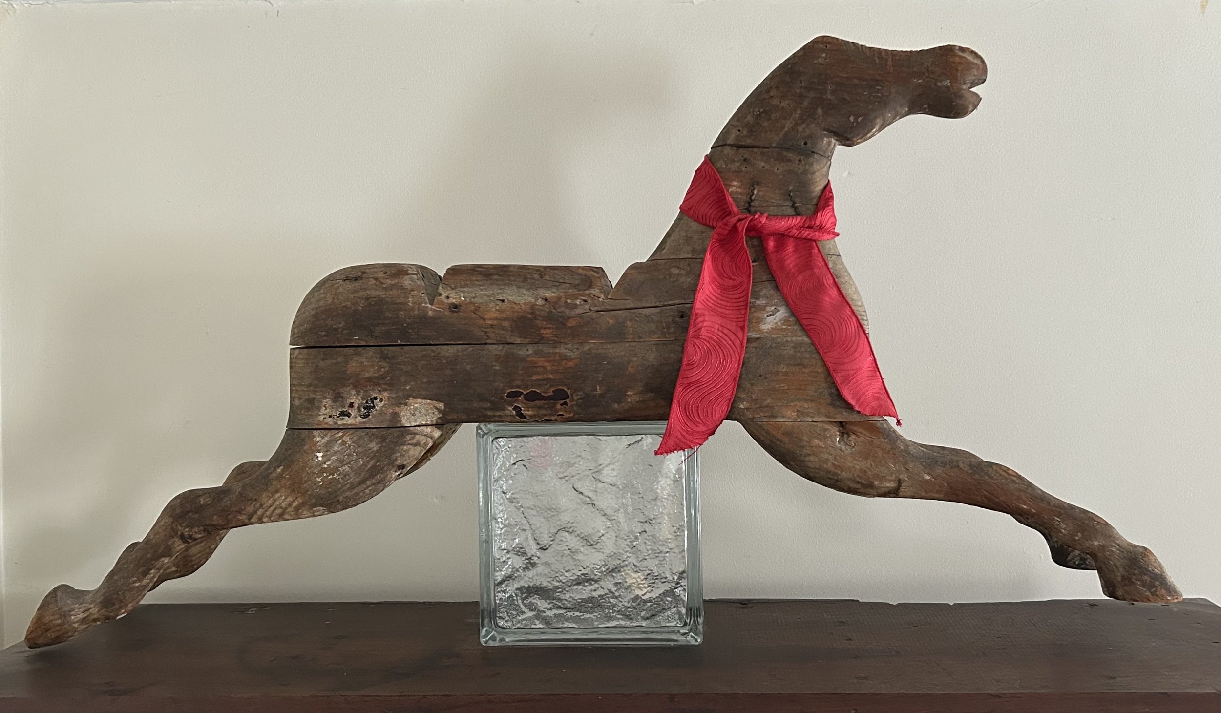
I have had this horse sculpture for many years, and he sits atop a wonderful old desk in our family room. Unfortunately, I know nothing about the horse’s history. My gut says it is very old (around 1850), American made and Midwest in origin. It is composed of layers of wood that were joined in numerous ways, and from that chunk of wood, an artist hand carved the 3-dimensional horse in mid-stride. He is roughly 3 feet in length, and has seen some rough riding over the years.
I have no idea what it was designed to do. It is too small to be a carousel ride. Possibly it was a store display sign, as the wood is well weathered, with only slight remnants of white, red and brown paint. But what was it advertising? What were the deep channels across the back of the horse used for? It also has two metal rods (possibly handmade nails) cut off on its flat bottom. Given the trouble I have had over the years keeping him balanced atop my desk, I suspect he was mounted somehow using those now removed pieces of metal. (If you get the chance, ask my sons about the time they knocked the horse off the desk).
The desk – what a wonderful story that is! Husband and I were newlyweds, and went on an antiquing trip with another couple in 1989. Both couples were looking to furnish recently purchased houses, and I specifically wanted a large old desk. We headed to Indiana from Illinois, with one couple driving a car and the other driving a rented van to fill with our treasures. As this was pre-internet days of antiquing, I had called ahead to a few dealers to find those selling furniture. Our first stop was in a small town in northern Indiana. We were not optimistic about the “shop” as we drove through a 1950s subdivision and pulled up to an unassuming home. However, the old man walked us over to his garage, which turned out to have a large pole barn attached to the back. Literally the first thing we came across was this desk. There was much discussion regarding whether I should buy something immediately, and I recall I was dissuaded from the purchase and we drove off. Within hours I knew that was a mistake, and we backtracked and snagged this wonderful desk.

The piece has two 1893 Arm & Hammer calendars glued to the inside of one door. However, I believe it is much older than that, probably circa 1850s. It is considered a “plantation desk”. That said, I hate the term for the connotations it evokes of our Civil War history. Interestingly, though, the origin of the plantation style desk was not southern, but for rural post office work. Like most of this style, the base of the desk is deep, with a slant to it. These sometimes had a base that lifted, much like the school desks of my childhood, but this one does not. Instead it has a remarkably deep drawer on the right side, and a charming decorative cut out on the left to allow you to sit at it. It is made predominantly of walnut with a few other woods. The legs are hand turned, and there are wonderful cubbies and drawers behind the doors. The nails are handmade, but unfortunately, the keys for the locks are long gone. It would not be considered “fine furniture” but was clearly handmade with a purpose in mind. The fact that walnut is a northern wood, and that I bought the desk in Indiana from an “antiques picker”, I feel fairly sure it came from a rural town in Indiana, Michigan or Illinois. Antique pickers journey around to local auctions and estate sales to stock pile interesting pieces to sell to “big city” dealers…or young couples!
The desk moved with us 25 years ago to our current home on the old Quaker Oats Research Farm property. It feels fitting that the rural desk and well weathered horse reside together in our family room. Our horse-riding daughter could not understand why, as we had a large barn, she could not also have a horse. As our town administration had a conniption fit regarding the rental house on our property, it was highly unlikely we could add a horse to the mix. To say nothing of the cost. She is still grumpy that the large collection of Breyer horses I played with as a child in the 1970s got pitched by my mother. Her room in our home is most definitely decorated with horse art. Now that she owns a home, I keep hoping all those dust collecting tchotchkes will gallop off to her place. Thus far, no dice. I did manage to get her to take the ridiculous pile of horse gear won in show competitions, as well as the large container of “place” ribbons. The large tack truck is still stored in the barn, but I suspect someday this rough riding horse will retire to her place to live out its days in comfort.

I think this answers my question regarding the purpose of said horse! 1875 handcarved wood “glider” rocking horse

A Woman’s Wide Shoulders, Giacometti Style
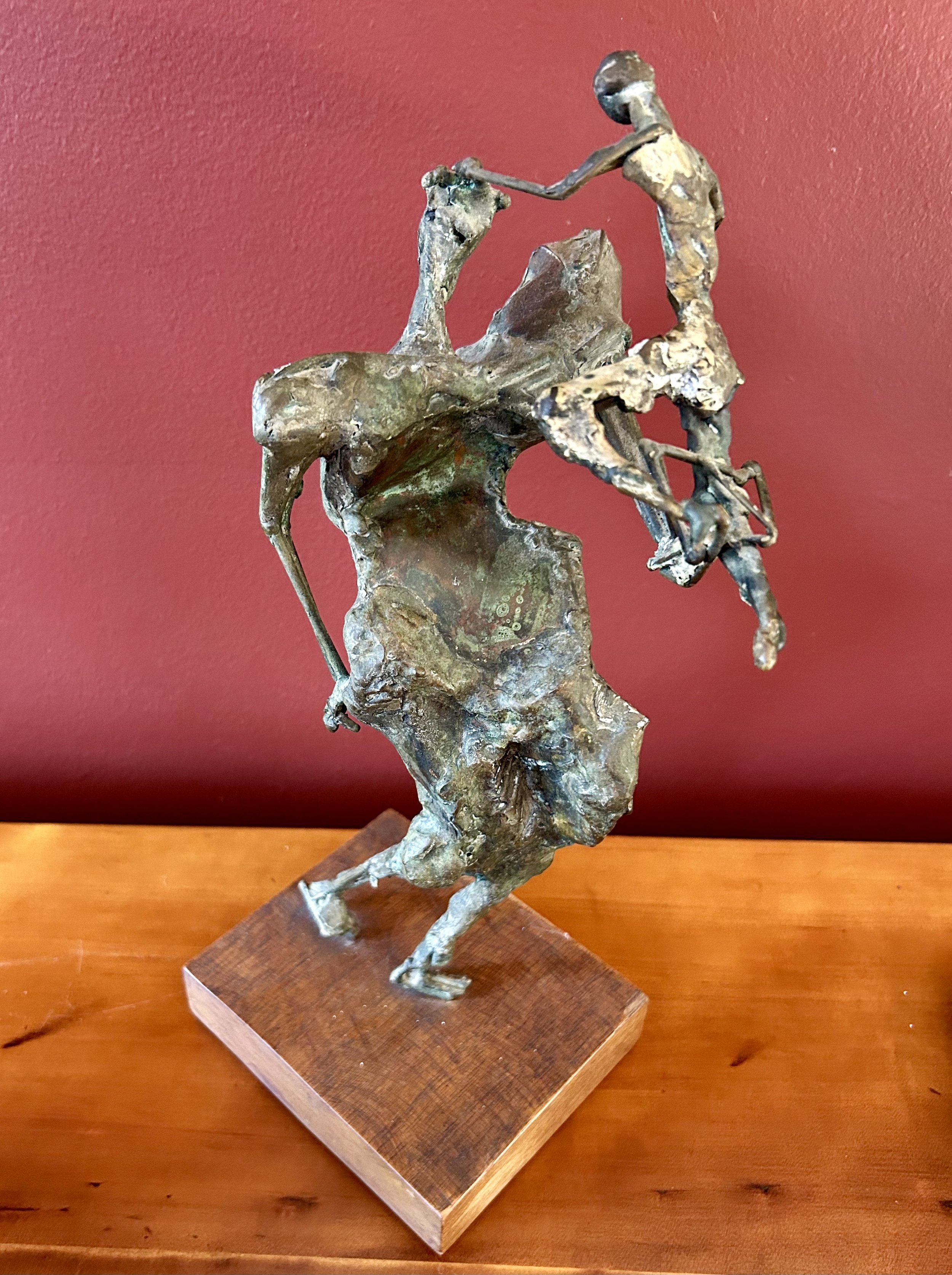
Wouldn’t it be wonderful if this was a Giacometti sculpture? Highly unlikely as he was Swiss, working in Paris, and I found this sculpture at an estate sale in my Illinois town 30 years ago. The statue was cast in metal, possibly bronze, and secured to chunk of wood. I see a woman, wide shoulders and flared hips, holding a child in her left arm, with the child resting a hand on her head for balance. There are no markings, and no identifying information. The figures are very abstract, but often I am startled when visitors simply cannot see the woman and child.
The work seems similar to sculptures made by Alberto Giacometti (1901-1966). Before WWII Giacometti’s statues were small, some smaller than a few inches! His early work was with the Surrealists in Paris, but they kicked him out as his figures were too “realistic” for them. While he did produce various types of art, he continually returned to the human form. His work, as well as my mystery piece, was created by building a model with clay (or wax), working the piece with fingers, knives or chisels to created desired effects. When satisfied, the piece is cast in plaster to create a mold. Molten bronze is then poured into the mold, which melts the clay (or wax) form and creates the statue. A different technique is to create a re-usable mold from the original clay/wax sculpture, allowing the statue to be cast multiple times. Until the mold is destroyed, the piece can be continually recast, as happened to Edward Degas’ (1834-1917) work after his death. Giacometti actually did produce re-usable molds, though he tended to “rework” each piece.
Interestingly, I had attached a note to the bottom of the piece when I purchased it. I must have asked about its history, and the seller indicated it was picked up by their deceased relative at the estate sale of David Adler. My mystery deepens! David Adler (1882-1949) was a well-known architect in the Chicago area, designing remarkable estates for very wealthy clients (http://architecture-history.org/architects/architects/ADLER/bio.html). He studied in Paris, and traveled through France. He died a widower at age 67 in a home in Libertyville. (That home, The Adler Center, was donated to the town of Libertyville by his heirs and has remained a local art center for our community). The sale my sculpture was originally sold at was for David Adler’s estate (he had no children) in 1950 or so, purchased by a local family, and then sold again to me nearly 30 years ago. Given the wealthy clients Adler worked for it is possible she was a gift to him, or Adler could have purchased her in France and so I’m not betting against the statue being a Giacometti!
Giacometti’s work often featured human figures, and after WWII, he created the elongated single figures he is known for. Giacometti “whittled his subjects down to heavily worked but stick-thin figures…[His] expressive figures became associated with existentialist ideas and a sense of post-war trauma…“Reduced, as they are, to their very core, these figures evoke lone trees in winter that have lost their foliage” (https://www.tate.org.uk giacometti). In addition, he is well known for his work having very small scale heads in proportion to the bodies, much like my statue has.
My “Mother” statue has textural details resembling those of Giacometti’s work, and the elongated female and child, with their off-balance orientation, creates a sense of movement and challenging perspective. The peculiar stick thin arms and legs, and the elongated neck of the woman are not a “portrait” of someone, though Giacometti wrote that he created his art from his viewpoint of a model, with some of the features being distorted due to the perspective he saw. The child, while clearly younger than the female, is also oddly thin and elongated. To hold an older child as such would be rather impossible, but a baby would not be so long limbed. I do sense the idea of bare trees in winter, with the odd stick limbs and sharp angular shoulders.
Those shoulders, to me, are the defining feature, and evoke a difficult time in my life, as a daughter and as a mother. Back in 2010 my father had died, and my mother, Barbara F. Humphrey (1928-2021), facing widowhood and early stages of dementia, was struggling through a painful family rupture. She was scared, felt abused by some of my siblings, and relied on me a great deal. It was a difficult time, one that left many scars on my heart, but I was blessed to have a husband and children who supported my need to often fly to Florida to help Mom. As we were at the end of the process of relocating her – and trying to settle my father’s estate as my mother desired – my mother gifted me a simple diamond necklace. She told me that I had strong shoulders, ones she relied on a great deal, and she was incredibly grateful for all my strength, support and love. I have worn the necklace ever since, and recognize how important it is for women to be strong, to have broad shoulders, as they face the obstacles life throws them. I have been rock climbing for over 20 years, and thus literally have strong shoulders. But Mom was referring to my emotional shoulders – the ability to offer her my strength to help her get through such a fraught time. Rest in peace, Mom, you earned it.

Gardening In History

I purchased this vintage poster on eBay around 2001. It hung in my daughter’s bedroom for years, with the charming, yellow Anna French wallpaper husband and I loved. The wallpaper is long gone, sadly, but the artwork now resides in our bedroom, which I guess is a fair trade. I love its peacefulness, and it brightens our north facing room.
The piece is dated 1931 and says “Concours de’ L’art a l’ecole” (School Art Competition). It is signed G. Rochette below the kneeling girl. The work is Art Deco in style and coloring, and was printed in blocks of colors. To me, it is 3 children in a garden. However, a similar piece online was described as a scene of a teacher (kneeling) with a boy (shoveling) and girl (watering can). Possibly, but I will stick with children as I like that interpretation better. Trying to figure out more about the piece, I began internet sleuthing.
To start with, the piece is referred to as a “stone” lithograph. As that was a new term for me, I did some research. A stone lithograph is made by hand, literally drawing directly onto a stone plate (other mediums are used as well nowadays). The image is secured using chemicals, the stone is inked, and is then pulled through a press. Prints made this way have very random “dots” of ink, visible with magnification, which are distinct from the mechanically reproduced “prints” with uniform dots. This lithograph is large and required a similarly large-sized press to run it through.
Clearly, the work was created in a school of art (“l’art a l’ecole”). THE art school in Paris was the Académie des Beaux-Arts, and in all likelihood this piece was from a student there. The school maintained both an “Academy of Painting and sculpture” as well as “Academy of Architecture”. Students began by studying classic art and architecture, and in advanced grades were required to compete in “cours” (competitions). I suspect this piece was produced for such a competition.
As I was researching the school for this picture, I realized I have a family heirloom hanging on my wall that also is from the Académie des Beaux-Arts. This collaged piece was assembled by my eldest sister back in 1980, around the time my parents were clearing out the box of family heirlooms. I recall there were a few other “postcard” paintings addressed to Ben Strong, but they have been lost over time. These ones, all signed (unclear) and dated around 1917 are of various landscapes with buildings around Paris. As I don’t read French, and Google can’t make heads or tails out of the writing, they remain unidentified, both the artists and the sites.

Many American students attended the school in the early 1900s through scholarships, and it seems my paternal Great Grandfather Benjamin Strong (1872 – 1928) was a sponsor of these students. They, in turn, mailed him these postcard pieces of art during their time of study. Amusingly, they addressed the envelope: Mr. Benjamin Strong Jr., Federal Reserve Bank, New York”. Mailed by boat all the way from France, before World War 1!
It is rewarding to learn the process behind their creation, and to know my Great Grandfather was a patron of the arts as well as known for creating the Federal Reserve banking system in our country. I have had the collaged piece for many years without knowing anything about it. Understanding a bit more now about Ben Strong’s personal struggles makes this piece all the more impactful. His first wife’s suicide, his second wife’s abandonment, the death of a young daughter and the separation from his two youngest daughters all occurred between 1904 and 1916. In addition, he was raising 3 children, battling tuberculous and the corresponding opioid addiction. But he still supported young artists, offering them financial help to study in Paris. I can only hope these little pieces of art brightened his life as only a moment outdoors, in the sun, among the flowers can.

Dutch Treat

Having just returned from a week trip to the Netherlands and Belgium, it seemed an appropriate time to look at this large-scale watercolor I found months ago at my local thrift store. The picture measures 21” by 17” and is nicely framed, though to capture a painting behind glass takes a bit of camera work so the frame is not shown. It caught my eye, likely because I’m a sucker for anything Dutch. For the ridiculously low price of $35 I couldn’t pass the piece up. I hung it on our screen porch as the colors worked beautifully, and I puzzled over the image for quite a while.
Oddly enough, I recognized the signature. Linda Kollacks had been a member of my quilt group years ago, and I admired her amazing applique work. She is also an artist of some renown in our area, and works mostly in oils. In fact, I purchased a small oil from her years ago for my daughter, as it depicts the ponies of Chincoteague, a sweet reminder of a trip daughter and I took to see the famous “swim”.
Clearly this large watercolor is depicting some Dutch scenery, but the musical instrument in the background, and the very obviously dated costumes left me a bit confused. The puzzle was solved – sort of – when a friend posted photos on her Facebook page of her recent trip to Holland, Michigan. It seems the image Linda Kollacks painted was from a Dutch village in Michigan called Nelis Dutch Village. (https://www.dutchvillage.com/) The Village is similar to Colonial Williamsburg, having interactive exhibits and events recreating the culture and heritage of the “real” Holland. The city also hosts a tulip festival each year, a celebration started in 1929. (This year’s event is May 4-12 so maybe plan for next year!) It is at this Village you can find this odd musical machine – known as “De Gouden Engel” (The Golden Angel), a Dutch Street Organ. After consulting The Oracle (ericas-heirloom-treasures/the-oracle-not-at-delphi), I learned quite a bit about these instruments, this one in particular.
The organ is from 1908, and was originally known as “De Tiet”...due to rather voluptuous female caryatids on the front which were removed at some point, well before the organ arrived in Michigan. There is quite a dissertation on the De Tiet (now De Gouden Engel) (https://Carl Frei Dutch rebuild Nellis' Dutch Village Holland MI.pdf) but it seems this particular organ has gone through a number of renovations. It is a thought to be a “genuine Carl Frei organ” built from a Gavioli machine. It was “rebuilt” by numerous organ companies, and spent many years being rented out for events in Holland and Belgium.
Still not clear what a “Dutch Street Organ” actually is, so more consulting with The Oracle. The origin was the simple music box, carried by a strap around the neck, and played by turning a crank. Eventually, these grew into larger, louder machines on wheels. Traveling showmen would rent a Street Organ for their music halls or fairs, and the machines “soon proved to have some nasty disadvantages when they were transported and played on the streets. Filled with reed pipe ranks such as vox humanas, saxophones and clarinets, they went out of tune very easily during their daily voyage over the cobbled streets of Amsterdam and other big cities. Moreover, due to the increasing traffic noise by motorcars, their sound also grew relatively too weak to be overheard properly. As a result, nearly all of these organs were rebuilt in the 1920s and 1930s to match the changing circumstances.” The Organ’s sale to Mr. Nelis in Holland, MI in the 1970s for his amusement park saved its musical details from additional ruin/repair.
The amusement park includes dancers, as depicted in Kollack’s watercolor, with the street organ playing behind them. I have not yet figured out why she painted such a large watercolor of the scene, but I did learn in my research that she and her husband spent over 20 years living in Brussels. Possibly a visit to Holland, MI spoke to her and she captured the scene in watercolor.
My recent visit to Amsterdam and Belgium did not include street organs and dancers. However, Kings Day in Amsterdam certainly created massive crowds dancing to all sorts of modern street music- live music, boom boxes, ruckus singing (and LOTS of drinking…don’t advise getting caught in that chaos!). However, the wonderful city of Bruges, filled with cobbled streets, fascinating history and an ancient clock tower certainly makes you feel you are in living history. The city was not bombed by Hitler as he was keen to get his hands on the only Michelangelo statue outside of Italy – the lovely small-scale Madonna of Bruges, displayed in the Church of Our Lady. While Hitler wrecked destruction on humanity, his avarice for precious art did allow small moments of miracles – including the saving of Bruges. I will not discuss the horrors of his behavior, but will feel thankful for the Madonna of Bruges for her sojourn to the salt mines of Austria, and her return to the beautiful city she rescued.

Adeline and The A.S.S.

Pardon the alliteration, but all will make sense eventually. In the meantime, I wonder how many of you can rattle off the maiden name of your Great Great Grandmother? I want to introduce you to my Great Great Grandmother: Adaline Torrey Schenck Strong (1844-1933). She was my paternal grandmother’s grandmother. I know almost nothing about her, except that she decided, back in 1864, to buck tradition, which endears her to me.
Adeline Torrey Schenck married Benjamin Strong (1834-1915) at the age of 20 in 1864 in Philadelphia. I found their elaborate marriage certificate, signed by generations of my ancestors, in the box of papers my parents gave to me for safekeeping. I had it professionally framed in archival materials years ago. Adeline lived in an age – and a socio-economic class – where embroidering table linens and engraving silver was a custom. That said, the family tradition was for the bride to keep her maiden last name initial and add her married last name, thus I am Erica H. Jarrett. Poor Adeline was in a bit of a pickle: Adeline S. Strong resulted in the initials A.S.S. Her solution was to retain her middle name Torrey (her mother’s maiden name) instead, and our family has long referred to her as Adeline Torrey Schenck Strong.
I have two other items of hers, a linen table cloth with embroidered initials “ATS”, as well as a small silver dish. It has stamped hallmarks, and research indicates it is Gorham Silver, produced around the time of her wedding in 1864. And good grief, I spent a solid 30 minutes trying to polish the thing, and gave up after polishing one side! Not a very practical item, but I use it to hold a collection of antique skeleton keys to open the large Princeton sideboard which, I suddenly realized, would have resided in her home as well!

The “Princeton sideboard” is a huge piece of furniture. My parents had it in our dining room, and when they downsized, my husband and I carted it by U-Haul to our home in Illinois. The piece is heavy, made of solid mahogany, and was in dreadful shape by the time we got it. (I discuss the history of this piece in an early blog post: https://www.ericasheirloomquilts.com/ericas-heirloom-treasures/to-renovate-or-not-to-renovate) It sits across from me in our dining room as I write. And I realize this exact piece of furniture sat in the dining room of Adeline Torrey Schenck Strong’s home in the 1870s. AND I realize I misattributed the piece to the Strong family, which is incorrect - it arrived in our family via our Schenck ancestry.
I don’t have a clue when Adeline and her new husband, Ben Strong, took possession of the sideboard, but it came from her parents, as her father, William Schenck (1819-1903) was a well-known Presbyterian minister in Princeton, NJ. I’m diving a bit deep into family genealogy here, but this fascinates me. Her paternal grandfather, John C. Schenck (1788-1846), purchased land from William Penn’s family near Princeton, and he would have been the original owner of the sideboard. The Schenck family (Dutch in origin) had long roots in early American history, including an original home from New Holland now displayed in the Brooklyn Museum of Art.
Adeline was the first child born to her parents, with 7 more to follow. Her mother, Jane W. Torrey, died in 1856 after 13 years of marriage and 8 children, when Adeline was 12. As the last child, Harris, was born 2/27/1856, it is likely she died in childbirth. Of course, all the genealogy research compiled through the years only discusses the men, their careers, and deeds. The women remain voiceless. Even Adeline, who lived to be 89, likely helping her father raise her 7 young siblings, and birthing 5 children herself, had no paperwork saved for me to read. Adeline, with her marriage certificate and fancy silver, who stored her finest housewares in the sideboard sitting before me, will have to speak to me through the lines of the family history. And in the stitches she took, carefully avoiding the A.S.S. that tradition dealt her and rewriting herself to be A.T.S.

The Oracle Not At Delphi

Recently I was asked what “The Oracle “means. This is a tongue-in-cheek way I refer to a search on the Internet, mostly via Google. The original Oracle, however, was a female priestess. These women were devotees of Apollo, and served at a temple to him located at Delphi, in Ancient Greece. When I was turning 18, my parents took me and a brother on a trip around Greece, and my mother insisted we visit The Oracle of Delphi. She loved the ancient history of the priestesses, and we used the term “Oracle” often in our family. The site itself is remarkably peaceful, tucked in the mountains and preserved fairly well.
In ancient Greece, the priestesses held a great deal of power, and leaders would consult The Oracle for predications regarding wars, decisions, and political ideas. The original shrine at Delphi was to Gaea (Earth Mother), though it seems she “gifted” her powers to Apollo in the 8th century B.C. Personally, I’m not buying that – historically female-based societies were overpowered, literally, by patriarchal ones, and the Greeks were no exception. The Greeks referred to the Temple at Delphi as the “omphalos” – the navel of the world. This alludes to the birth of a child, with its connection to the umbilical cord. As the site originally honored Gaea, literally the “Earth Mother”, the Greeks recognized the power of knowledge and wisdom in the origin of humanity. (As an aside, one of my favorite words during college was “omphaloskepsis” which describes the act of thinking while staring at your belly button!)
During the ritual at Delphi, the priestess would fall into “divine frenzy”, with numerous ancient Greeks describing this process. It has actually been proven by modern science that this was due to geology (fascinating story). According to a New York Times article the “region's underlying rocks turn out to be composed of oily limestone fractured by two hidden faults that cross exactly under the ruined temple, creating a path by which petrochemical fumes could rise to the surface to help induce visions.
In particular, the team found that the oracle probably came under the influence of ethylene -- a sweet-smelling gas once used as an anesthetic. In light doses, it produces feelings of aloof euphoria.” The power and wealth of Delphi waned as the Roman Empire took over and banned “pagan” worship around 2nd century B.C. (https://www.nytimes.com/200203/19/science/for-delphic-oracle-fumes-and-visions.html).
This white statue is neither Greek, nor of an Oracle priestess. Instead, she appears to be of Asian origin, standing on a lotus flower, with incredible details in her dress. Remarkably, there is not a chip on her, including her delicate fingers. I found her at an estate sale last summer, and while I am not much of an Asian art fan, her details and serene nature spoke to me. She also only cost $10 which helped. I knew virtually nothing about her, as she is not marked in any way, nor is it clear how old she is.
A quick visit to my favorite source, The Oracle, determined she is a “Blanc de chine” statue of Guanyin. This is a specific type of pottery, literally “white from China”, that has been made in the kaolin-rich, south-eastern Chinese coastal town of Dehua in central Fujian province. These pieces were being produced as early as 960 A.D., and, starting in the 1800s, were exported by French merchants to Europe. “Guanyin” is the Chinese translation of “Avalokiteshvara”, the bodhisattva of compassion. Bodhisattvas are enlightened beings who chose to stay on earth as accessible examples for Buddhist faithful to follow. She is considered the Goddess of mercy, compassion, and kindness in Chinese mythology.
Unfortunately, “Guanyin” doesn’t roll off the tongue quite like “The Oracle” does. Honestly, given my dyslexia, I’m not sure I could even pronounce it. I’d have to turn to The Oracle for a YouTube video on pronouncing it no doubt! But it did make me pause, to learn those women in ancient Greece were simply cooking up an excuse to get high. They managed to make a good living at it, as the petitioners had to provide very specific donations. It is possible they were honest and gifted. It is also possible they were not. Guanyin, on the other hand, requests nothing. She does not judge nor cause wars. She does not partake of fumes, which apparently are non-toxic to humans but can cause frost bite. She shows mercy, compassion and kindness. I’m thinking we could all use a bit more Guanyin and a lot less Oracle. Unfortunately, The Oracle remains the source of much information, though we should take some of it with a grain of ethylene.

No Gnomes

This charming gnome has been on our staircase for many years. At some point my two-year-old granddaughter decided she was not keen on him. She was quite distressed when she saw him, and announced “no gnomes”. Thus, the poor guy has to hide in the closet whenever the kids are coming to town, so granddaughter does not get distressed. Unclear when he can emerge from the closet banishment.
This particular fellow is made of cast iron, and painted, probably c. 1950 or so. I suspect he is a door stop as he is quite heavy. Gnomes are often placed in gardens, but putting him outside would likely cause his paint to wear away and the darn thing to rust. I picked him up at a local flea market many years ago, and he’s been near our front door ever since.
The Oracle explains the idea of garden gnomes began in 1844 when a German company sold small ceramic statues. The term “gnomen-figuren” means “miniature figurines” in German. However, the Germans did not invent the idea of a gnome – that came from ancient mythology. The god Priapus was considered a fertility god, and protected beehives, flocks and vineyards (those worried about their wine). The Romans honored statues of Priapus in their gardens, and the imagery spread with the Roman Empire’s trek across Europe. While their popularity waned over the years, Disney’s animated film “Snow White and The Seven Dwarves” (1937) created a new craze for gnome statues. In the 1990’s, pranks of stealing garden gnomes became popular, and the French movie “Amelie” (2001) has wonderful bits of this idea in its story line.
Being curious, I turned to The Oracle to find out what the difference between a gnome and a troll might be. It seems trolls are from Scandinavian mythology. They are grotesque, brutish monsters, and came in many sizes. Contemporarily, we think of trolls as small sized, like gnomes, which the Norwegians refer to as “Troblins”. The English began using the term “troll” around 1600 as a term to describe a folk creature who is antagonistic and unfriendly to people. Modern English uses “trolling” interchangeably with “trawling” – i.e. trolling for fish or compliments.
“Troll” was first used to describe behavior on the internet in 1992. I am not familiar with the site “alt.folklore.urban” which was a very early internet chat group (basically). The group used the term to refer to threads that attracted comments from new members as “trolling for newbies”. Eventually the concept of trolling became a negative one, and we now all recognize the dangers of the wild web where trolls lurk. The modern definition of a troll (Wikipedia) is someone who posts deliberately offensive messages online or in real life, to cause people harm or distress.
I’m afraid to say that while my charming (and benign) gnome was hiding in the closet over my birthday weekend, a Family Troll landed with a plop amid my birthday presents. Some of you are aware my family of origin is filled with siblings with whom I no longer interact. One such sibling sent me a text as my children, partners and hubby sat enjoying cake and presents for my birthday. In a peculiar approach, the text opened by indicating I was a “b-tch who had turned my family against him”. I didn’t read past that line, as the opening was a tad off-putting. I gather, as my children read the rest, this was supposed to be an olive branch to begin having a relationship. Honestly. I am grateful for the text in an odd way, because it made it clear to my adult children (and their partners) the type of nasty trolls I had in my childhood home. At kids’ request, I blocked this sibling after sending a reply, and I felt incredibly lucky to have my children there to take over the communication and shut down the nastiness.
Trolls are definitely nasty, and should be avoided at all costs. They are always antagonistic and unfriendly, and are not good for us. Gnomes, however, are. How could they not be as they are protecting our wine?! And the bees – and we all know the bees need all the help they can get these days (see The Oracle for Bee Hive Collapse Syndrome). After the kids left, I did move my gnome out from the closet. I dusted him off, gave him a pat for understanding his banishment, and hope I remember to tuck him away the next time the granddaughter comes to stay. Eventually I hope she will understand the difference between sweet gnomes and nasty trolls.

Kookaburra Tree

To be honest, this is not actually a “kookaburra” tree, but how many of you can hear that song now in your head?! I cannot begin to explain why we sang it when I was young, in the late 1960s and early 1970s. Fortunately, the Oracle could explain a bit about that ear worm I now cannot get rid of, but I’ll get to that later.
This quilt – with a native New Zealand tree called a Pohutukawa – was made for my cousin’s first grandchild. I have been thrilled to connect with him due to my rambling blogs, and we periodically touch base, even though he lives in New Zealand. No matter what the holiday, his is the first greeting I receive! When I learned his daughter was having a child, I wanted to send them a quilt. Fortunately, I knew my sister was heading to NZ and could carry the quilt to them (under much duress, mind you, as she is a minimalist packer… she only had a carry-on for a 3-week trip to NZ!). I asked my cousin what his daughter loved, and he mentioned trees. Off to The Oracle to find images of native NZ trees. There are a number, but when you filter your search to only present drawings, this design shows up. Sadly, it is not attributed to anyone, other than to say it is aboriginal in origin. NZ has summer when we are slogging through winter, so the Pohutukawa tree is in full bloom at Christmas time, thus it is considered their holiday tree. I was attracted to the shape and colors.
I work very part time helping a local print company manage their accounting, and the owner is wonderful at creative projects (Little Fort Media in Waukegan). I asked her to enlarge the image to create a pattern. As the piece is a mirror image of itself, I actually told her she only needed half of the piece. The bird is not, though, so I did need all of him.
Once I had my large paper template, I dug through my fabrics, finding a great brown for the tree, as well as a mottled green to represent the ground. The reds needed a subtle contrast, and a green needed actual leaf imagery to help give texture to the little leaves. On to the pattern.
This part was a tad complicated. Using a fusible webbing, I had to trace the image of the tree. The tracing part is not hard, but it is ALL ONE PIECE! Hadn’t really thought that one through. It was easiest to trace one half, fold the webbing, and cut in two layers. If you have ever cut complex paper snowflakes, you can understand my dilemma. The darn thing tangles and twists. I had to peel off a paper to reveal the sticky backing, and doing so made all the little bits start sticking together. Solution was to lay it down a bit at a time, smoothing it out as I went.
Now for the red. Not difficult, but getting some contrast and making sure to cover the ends of the various branches turned out to be more difficult than expected. Thank goodness the shapes are basically blobs, and I could cut and trim as needed. And add more blobs, until I felt the coverage was good. Clearly diverging from the “pattern” but the joy of these style projects is that patterns are optional! I am a bit of a “Pirates of the Caribbean” style person: rules are only guidelines…
I confess the leaves nearly did me in. Not only did I need to cut endless little almond slivers, I had to keep them from sticking to each other. And scatter them so they looked right. Which meant cutting a great deal more. Then, to make things more painful, I had to machine quilt around each and every leaf – I did not applique the pieces down in the traditional sense; I use a fusible web that holds the pieces in place. Then I machine quilt, outlining each individual piece, which secures them and strengthens the quilt. Especially for a baby quilt, which should be used and washed, and shoved in bags, and draped on the floor. Those darn leaves felt endless while sitting at the machine, but the result was worth it.
A Kookaburra is actually a native bird of Australia, and it is sitting in an “old gum tree” in the song. The song was written by Marion Sinclair (1896-1988) in 1934. She wrote it for a competition run by the Girl Guides Association in Australia (Girl Scouts), to raise money for the purchase of a camping ground. While I was never a Girl Scout in my youth, I did attend some camps with friends, so possibly that is where I picked up the ear worm now residing in my head:
Kookaburra sits on the old gum tree,
Merry merry king of the bush is he.
Laugh, Kookaburra, laugh, Kookaburra,
Gay your life must be!
Interestingly, this quilt was for a NZ baby, and the land mass of NZ has almost no native mammals. The only ones are bats and marine mammals. And many birds. While the Kookaburra is seen, rarely, in NZ it is not native, but was introduced back in the late 1870s. The tree in this quilt is of the myrtle family, and is an evergreen tree. The tree features in many Maori legends, and has been recovering it’s population with restoration programs. The bird is a Tui in Maori, and also has special symbolic meaning to their culture. It is a national heritage animal of NZ. The Maori associate the bird with life fulfillment, confidence and spiritual harmony. When I made the quilt, I did not know the cultural significance of both the tree and bird – I was focused on the visually pleasing imagery. Now that I do know, I am pleased to send little Jack a quilt full of symbolism offering him a life of fulfillment, confidence and spiritual harmony.
<a href="https://www.bloglovin.com/blog/21571246/?claim=5am8fbfha3y">Follow my blog with Bloglovin</a>

Athena And the Eclipse
Today is all about the sun. The solar eclipse, happening today, is going to be visible across a swath of the United States. We are not in the “totality” zone, but are fairly close. I have heard total solar eclipse are rare, but it turns out they happen every 18 months. That said, they are not always visible to people. Any given place on Earth’s surface will only experience one total solar eclipse, lasting only a few minutes, every 375 years on average (1).
The next full solar eclipse to be seen in parts of the United States will be August, 2044. As I am not science oriented, I turned to The Oracle to learn a bit more about the “why” of an eclipse. The moon must be positioned directly between the Earth and the sun, blocking out the sun’s light. However, because the Moon’s orbit around the Earth is slightly tilted compared to the Earth’s orbit around the sun, this alignment does not occur frequently. This particular eclipse is also happening during a “coronal mass ejection” (CME) cycle, something that happens every 11 years on the sun. That means these CMEs will be visible to the naked eye during the eclipse, which is a very rare treat.
As I am thinking of the sun, the goddess Athena comes to mind. She is often associated with the sun, due to her connection with agriculture and wisdom. Her origin is complex, and evolved over many cultures, with the Greeks using her to be the protector of their city, Athens. She is a fierce woman, in a pantheon of patriarchal gods, and was “born” straight out of Zeus’s head. She is portrayed in a golden outfit, fully armed, and often used her wisdom to diffuse destructive wars.
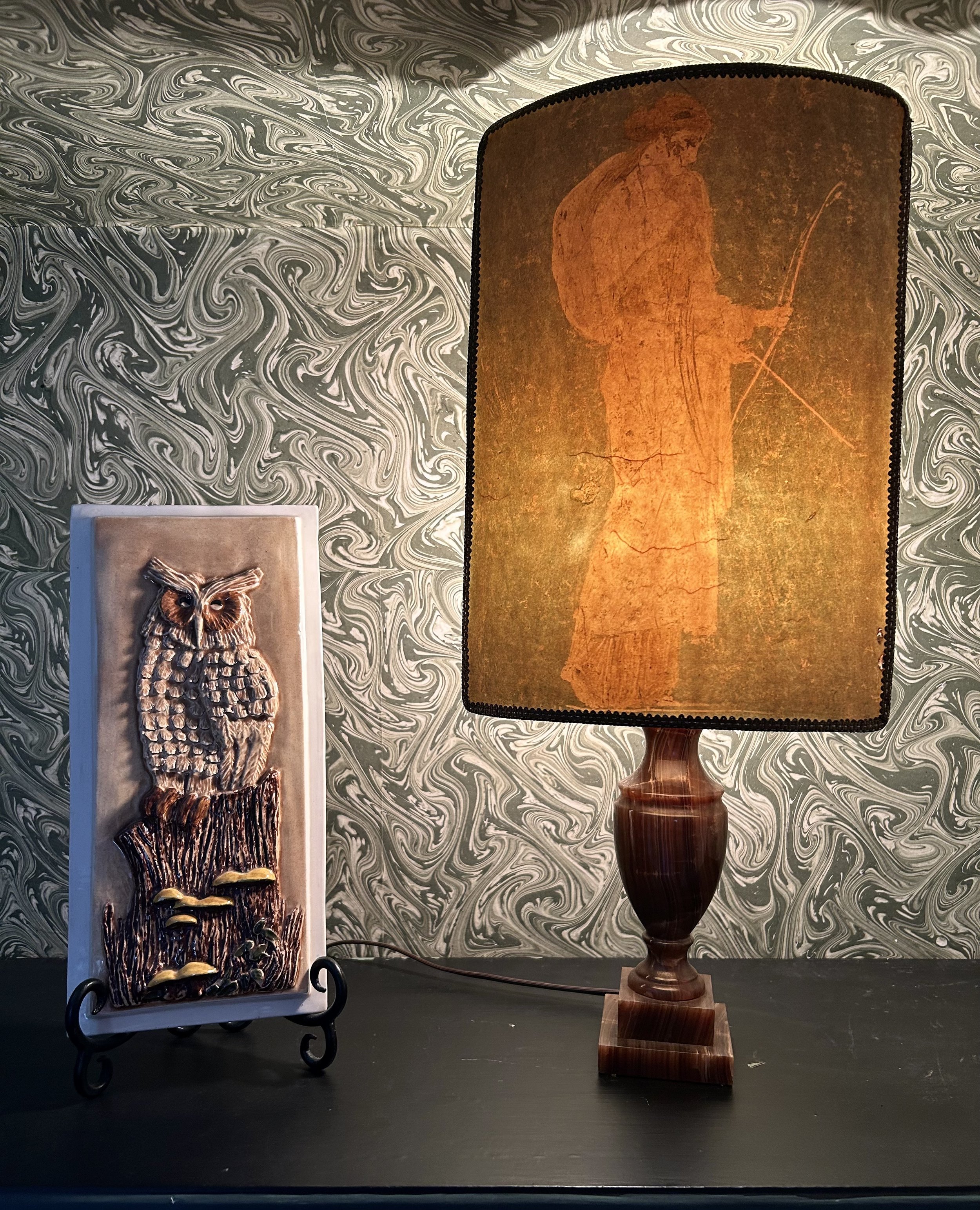
This small marble lamp has a paper shade with an image of Athena. I spotted it at a charity shop a few years back, paying around $30 for it. The shade is made of heavy paper, with a wonderful green background. I cannot determine how the image was made; it is possibly a hand done print. The paper was then wrapped around a metal frame and finished off with a rich gold ribbon. Age is unclear, but I would guess 1940s. She lights up each night via a timer, casting a soft light in our home. Though, to be honest, hubby gets annoyed when the time change happens as the light then stays on past his bedtime, grumbling until I adjust the timer to appease his luddite sensibilities.

Athena is often depicted with a bird symbol, commonly an owl due to her association with “wisdom”. This three-dimensional plaque of an owl was found at the thrift store, and had a few companions. The other owls were not as charming, so this is the only one who ventured home with me. Also not signed or dated, but the yellow mushrooms and green plants make me think 1970s. We are very fortunate to have Great Horned Owls that nest around our property, and can sometimes hear them late at night. I have read that as the eclipse blocks the sun, birds and animals will begin to respond as though night has fallen. I will listen for the Great Horned Owls, and be thankful we live in a time that wisdom is available at the click of a few buttons.
(1) https://www.scientificamerican.com/article/how-ancient-humans-studied-and-predicted-solar-eclipses/

Red Headed Romance
Finding original art at thrift stores is an exercise in perseverance. The old adage “you’ll kiss a lot of frogs” springs to mind – I marvel at the shear amount of stuff I dig through. Because to find a treasure, you most certainly have to dig. And there is a commitment to this process as well – people who “thrift” will go to their favorite haunts a few times a week, as finding that treasure is directly related to “being there” when items are put out for sale. Since most thrift stores are simply in the business of moving items, there is not typically a schedule to this.
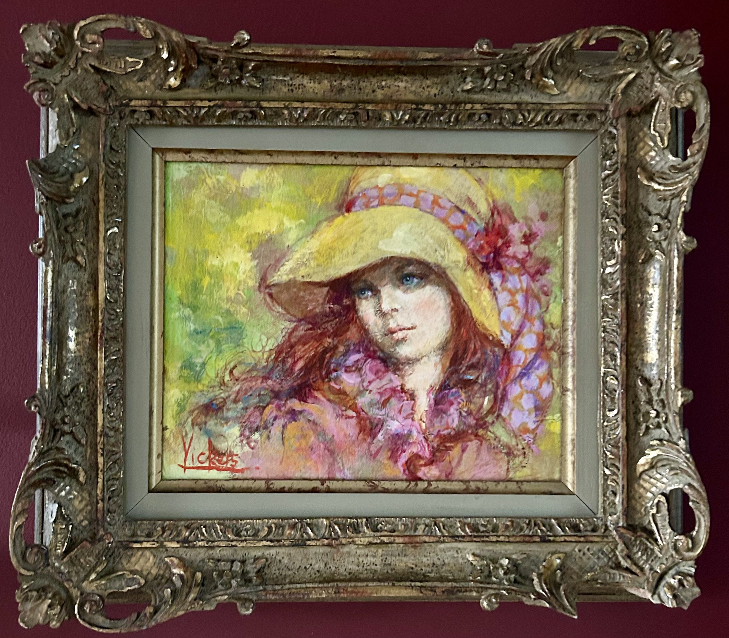
I had noticed, however, that my fave haunt was not adding artwork very often. Entering into a discussion with a volunteer, I learned there was a need for someone with an art background to help with the sorting and pricing. I certainly fit that bill! Now I volunteer at the store, sorting through the piles in the storage area to determine what is of value and what is not. Besides the fun of uncovering original art, researching it on the fly, and helping the manager decide what to display, I get to see what is donated first hand. And as a bonus, I get to pick up treasures before they head out for sale.
This charming small oil painting is, to date, the only treasure I have brought home in the past 6 weeks. It was painted in 1972 by Mary Vickers (born 1940), a British artist. There is a charming flyer tucked in the back of the canvas, letting us know Vickers is a “modern day Romantic. No artist paints more eloquently the rejection of drab reality.” The flyer explains she was influenced by studying the art in London museums, particularly of the Romantic movement. This particular painting was presented at a “one-man show scheduled for Paris” in Spring, 1972.
The painting brings to mind my childhood of the 1970s. While the colors of that era were bright, filled with flowers and smiley faces, the reality of the 1970s was a different story all together. Vietnam, political protests, young generations seething with discontent, to say nothing of the significant lack of women’s rights. This artist’s work certainly rejected the drab reality of the times. A brightly lit woman with flowing red hair and blue eyes. She wears a vibrant yellow hat with a pink polka dot scarf, all set against a neon green and yellow background.
My 1970s childhood was very sheltered. My parents restricted television, and we had one black and white set in a basement rec room. We were only allowed a certain amount of tv watching each week, which, I vaguely recall, was two hours total. Books were unlimited – I could read anything I came across. (Those 1970s trashy novels I “borrowed” from a friend’s mother certainly set the stage for a future guilty pleasure!) As we did not have television going during our days, the visuals of the Vietnam War and the protests roiling the country were hidden from me. I do recall I would sneak down to the playroom late at night so I could binge watch television (2 hour limit be damned). As this was the time of traditional tv, limited to the channels received by antennae, that did not include 24/7 news. What played at night were very old movies, Twilight Zone shows and horror flicks. I scared myself to bits, which may explain my continued reluctance to watch anything “horror” based.
I recall a playmate of mine from that time had an older sister who was very active in the anti-war movement, and so I understood to some degree there was discontent, and a war, going on. She had dog tags from a soldier in Vietnam, and at some later point, a young man entered the picture. In my childish perspective I assumed he was her “husband”, though in retrospect, I have no idea that was accurate. I found her fascinating, and she had red hair to boot.
Amusingly, if you turn to The Oracle, you can find may “theories” about the origin of red hair. It seems it is due to a mutation in the MC1R gene, and originated in Central Asia, or possibly Africa. That said, it is most frequent in areas of Northern Europe, specifically those of Celtic origin. While many of us think those pillaging Vikings were the root, it turns out that is exactly backwards. Scottish and Irish Celts were taken – likely as slaves – by the marauding Vikings back to Norway, adding red hair to that gene pool. As the gene is a recessive trait, it must come from both parents for the offspring to be a redhead. (1)
Having red hair turns out to be rare, as only 2% of world’s population are redheads. In addition, being blue eyed with red hair is even more rare – a 0.17% statistical chance. My paternal grandfather was a redhead with blue eyes (WSH 1890 -1968), and a few of his children were as well, though not my father. In addition, my mother seemed not to be blessed with the recessive red head gene, as 7 children turned up not a single red head.
Back when I was kissing a bunch of frogs, the prince I landed on turned out to be 100% Polish. With brown eyes (dominant). So our children didn’t stand a chance of inheriting red hair. They do, however, carry the recessive gene from my paternal grandfather. And I find it interesting BOTH my sons married red headed women! I’m keeping my fingers crossed for redheaded grandchildren. Romantic indeed!
(1) https://www.eupedia.com/genetics/origins_of_red_hair.shtml

Winner Winner Chicken Dinner

Do I like chickens? Not particularly. But when you own a property that was once a Quaker Oats chicken research farm, it is hard to avoid poultry. Not only gifts, but art in many forms. This collection is decorating a “chicken” themed bathroom, and, before you ask, yes, I did hang the toile wallpaper featuring chickens. I couldn’t resist. In the spirit of “if you can’t beat ‘em join ‘em”, I have gathered (mostly black and white) chicken artwork in many forms, and display them in this bathroom.
I have gathered a large collect of Ful-O-Pep brochures, printed by Quaker Oats. Some came with our property but others were purchased on eBay years ago. The two inside the black shelf are some of my favorites due to the amusing artwork, and these images are reduced sized copies of the (larger) originals. These brochures have provided interesting tidbits of information about the research farm Quaker Oats was running on our property (1922-1965). Quaker Oats was looking for a way to sell the byproduct from manufacturing oatmeal, and the solution was to market it as a fortified animal feed, primarily for chickens. The feed was distributed across the country, and marketed to families that maintained backyard chicken coops. These brochures, as well as a weekly radio show, Man On The Farm, were part of that marketing.
The middle rooster artwork in the black shelf is a small watercolor I found at a thrift shop, as is the framed chicken artwork on top of the display. The black and white oil painting hanging on the wall beneath is also a thrift shop find. He is actually signed “Betty Kingsbury 1987”. Amusingly, the price sticker is still on the back from the thrift store – I paid a whopping $2.00. He is a dapper rooster, nicely done in a folk-art style.
The black framed art work on the top of the shelf is an eBay purchase from years ago. It is a very old photography postcard, with a cancelation stamp saying “Dunkirk, NY April 8, 10am 1906”. For those interested, Dunkirk is up on Lake Erie, south of Buffalo, NY. The actual stamp has been removed, and the writing is badly faded as it was in pencil. The only word still legible is “birthday”, but in very faint printing, the front says “Easter Greetings” along the top edge. I do not know the type of photographic production used, but the piece is likely from 1890 or so, and has a lovely metallic sheen.
The middle piece on the shelf was my mom’s, and I recall it was in our kitchen throughout my childhood. I believe it is a Portuguese pottery tile, but I do not know why my mother had it. It is a bit peculiar in its humor – the image is of a cooked chicken “dish” with the saying “when the cock crows our love will be over”. The implied message is the darn rooster is now cooked so not likely to actually start crowing again – but what a twisted comment about love.
This last piece is on the wall in the guest room just outside the bathroom. My daughter created the artwork in elementary school art class. How could I not display this charming rooster awaiting the sunrise?! I paid to have it professionally matted and framed, and each day I see him, I smile at his charm. Thankfully he is not able to crow, but not because he’s been overcooked. He is a silent reminder of my daughter’s childhood joy in the creation of art. As well as the peculiar saying her trainers would chant when she continually won horse competitions: Winner, winner, chicken dinner! According to The Oracle, this originated by gamblers, trying to win $2 to cover the cost of their dinner in Las Vegas. Over time, it became a phrase to use when celebrating a victory. Time to go make a chicken dinner.


My Violets Are Blue

This bunny, a thrift store find, made me think about our yard in the Spring. We are fortunate to live on a property Quaker Oats developed to be a research farm and showcase for the public, between 1922 and 1965. Thus, our place was hardscaped and planted to be a top of the line “family farm” circa 1930. There are wonderful stone walls and walkways. Huge old trees, including a towering basswood. Quaker Oats planted wisteria, which has aged badly. Peonies as far as the eye can see. Climbing hydrangea scaling the chimneys. Massive Oak leaf hydrangea in stands around the house. There are ancient grape vines. A wonderfully fragrant forest of lily of the valley. Unusual white Persian lilacs. A bed of antique bourbon roses. Carpets of snow drops and cilia. Fiddlehead ferns and English ivy (which is a beast to control). Stands of forsythia growing wild. (As an aside, all the plants over here grow “wild”, otherwise our relationship is doomed. My gardening style is colloquially known as “benign neglect”.) And violets all through the foundation beds around the house. Mine are blues and white, not the yellow ones painted charmingly on this bunny.
To say nothing of the myriad of things I’ve added or encouraged, in the spirit of native and maintenance free. Tricolor Beech, Redbuds, and boxwood. Oaks and Walnuts curtesy of the squirrels. Even a Tulip Tree, which mysteriously arrived. A large raspberry hedge. Prolific Sour Cherry tree. Gifts from friends of trillium, bluebells and mayapples. I’m sure I’m forgetting a few things, but I will move on in the spirit of not boring you to death.
And this week, end of March, the cilia are ending their display and my forsythia plants are starting to bloom. That is at least two weeks too soon. Global warming, I suspect. Last night, the weather dropped, from the sunny pretend Spring days of late, back to normal below freezing. And I worry now about the damage to these wonderful old plants
Back to the charming, hand painted bunny. Done in 1982 by “JER”. The bunny arrived in our house from a jaunt to a thrift store – and while he was quite immobile, frozen on the shelf amid a myriad of other tchotchkes, I spotted him immediately. And boy do bunnies reign in our yard. Over the years we have watched baby bunnies literally romp playing across the yard. Uncovered nests, quite by accident. And dealt with a cat bringing a live baby bunny into the family room, with the ensuing chaos of kids squealing in delight, me yelping, the dog chasing the cat, and the cat chasing the bunny. Can’t recall how that one ended, but it still makes us laugh. Those darn bunnies love to eat things, and protecting oak saplings and other plants becomes an exercise in persistence. Sometimes the bunnies win, other times we do.
Our property is also rich in wildlife, moving through our area by the large easement that runs east of us. Deer and coyote are common. Nesting hawks are often around. Great horned owls live nearby. We haven’t seen red tail fox in a while, but over the years we’ve discovered them lounging in the sun, with a den nearby. There was a remarkably fat woodchuck years ago who tunneled endlessly. Fortunately (for our yard) it was not fond of our dog and moved on. I worry about our property’s future. It has such rich history and wonderful old buildings. And plants.
The violet symbolizes “modesty and faithfulness” in the language of flowers. Using flowers to express ideas has been around before Shakespeare’s time, but he used them often. In Hamlet, Ophelia delivers flowers to the court, saying:
There's rosemary, that's for remembrance; pray you, love, remember. And there is pansies, that's for thoughts. ... I would give you some violets, but they wither'd all when my father died.
Meaning, of course, that faithfulness died when her father was killed. Unfortunately, our home is in a community that tends to take down old houses, building modern structures. I have had local realtors tell me our property is a “great teardown” since two houses could be built here. I have tried to sustain the place, nurturing plants as I can with my limited knowledge and resources. Struggled mightily to eradicate buckhorn and garlic mustard. We’ve made all the barns sound, and use and enjoy them. But I look to the property’s future and worry, not sure if “faithfulness” will sustain it. And so, I smile sadly when I see this charming bunny, with its sunny yellow violets. Some folks tell me violets are weeds, and I should pull them all out. But I refuse to remove them as I find them a cheerful harbinger of Spring, and hope my faithfulness will be rewarded when the day comes for us to move on.

Warning For 60

I recently visited with my sister in Phoenix, and came home with this charming lithograph. Phoenix thrift stores are not a source of inexpensive artwork – most items I saw were priced beyond my budget. This one, however, eked in under $20, and I loved the female characters, circus theme, and fun vibe. Additionally, someone spent a good deal of money on the framing, using a gorgeous, purple, raw silk matting and rich gold frame. The piece is titled “Cirque” and is signed Tanya Doskova. It is numbered 22/100 (meaning it is the 22nd print out of 100), and is not dated. While I didn’t originally notice, now the number “60” jumps out.
Doskova was born in Bulgaria in 1960, and resides in Arizona. She is known for her magical surrealism, socio-political satire and modern folk tales. I was not able to locate anything regarding this specific piece; however, I’ve decided it is a tribute to women turning 60. Doskova would have turned 60 in 2020, as we all hunkered down to struggle through Covid-19, and I turned 60 this past year. The artwork brings to mind a well-known poem by British poet Jenny Joseph, written in 1961, entitled “Warning”. Most folks think it is called “When I am an Old Woman” but not so. The opening line has remained a mantra for older women everywhere:
When I am an old woman I shall wear purple
With a red hat which doesn’t go, and doesn’t suit me.
The poem goes on to describe all the dreadfully inappropriate things she intends to do when she is an old woman (And I shall spend my pension on brandy and summer gloves/And satin sandals, and say we’ve no money for butter). I can certainly relate, though I would not survive without butter as I love to bake – likely I would skimp on dinner. Joseph goes on to express how, at her age of 29, she must be responsible:
But now we must have clothes that keep us dry
And pay our rent and not swear in the street
And set a good example for the children.
We must have friends to dinner and read the papers.
But maybe I ought to practice a little now?
So people who know me are not too shocked and surprised
When suddenly I am old, and start to wear purple.
The woman on the right in the lithograph most certainly is wearing a red hat, and while her slinky outfit is not purple, the hat is decorated with a purple flower. She looks out toward the audience, while nonchalantly holding up the leg of her cohort. That performer, who seems half asleep, holds a moon, which casts the “0” shadow on the back wall of the tent. There are touches of purple throughout the work, including the night sky, and the platform with the reclining performer. Oddly, the “6” does not seem to align with anything casting a shadow, so it feels very much an added element.
While the characters are depicted as circus performers, the name “Cirque” is an interesting choice. Searching The Oracle for “cirque” will bring up many Cirque de Soleil sites. However, “cirque” is a French word for “circle”, but specifically a circle formed through the erosion caused by a glacier. “Because glaciers must originate above the snowline, a survey of the elevations of ancient cirques provides information on climatic change and on the former position of the snow line.” (1) I find it interesting that cirques are exposed as glaciers erode, leaving behind evidence of the earth’s movement. Much like our older bodies show evidence of the years we’ve lived, sometimes to the detriment of current fashions, and our desires. That said, the creases and extra padding I carry exist because I have been blessed with 3 children and 60 years of living. I for one will not moan about my old body– erosion be damned!
In this artwork, Doskova depicts three women performing a Cirque de Soleil style act (though it is a highly unrealistic performance). The women create an internal circle in the work, wrapping around the “60”, with the moon adding to the circular motif. In many cultures, the feminine is depicted as a circular snake, honoring female fertility. The snake, biting its own tale, represents the cycles of the seasons, and the continued renewal of life. A woman, able to give birth, creates a new generation, continuing the circle of life. The number 60 itself is filled with circles – the “0” being a complete circle, and the “6” looking like a snake beginning to curl in on itself. I am not suggesting “60” means we’re near the end, but realistically, my contribution to the circles of life have been created, and my life has been rich and rewarding. I better start hunting for that red hat.
(1) https://www.britannica.com/science/tarn-geology

Not A Chance
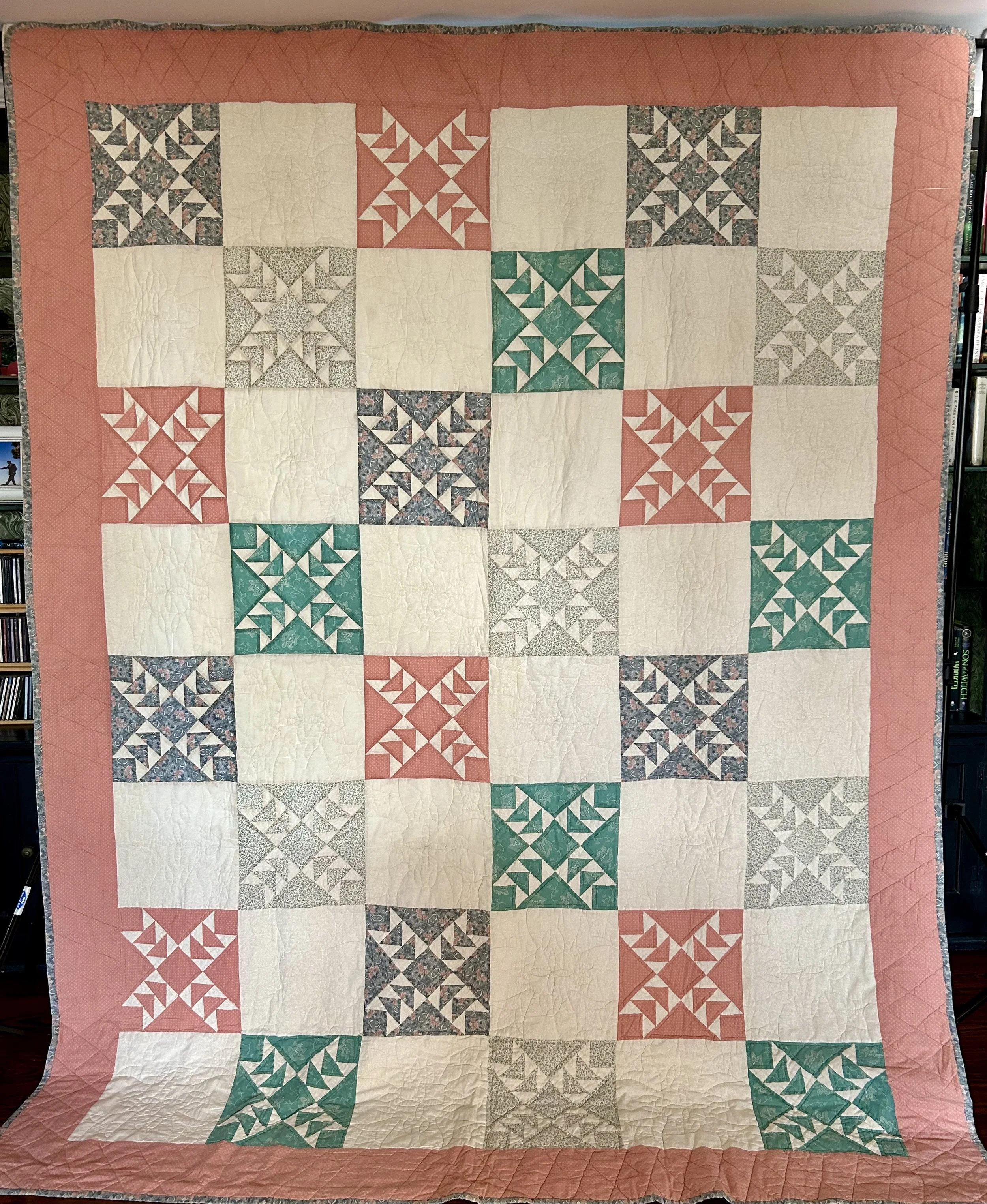
This is my first quilt. While I cringe a bit as I look at it, when it was made, I was quite proud of it. I suspect a number of you can immediately identify what decade it was made. For those of you unaware, peach and green were the dominant color choices in the 1980s. Much like many of you will look back to images taken now and realize “gray” was the name of the 2020s game.
I was a new bride in 1987, setting up home in a city far from anyone I knew. I didn’t have much money as I wasn’t working yet (long story) and Hubby had lost his job in Cleveland a month before our wedding. We sold the home we had purchased 5 months prior in Rocky River, OH and moved to Evanston, Illinois in search of work. I was an avid reader of “Country Living” magazine at the time. I loved the antique, handmade look, and a passion for finding old furniture I could renovate started. While we lived in a second-floor apartment in Evanston, I refinished (striping, sanding and urethaning) a large men’s dresser purchased at a thrift store for $100. Husband still uses it! Thus ensued shopping ventures to flea markets, antique stores and even auctions.
I also began to see quilts, especially at all those antique venues. I immediately loved them, though could not afford the lovely 19th century ones for sale at the time. I discovered a local quilt guild in 1991 by reading of their upcoming quilt show in the “Country Living” magazine, and I am still a member of that guild, Village Quilters, 30 years later! Quilts were often featured in “Country Living”, and I decided to make one when the article included a basic pattern. Believe it or not, I still have the pages from the magazine.

As I had never made a quilt, I found a local quilt store, The Apple Basket, in Evanston. The women there taught quilting the “old fashioned” way - completely by hand. With scissors. And cardboard. And handsewn with needle, thread and thimble. Of course, in 1987, almost no one knew a different way. The quilt is a “wild goose chase” block set with a flying geese border. I baulked at making all those border geese blocks by hand – tracing all the tiny triangles with templates and hand sewing them together was ridiculous. Mind you, I was three quarters of the way through making the quilt by hand when I realized I had a perfectly functional Pfaff sewing machine in my closet.
This machine was my high school graduation gift from my parents in 1982. It had not been used much during the 5 years I had it. Finally, with typical Humphrey ingenuity (i.e. make it up by the seat of your pants but insist you know what you’re doing) I figured out how to sew the thing together by machine and got the top done. Sans flying geese. When the top was complete I realized I had not trimmed the selvage off the fabric and it was exposed on one of the borders. I did not redo it – as one of my quilting girlfriends always says “done is good”. I’ve regretted that ever since.
I realized I should have made the flying geese border, and not have the darn selvage showing. I purchased some additional fabric – I still have it – with the intention of redoing that border. As you can see, that did not happen. That said, making flying geese at this point is ridiculously simple so the creation is not the problem.
This is a bit of a “give a mouse a cookie” problem. I would have to unquilt the borders. And then I would be upset because of course the batting is polyester and I would rather undo the entire quilt and change the batting to wool. Now, once the top is redone and new batting is at hand, I have to quilt the thing. Hand quilting a quilt this size would likely do my fingers in. With all my rock climbing, I don’t know if my fingers could even hand quilt. And contemporary quilting, mostly done on machines, is so lovely and dense, I would struggle to match what my current taste is with doing the quilting by hand. I could simply re-quilt it on a machine, but at that point, is it any longer my “first” quilt?
So, have I changed that border? Not a chance.

To Renovate or Not To Renovate

A good question. There are any number of schools of thought regarding this when it comes to items that are considered “old” or “antique”. The prevailing one is that if you do anything to “renovate” a piece, be it furniture or quilts, the piece is no longer considered “antique”. I grant you there are likely some cases where a valuable piece of furniture has been painted or “modernized” to suit a new generation’s taste, thus destroying the intrinsic value of the antique. That said, is the piece meant to sit, unused and unappreciated? Or is it better to repair something so it can continue to be used and loved? I fall in the second category – mostly.
I bring this up because a friend recently asked if I could repair a quilt that was gifted to her for her wedding in 1993. The quilt was purchased from an unknown maker and was called an “Amish quilt” so most likely it was produced in Indiana by a woman from an Amish community there. This one is a lone star pattern with an appliqued “pillow top” section, and was hand quilted. While the fabric was a quality fabric, some of it did not age well. Typically, browns, burgundies and greens can age badly, especially when exposed to sunlight. They fade terribly, and can rot, leaving holes in the quilt top. The young couple used this quilt for years, but now are concerned it is too fragile to even display. This quilt is an heirloom for them, and as such, it is important to repair the quilt so it can continue to be cherished.
The trick for this quilt will be to incorporate the newer fabrics into the actual pieced parts of the quilt – the three long borders and a number of the diamond sections inside the Lonestar. While the process will not be complicated – I will applique the new fabric on top of the older worn one – the new pieces will also need to be hand quilted to mimic the original ones. Sigh.
So, is it still an “original” quilt of historic value? Likely not, but it was never a rare or collectible quilt. It was meant to offer love to a new couple starting their married life. It has done that for over 30 years, and as such is a treasure for the family.
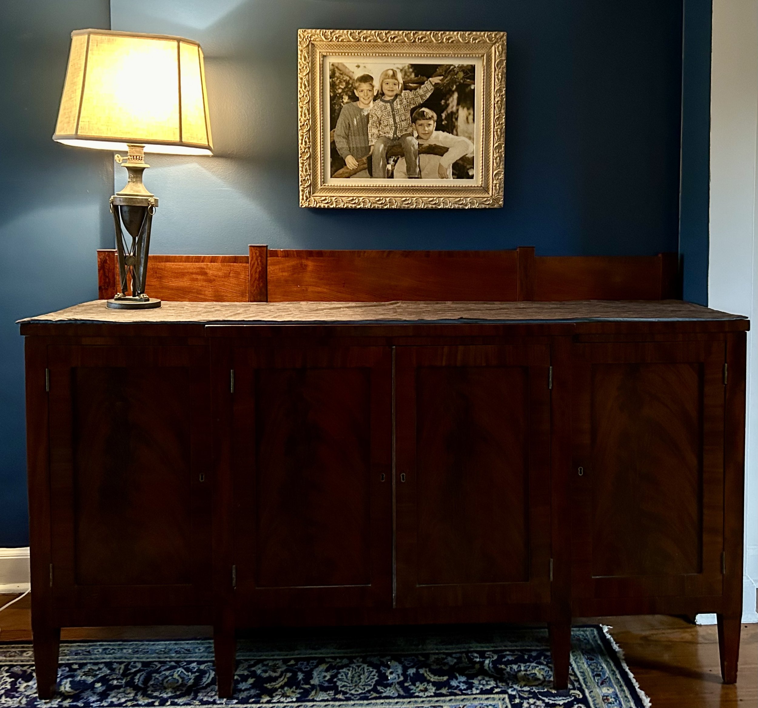
I was thinking about this process when my friend brought this quilt over because I own an heirloom piece that I did have restored in 2012. The piece is a huge mahogany sideboard, and is known in my family as “The Princeton Sideboard”. It is a “Federal Style” piece, and was made likely around 1800. It came from my paternal grandmother, Katharine Strong Humphrey Osborne (1904-1987). The ancestry traces back to Benjamin Strong (1777-1831) who lived in Princeton, NJ. It passed from him to his son, Oliver Smith Strong (1806-1874), to his son Benjamin Strong (1834-1915), and to my great grandfather Ben Strong (1872-1928). It passed from the Strong family to the Humphrey family with my father (1927-2010), and now onto the Jarrett family.
Unfortunately, my grandmother had the piece “renovated” in the 1950s. This involved “fixing” some of the veneers, rebuilding some legs, and smearing a toxic shellac on the piece, which had darkened to very nasty streaks. The piece is also very heavy, and the “repaired” legs were unstable. I decided the time had come to honor my family and have the whole thing properly redone. This was not an inexpensive process, nor easy to locate an expert to do so correctly. After contacting some historic sites, I was referred to a team in Evanston, Illinois, who documented all the issues and repairs with numerous photos and write ups, which I bound into a book to keep with the sideboard for historic record.
What this leaves is a “renovated” antique which is basically not officially antique anymore. Given the piece’s deterioration, was it better to leave a dreadful 1950s era renovation in place, or fix it to make the piece last for another 100 years or so? I went with the latter option, obviously, and the sideboard sits in my dining room as it had in my parents’ dining room for most of my life. So now I need to stop writing and get to work on my friend’s quilt!