
Primary Colors

In a prior blog post I noted my attraction to triangles, and the degree to which they impact our appreciation of art (ericas-heirloom-treasures/composing-in-triangles). All well and good, but people don’t tend to shop by “shape” – more likely you head to the store looking for that perfect pink dress. Or red. Or black. Or whatever color floats your particular boat. Colors are trendy, and believe it or not, there is actually an institute that predicts color trends: Pantone Color Institute (https://www.pantone.com/about-pantone). This is a for-profit consulting company that started in the 1950s standardizing colors for the printing world. It has a huge impact on designers as well as clothing, housewares, and decorating trends. Not surprising “Ultimate Gray Pantone 17-5104” was the “2021 color of the year”, and gray is everywhere these days. But the basics of all color we see are primary colors: Red, Blue and Yellow.
This gathering of glass vessels has been in flux on the mantle in our Calder family room for a number of years (see ericas-heirloom-treasures/calders-rewarding-circus). I did not have a “vision” of any type, simply would pick up interesting hand-made glass when I came across them at estate sales or thrift stores. I only just realized I had collected primary colors! With a lot of circles thrown in, all of which directly reflect the Calder work.
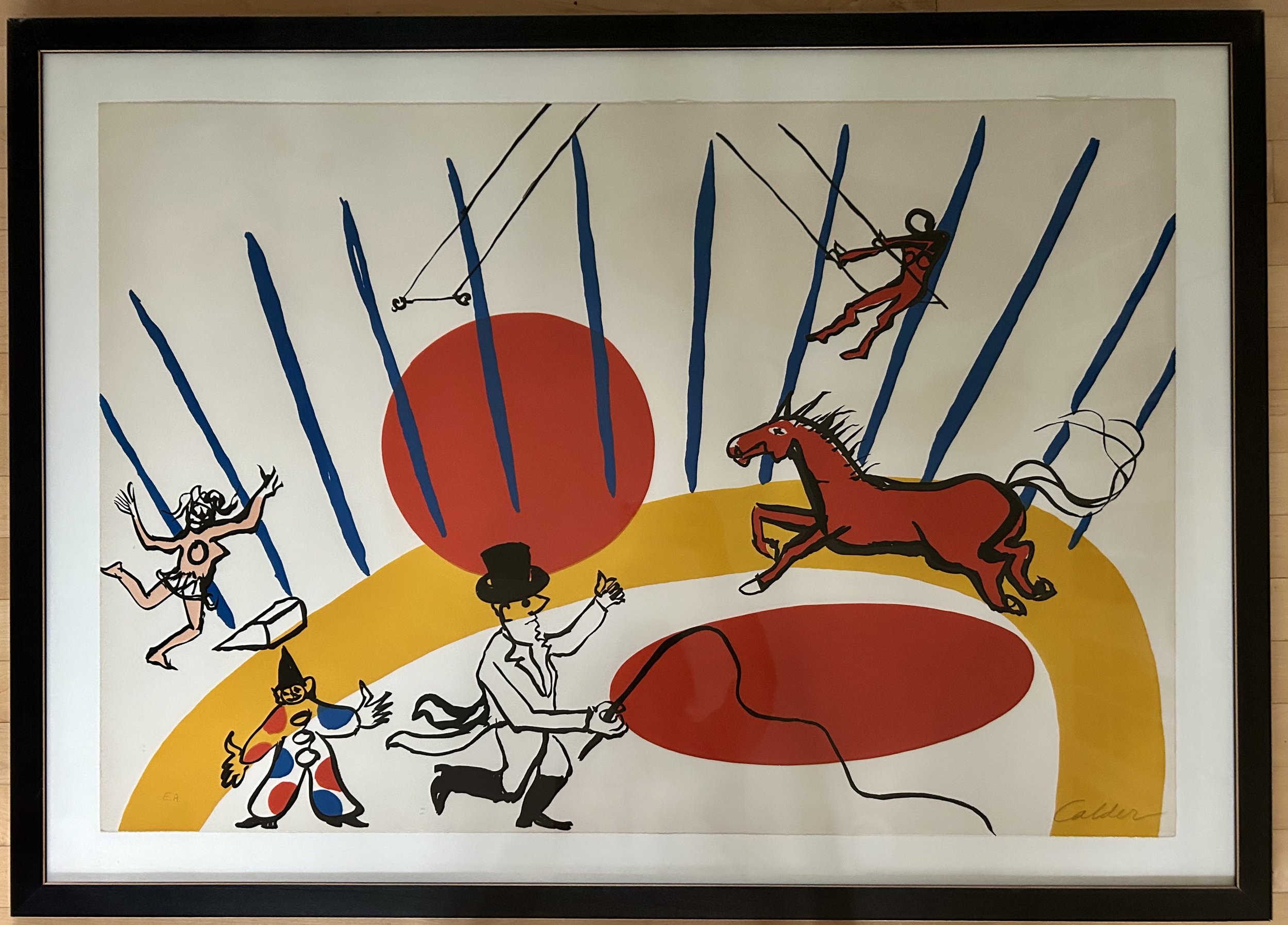
The wonderful red-orange jar was found at an estate sale years ago. Its color and shape are a great compliment to the orange-red circles in the Calder lithograph. The piece is a three-sided vessel, with a distinct circle indent on each face, a helpful means to hold the piece when pouring. I hadn’t researched the work as I didn’t think I could discover much about a vintage glass vessel. How Google Image Search has changed that!
The piece is a Blenko art glass decanter from the 1950s. Blenko Glass is an American art glass company started in 1893 in West Virginia, and is still in existence (1). This piece was designed by their first “resident designer”, Winslow Anderson (1917-2007). He began a residency at Blenko right out of college in 1946, though it is unclear when this piece was designed. It is described as having a “trefoil top” and both the jar and the glass stopper are hand-blown.
How to tell if a glass piece is “hand blown”? The most obvious is to feel for a “pontil” mark on the bottom of the work. This is a small ring-shaped divot in the middle of the base, which can be felt by running a finger across it. This comes about due to the artist using a long metal pipe, with a thin layer of glass on the end, to handle the hot glass during the shaping process. “This handle will often leave on a small amount of glass when separated from the hand-blown glass. The pontil mark confirms that the glass is blown by hand. However, this mark can be polished away to hide the irregularity” (2). A pontil is a term from Italian pontello or ‘small point’, a diminutive of the word punto – point or spot.
The term “trefoil” is also a Latin-derived term, relating to Christian symbolism. It is a “pattern of three interlocking circles that was used as symbol in church architecture…A trefoil is meant to represent the Holy Trinity” (3). (As a complete aside, I find it cosmically ironic that the trefoil symbol “evolved into the radioactive symbol and biohazard symbol…that represent hazardous material” (3))
The other two vessels are more recent thrift store finds. Both have pontil marks and were hand-blown, but very little other information was forthcoming. The blue is a cobalt blue satin glass, made circa 1940. The piece has a charming ruffled top, sweet dimpled curves and adorable blown-glass ball stopper. I feel like I’m describing a grandchild, but Google described it as a “cruet”. My curiosity got the better of me, and off I went to research (etymology, for anyone wondering, is the study of the origin of words and the way in which their meaning has changed through history). “Cruet” is also a religious word, deriving from German “kruche” or pitcher, and originally referred to the vessel used to hold wine during a Catholic service. Now we understand it to be a bottle, with a stopper, for serving liquid condiment during meals. This particular cruet is simply on display, no salad dressing in sight. And the rich blue is an exact match to the blue “tent” lines on the Calder.
The gold decanter (missing its stopper) is a very 1960s design, and makes me think of a childhood television series “I Dream of Jeannie”. In retrospect, that show is a bit disturbing, but as a 1960s child, it seemed magical. The “I Dream of Jeannie” bottle, however, was a 1964 Jim Beam “Christmas special” bottle filled with bourbon, and used as Jeannie’s home on the show. My gold decanter doesn’t look much like it, but its coloring, brass handle and wicker wrapped neck certainly feel very 1960s, and it creates yet more circles. These compliment the Calder’s large arching swath of yellow, which defines the circus ring.
I have a strong urge to move the 3 bottles around so that the red is on the left, with the yellow in the middle and blue on the right. This reflects my ocd focus on “roygbiv”, or the order of the colors of the rainbow (red, orange, yellow, green, blue, indigo, violet). But these particular glass vessels are rather stubborn, and make it quite clear they look better aligned by shape. The weight of the largest, red, vessel on the outside anchors them, with a triangular slant downward toward the lighter, yellow glass. The yellow compliments the antique frame of the large oil painting is rests against, and all those circles create a pleasing softness, offering a bit of a reprieve for your eye, even as you continue to argue they’re in the wrong order.
(1) https://blenko.com/pages/blenko-history