A Quilt Of Love
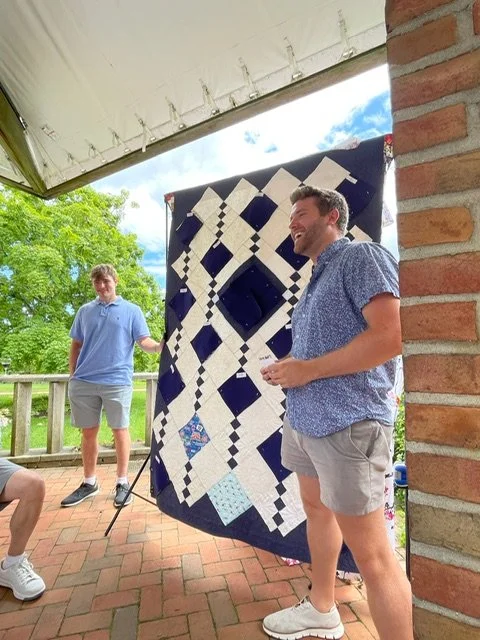
This quilt was a commissioned project for a client as a gift for his mother. It took nearly 4 months to complete. Thankfully, I was able to hand it over in time for the celebration he envisioned for his mother’s 80th birthday party. But it was a tad hard to finish it, not because of all the technically difficult steps, but because I was sorry for the process to be over. It was such a creative, collaborative and rewarding project.
Jim’s mother is a quilter, and he wanted to create a special quilt to gift to her for her 80th birthday, to say thank you for all the love and quilts she had provided them over the years. As a quilter, I appreciate how lovely a sentiment this is. He searched via Etsy, local quilt shops, and even area quilt guilds to find someone who could help create the quilt he envisioned. Nothing online inspired him, and eventually he was referred to me via a local moms’ Facebook group, and we began corresponding in February.
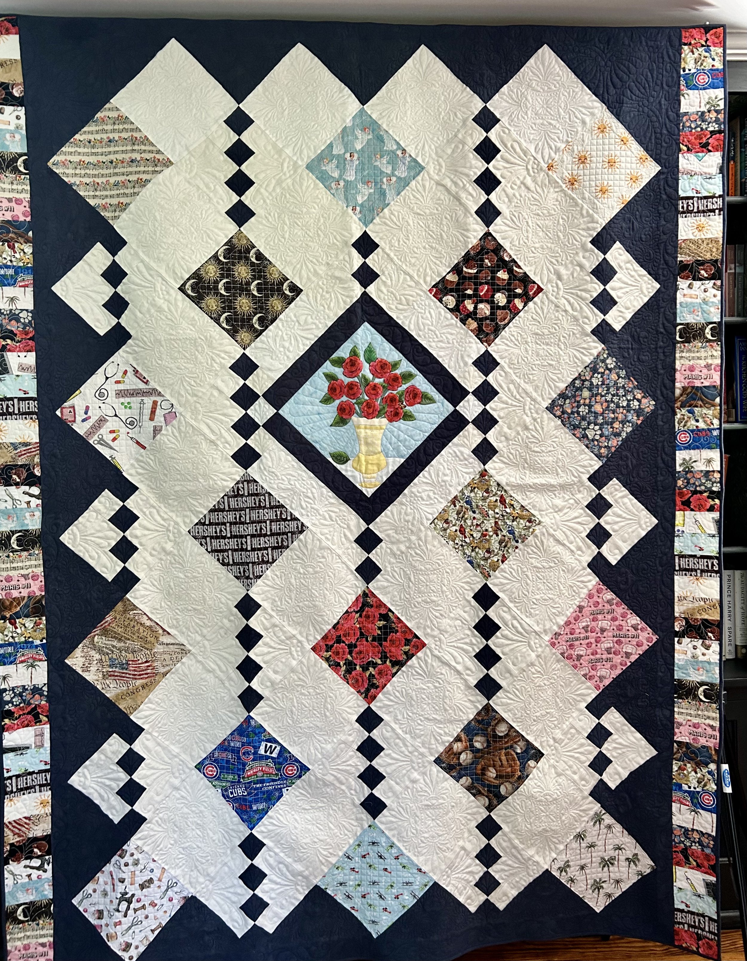
He explained he had asked 17 family members to provide cotton fabric, and he wanted these incorporated into the quilt. The fabrics were chosen to convey each person’s relationship with wife/mom/grandmother/great-grandmother. The idea was for the quilt to be “revealed” during the party, with all covered up, and each person discussing their fabric and its meaning one at a time . After some back and forth, it was clear he was attracted to designs “on point” – a setting were the blocks are arranged in diagonal rows, with the blocks forming diamond shapes (instead of the typical “square” set). While this can be a visual interesting design, it does create a bit more challenge from the math perspective - and geometry lessons were a LONG time ago! I searched online and found an image of a quilt pattern I thought would work well. Unfortunately, it was not an available pattern for sale, as it is used by an Etsy quilter for her business. (https://www.etsy.com/listing/622169623/necktie-custom-memorial-quilt.)
Jim had explained to me that his father’s fabric was “roses”. Since the couple went on a first date on the 11th, and later were engaged on the 11th, Dad has always gifted her 11 roses instead of the dozen often available. The joke being he was “too cheap” to pay for 12! I felt very strongly we needed to highlight the roses, and decided to strong arm Jim into agreeing to the idea of a vase of 11 roses in the center of the quilt. Thankfully, he didn’t need too much convincing, and quickly warmed to the idea.
The layout proved to be a headache – would have been ridiculously easy if it was a square set, not the diagonal one. If I was adept at the quilt design program “Electric Quilt” this may have been less torture, but I’ve not tackled learning that program as yet. I admire those that can and am certainly envious – especially when I’m taping grid paper and drafting with pencil and rulers!
When we eventually met, he provided me with 17 yards of fabric! One yard of 17 very – and I stress “very” - different fabrics. I referred to the collection as “Nausea”, mainly because as a whole the patterns did not blend well together. The challenge would be to create a unified quilt with the disjointed, but important, fabrics. He had intended to pre-wash the fabrics, and I suggested no. Not that they shouldn’t be washed – but that I was rather concerned all the different colors would bleed. If that is done in a random washing, loose color can migrate onto other fabrics in the same load, staining them. And then you have a mess. Using a product called a “color catcher” solves this problem – it is a super slick sheet, much like a dryer sheet, that will actually collect any loose pigment in the wash. In some cases, you need to run the fabric through a few washes with color catchers. I washed these fabrics twice, as the first round showed quite a bit of pigment “caught” by the catcher.
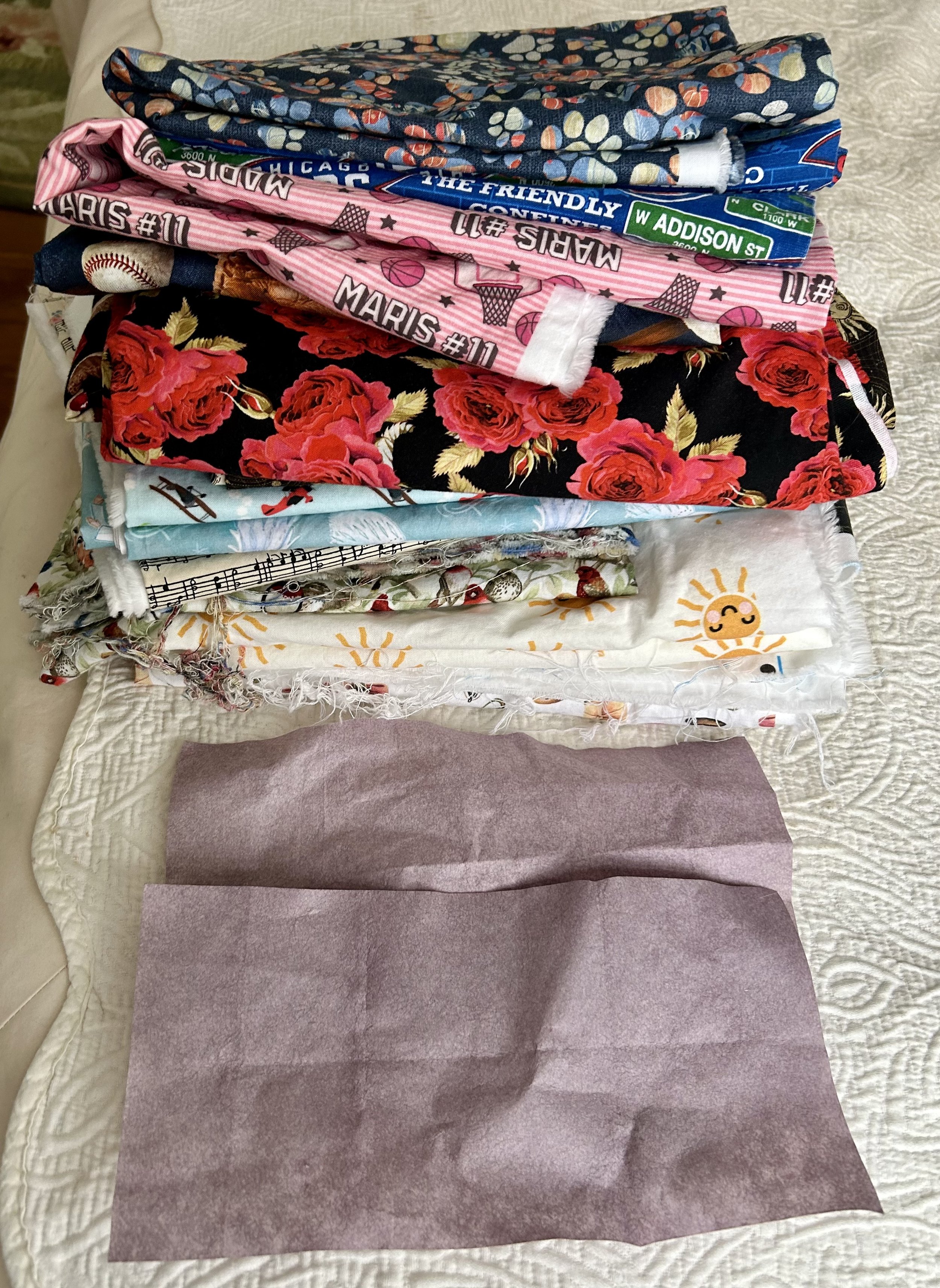
I fussy cut the fabrics to make sure they were also on point, so the various designs would read correctly when set in the diamond (otherwise lettering etc would end up sideways). Next issue to tackle was the background fabric choices. I requested Jim find out if his mother had a favorite color. I knew I wanted a cream overall to help calm all the busy fabrics, but the edge triangles and 4-patch diamond blocks needed a strong color to handle all the myriad fabrics. The joke was that Jim said: “Hilarious - to the extent she has one, my Dad says it’s red(dish)… :) Yeah. A red background on red roses? Not so good - even for an ignorant non-quilting boy…..”
Whelp, yes that would be a bit challenging. I voted for blue. I texted him: “So the problem is that red is not a particularly good blending color. Your eyes are used to seeing greens and blues behind things. So, my preference would be to use a nice dark blue as the accent color. And maybe do the center block in a pale blue background. That seem OK?? Can certainly add some more red to the border if we want to bring in red but we don’t want it to get to be a red, white and blue looking thing.” Jim agreed with my suggestions, and I was on to the “vase of 11 roses”.
He wondered if we could use a silver fabric to compliment the blue, but noted his mother tends toward gold. I dissuaded from silver as it would need to be dark to show against the light blue, and sourcing a dark silver silk fabric would be a challenge. I found a yellow linen napkin in my bin of vintage fabrics. Laying it out in such a way that the embroidered hem acted as the top of the vase, and fussy cutting the bottom to highlight the embroidery. After a bit of google searching, I found a pleasing shape, printed and enlarged it. The roses were fussy cut from Dad’s fabric, the leaves cut from a green print I had, and the stems made from silk ribbon. Edges were turned under, glued in place with water soluble glue, and machine appliquéd. I definitely wanted there to be a leaf floating to the ground, as I explained I felt the leaf helped “anchor” the vase on the table. After a bit of concern, Jim agreed, though he asked if I could embroider a date on the leaf. Great idea! He mulled date options with his father, with a bit of stress about which date to use, and the chosen one was hand embroidered in a stem stitch. Hand embroidery was never my strong suit so the lettering needed a bit of tweaking to look as desired.
On to tackling the sourcing of the other fabrics needed. I knew I wanted Cherrywood, a lovely rich hand dyed fabric, in a very dark blue for the accent color. Their website refers to one color as “Nightshade” and I blithely ordered the yardage I anticipated needing. The color arrived and looked like faded blue jeans. Definitely not what I wanted. The company was lovely, and offered to swap the yardage for “Cobalt” which is their darkest blue. Not logical in my opinion! Thank goodness as that was a tad bit of money – Cherrywood is $24/yard! The delay in timing for all the shipping back and forth was a bit of anxiety but I used the down time to work on finding the cream color fabric.
Being a bit of a vintage junkie, I began to search for antique linen I could use. I liked the idea of a rich, heavy fabric and vintage table cloths can be wonderful for their designs and weight. I came across a few with roses woven into the linen, and realized that would be ideal. There were a few on eBay, but nothing with acceptable yardage and cleanliness. Then I found a listing on Marketplace and was so excited I arranged to get it even before Jim had given me the go ahead!

I seriously could not believe it! The woman told me it had belonged to her great aunt, and had never been used. What an amazing piece of beautiful handmade linen, probably from 1920s. Don’t faint, but I put it through the wash. And dryer. If it was to be used in a quilt, it needed to hold up to such, and better to do it to check if it survives, than to find out later when the quilt was made. It was a dream – softened up, didn’t shrink and held up just fine. I did use starch to keep the fabric from twisting as it was a hand loomed linen, but all in all it was a beautiful fabric to sew with. I confess I nearly cried when I had to start cutting.
I was anxious to be sure I had enough of the linen for the quilt, and nearly wore out my calculator measuring way more than twice! More like measure four times, cut once! While there was yardage, the lovely damask rose pattern on the table cloth would not yield enough for all the white blocks on the quilt. I fussy cut all those I could, and used non-rose designs for the partial blocks. Once I had the correct dark blue (which I had to wash FOUR times with color catchers!) I got the blocks made and began the layout.

Upon seeing the first mock up, Jim requested the vase be set off from the theme fabrics with white squares and the blue and white 4-patch blocks. Which required a whole lot more math. As I texted him: “ Dear god it was nutty (the whole sideways thing does a number on my math!)”. His reply: “Loooooove it. MATH!!!” At some point, I simply gave up with the calculator, and began to sew. I felt the light blue block needed a bit more oomph to set it off the white, and came up with the following solution.

I tend to move darker fabrics to the outside when working on a quilt as it helps with the visual weight of a layout – if too much “dark” is near the middle, the quilt can seem heavy – and not pleasing from a design perspective. Jim noted the dark theme fabrics set against the dark blue tended to make them disappear. Amazing! He was correct, and I appreciated his visual awareness. In this case the dark blue acts as the outer anchor, and the theme fabrics needed to be scattered to balance that heavy border.
We settled on the layout, after a bit of moving things around, and then added a “Chinese coins” border of all the theme fabrics along the two sides. The decision to not add the border to the top and bottom was due to the measurements of the quilt – it was longer than it was wide, and to add more to the length would make it a rather long and skinny quilt. On to the quilter!
Designing the quilting on a quilt top in our modern age involves computer assisted design (CAD) on elaborate “long arm” machines, which is an art all its own. My dear friend Nancy is a wiz at the process, and, being an accountant by training, loves for things to be very exact. She and I hunted through her database of quilt patterns, and I shared options with Jim. The ones he liked were those we thought the best choices as well! While Nancy began to laborious process of quilting the top, I struggled with learning to use an embroidery machine.
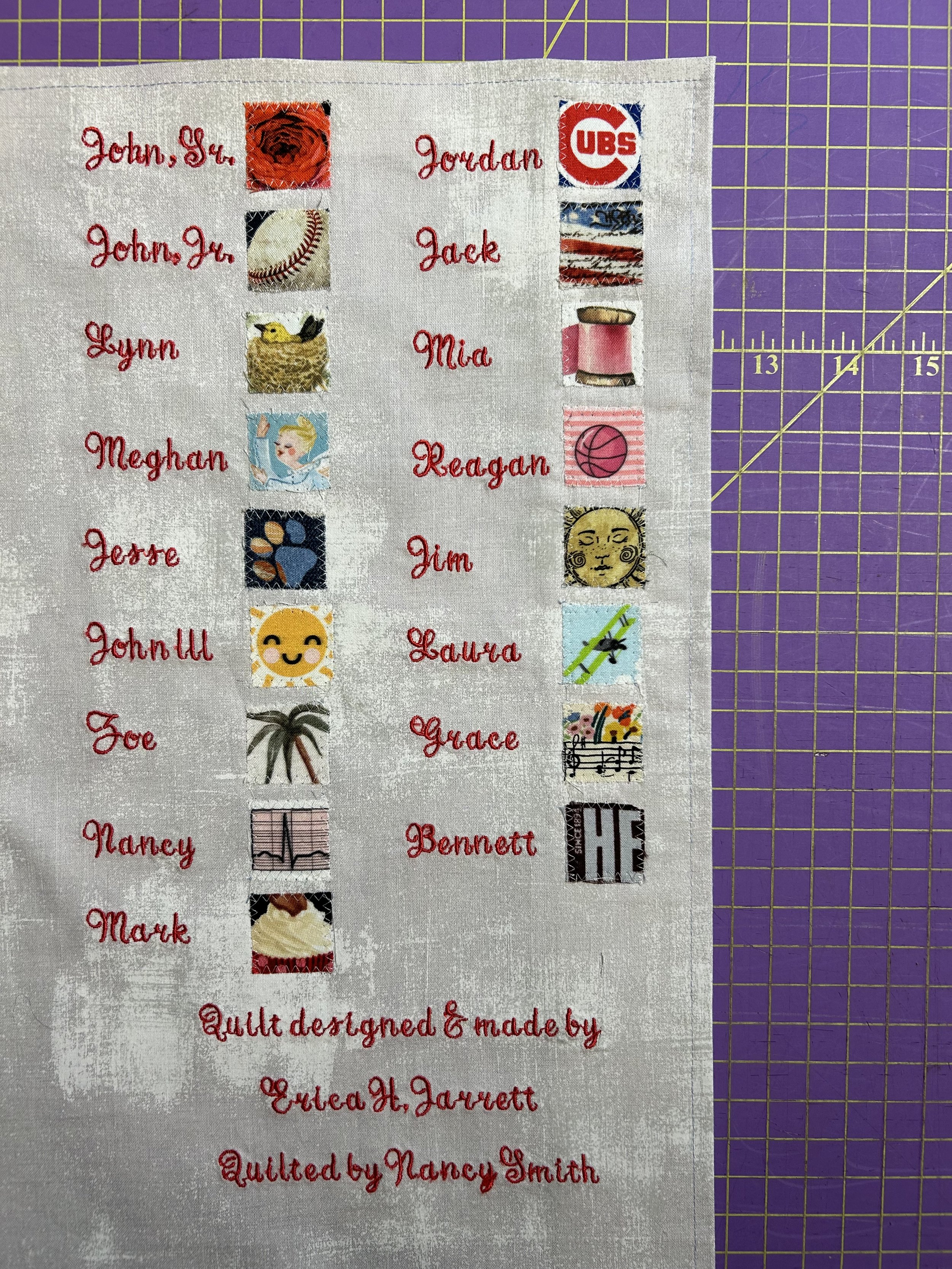
This started because Nancy had an older machine from a quilting guild friend who had moved a number of years ago into an assisted living arrangement. The machine, a Bernina, was a nice version about 15 years ago! The snafu was that I had to have a special “PED” machine to burn info off the internet to load into the machine. To do that, I had to have a pc computer (I’m an Apple girl). A friend cleaned an old pc he had, I ordered a “PED” machine, and I struggled to get the gadgets to communicate with each other. Unsuccessfully I will add. After hours of frustration. I recall being in tears at some point. And finally giving up, and ordering a second-hand embroidery machine off eBay. Which I then needed to learn how to use! Which is also an art – some quilters use embroidery designs as the quilt top work, but my goal was simply to figure out how to create nice looking labels, as my handwriting is less than fabulous.
I had suggested to Jim that the idea of a “key” for the fabrics would be a good thing to create. I had done this for another client – and it was by far their favorite part of the quilts they gifted their grandchildren, allowing them to identify all the family members on their family tree by the fabrics. In that case, my inspiration was great but I didn’t vet the info, and I learned a valuable lesson! Having to redo that key three times…aarrgg. Jim’s version did not include family names, connections and dates thankfully! I struggled through my steep embroidery machine learning curve. There was much back and forth regarding font style, layout options, and even thread color! The dedication label was a special family expression of love for their wife/mother/grandmother on her 80th birthday, not the right place for my name, and so I put mine and Nancy’s info on the “key” label.
The quilt was a tremendous success – for the family and for the woman who’s love of quilting inspired such a touching gift. I was touched by Jim’s comments after the event:
Yes, it was truly "our own" quilt and you made that happen effortlessly with me. My mom was very impressed with the quality and couldn't believe it. I really love the patterns we chose. The "key" on the back was an awesome separate reveal as well. You really helped my vision see reality. It was not just a precious quilt to gift, but it was the mechanism to create and deliver a precious moment. The moment was incredible and has exponentially increased the value and import of the quilt itself. Seriously, every time she looks at the quilt, she will be touched by the memory of the presentation. It really all came together perfectly - literally and figuratively.Thank you again for making that happen.”
What a special process to be able to take part in!